Laneige Homme
Cosmetic packaging
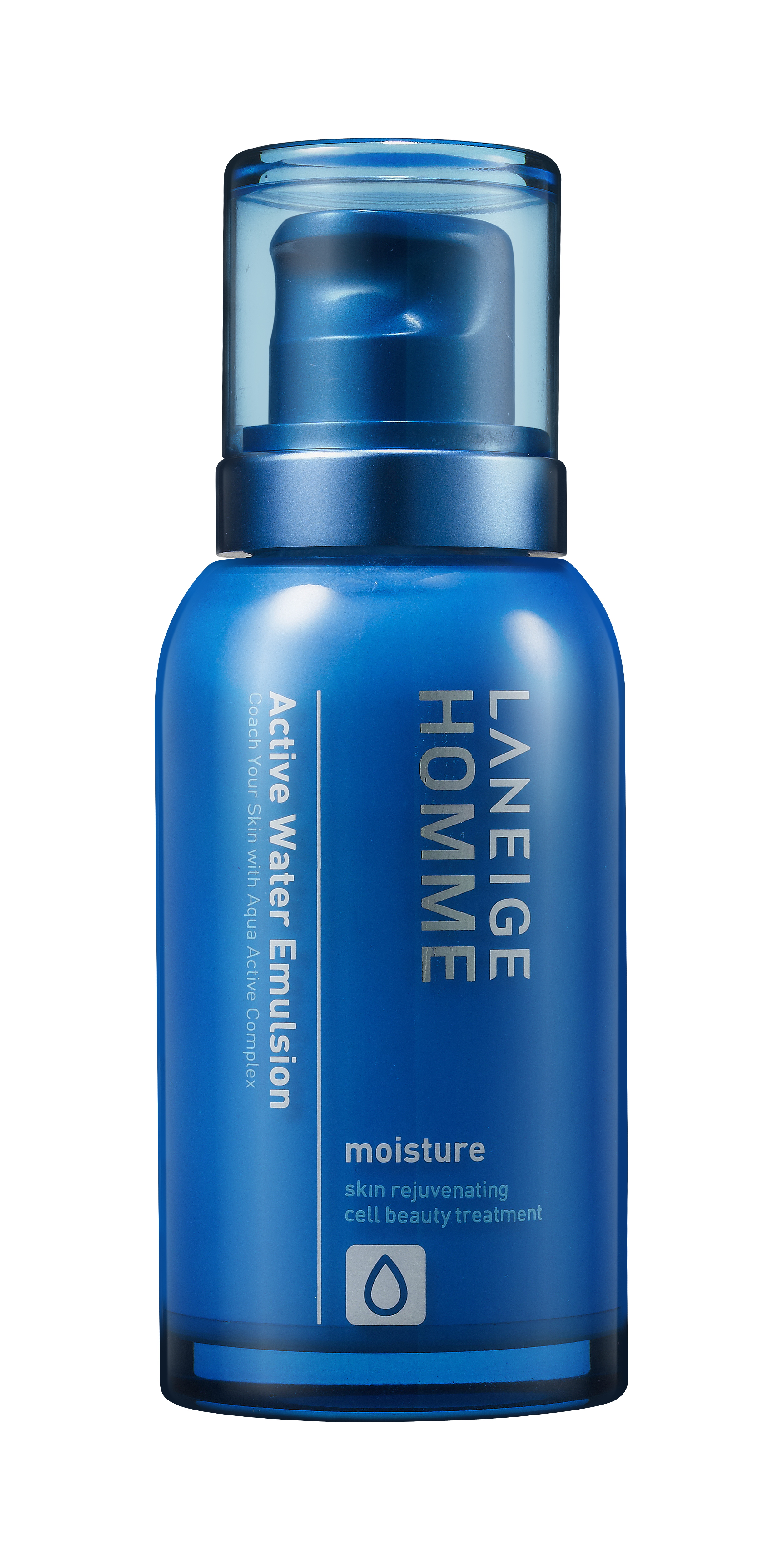
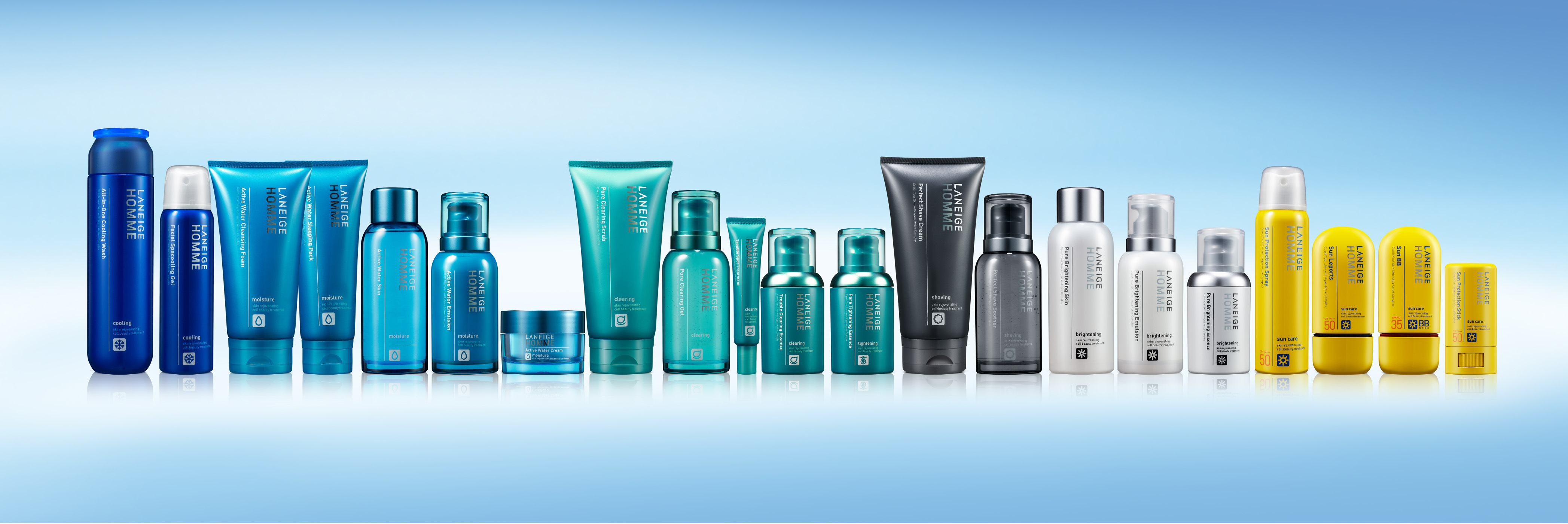
Laneige Homme went through an upgrade renewal project in 2012 to become a professional, young city man’s grooming brand. Its original, yet simple and modern image was maintained, while the top area of the container became much rounder to create a younger look. Colors and materials were also changed to show off a more stylish, active look. With the coloring of the headline “Vivid & Vitality”, each line has vivid colors for the whole container to allow distinction, while the packaging used a vivid cobalt blue color to show Laneige Homme’s identity. The easily readable Sanserif font contributes to the brand image and delivers a consistent image.