


lesen bildet
Corporate Design
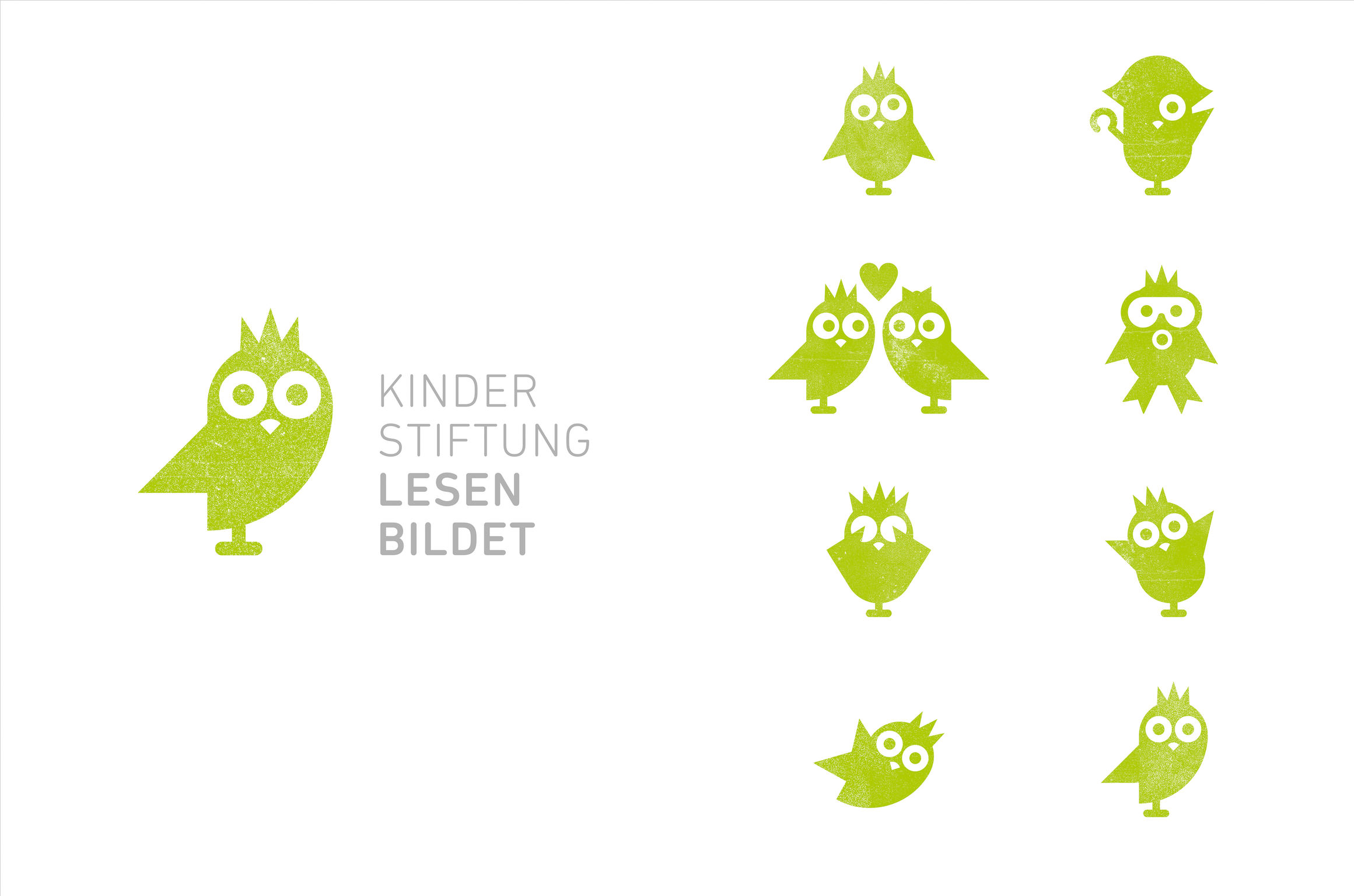
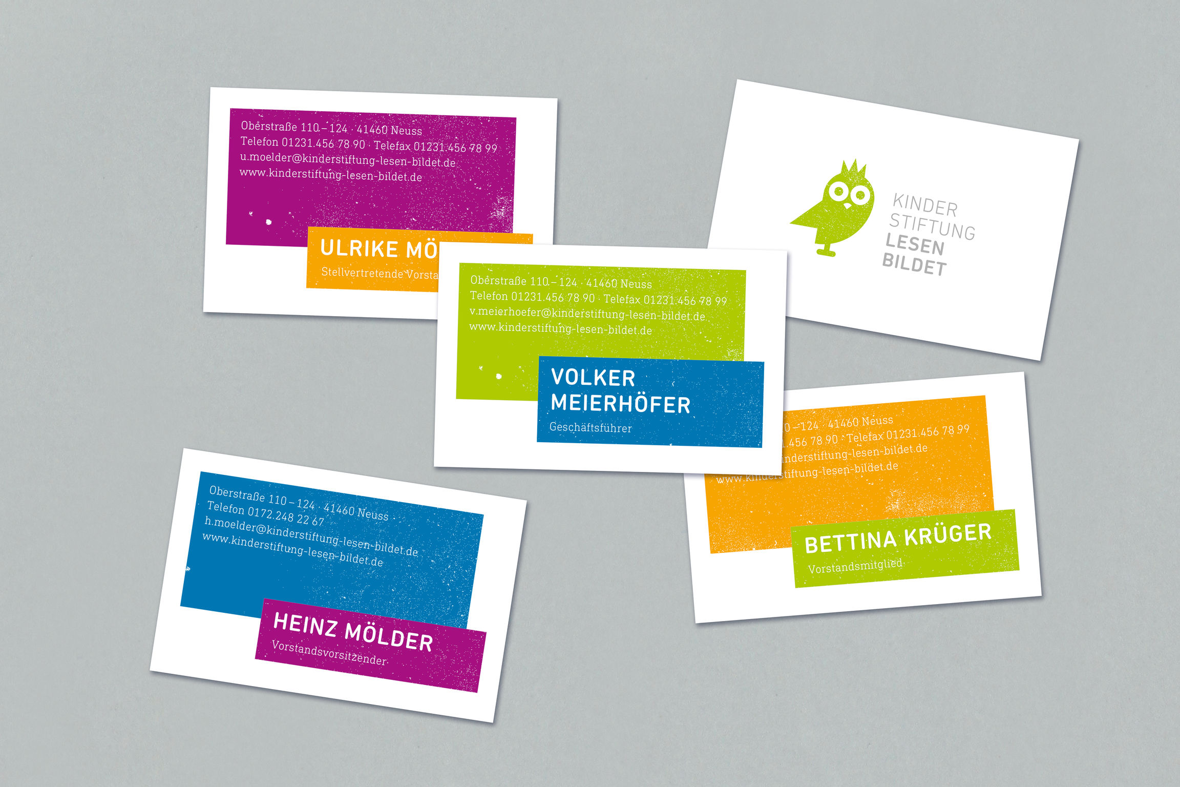
A corporate design, that arouses sympathy, is versatile in its use and also has high recognition value, was developed for the children’s foundation "lesen bildet" (reading is educational). The key visual is a specifically conceived reading owl, a symbol of wisdom and education. The animal illustration serves as a cheerful and likeable figure that is used flexibly throughout the corporate design. It depicts the varied aspects of reading, thus illustrating how reading conveys humor, tension, adventure, emotion, freedom and a lot more. Colorful areas are used to highlight content and, thanks to their shading, are also reminiscent of drawings.
Client / ManufacturerDesign
Kinderstiftung "lesen bildet"
Neuss, DELockstoff Design GmbH
Grevenbroich, DEDate of Launch
2015
Development Time
up to 12 months
Target Regions
Europe, "Deutschland"
Target Groups
Kinder, Eltern, "Spender"