Libergraphic Alphabet
Explore the city with a fresh perspective
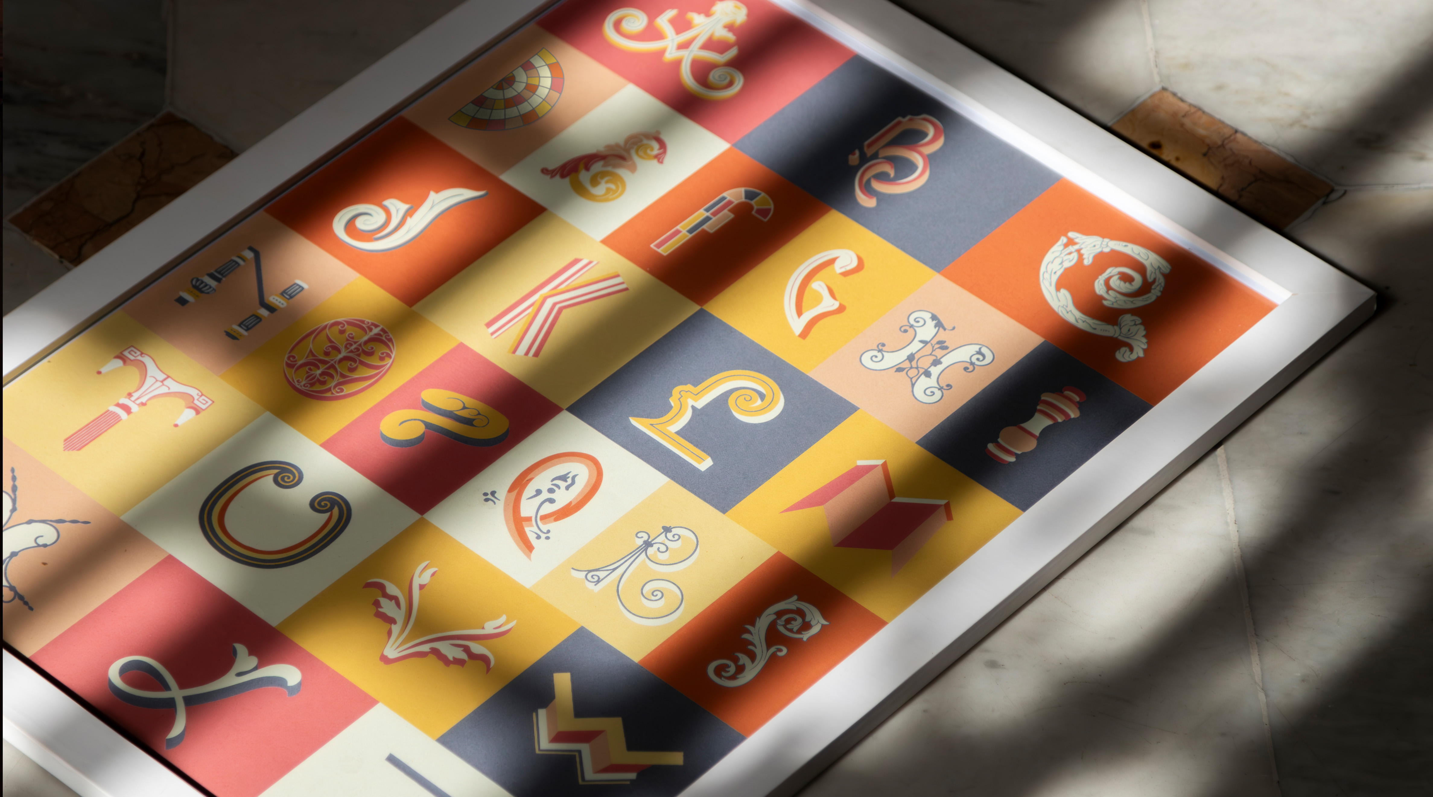
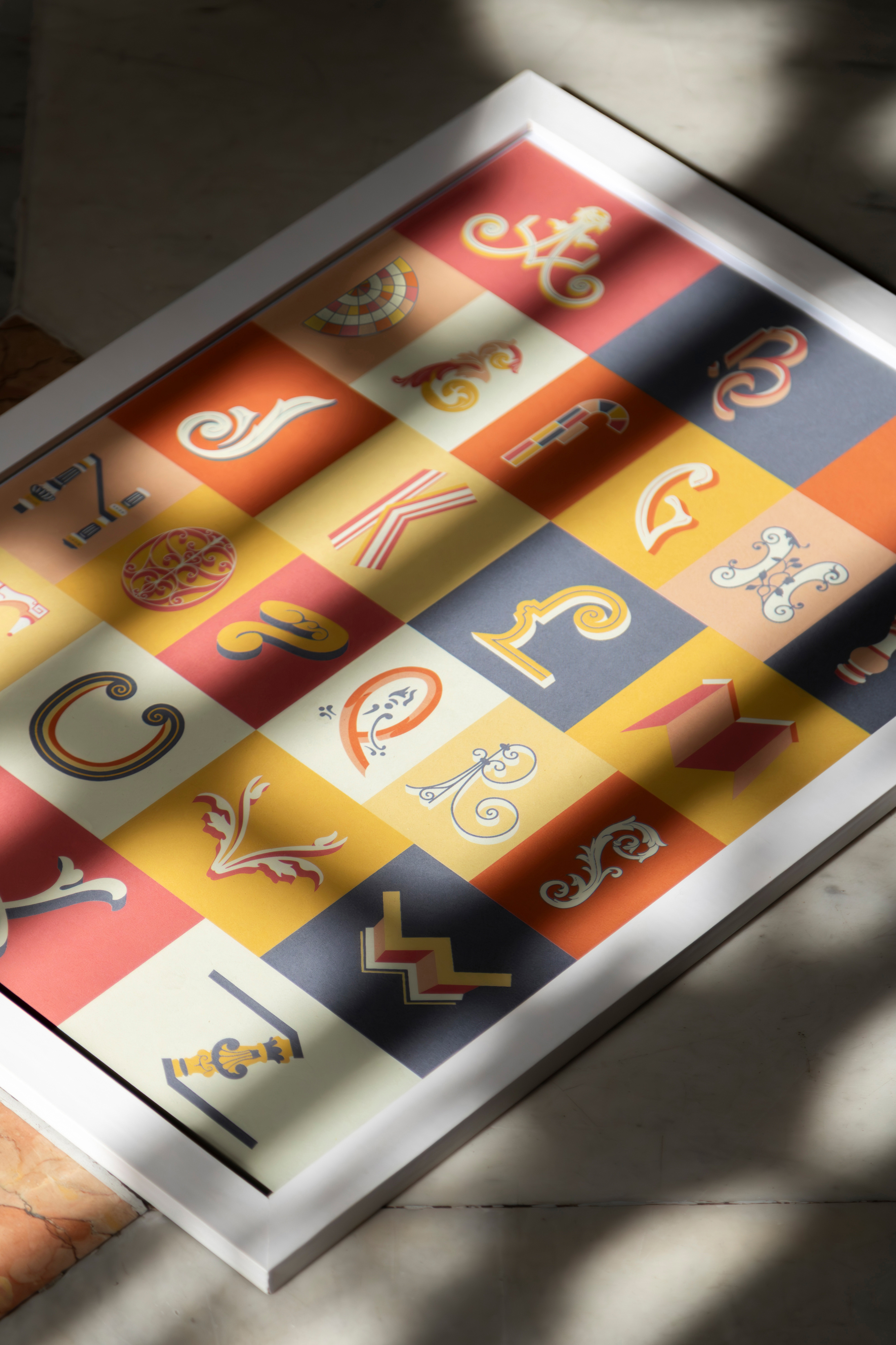
The 'Libergraphic Alphabet' is a lettering project inspired by the architecture of Circuito Liberdade in Belo Horizonte. It revives local graphic heritage by creating a unique alphabet that translates architectural elements into authentic letters, turning historic buildings into a new visual code. Developed through extensive research on eclectic buildings, the project strengthens the connection between citizens and their cultural heritage. It also includes an interactive expedition guide, inviting the public to rediscover these spaces with a fresh perspective and a deeper appreciation for the city's visual history.
This is a well-crafted exploration of typography, architecture and cultural heritage. It bridges design with history, encouraging a deeper engagement with the built environment. A great example of how typography can shape our experience of place.
WINNER STATEMENTThis news came as a breath of fresh air! It’s an honor to have my project recognized by the prestigious iF DESIGN STUDENT AWARD, judged by top professionals from around the world. I’m truly grateful for the opportunity to share a bit of my design—and of my city—with the world.
UNIVERSITYUniversidade do Estado de Minas Gerais
Belo Horizonte, BR