LINX
Brand Identity
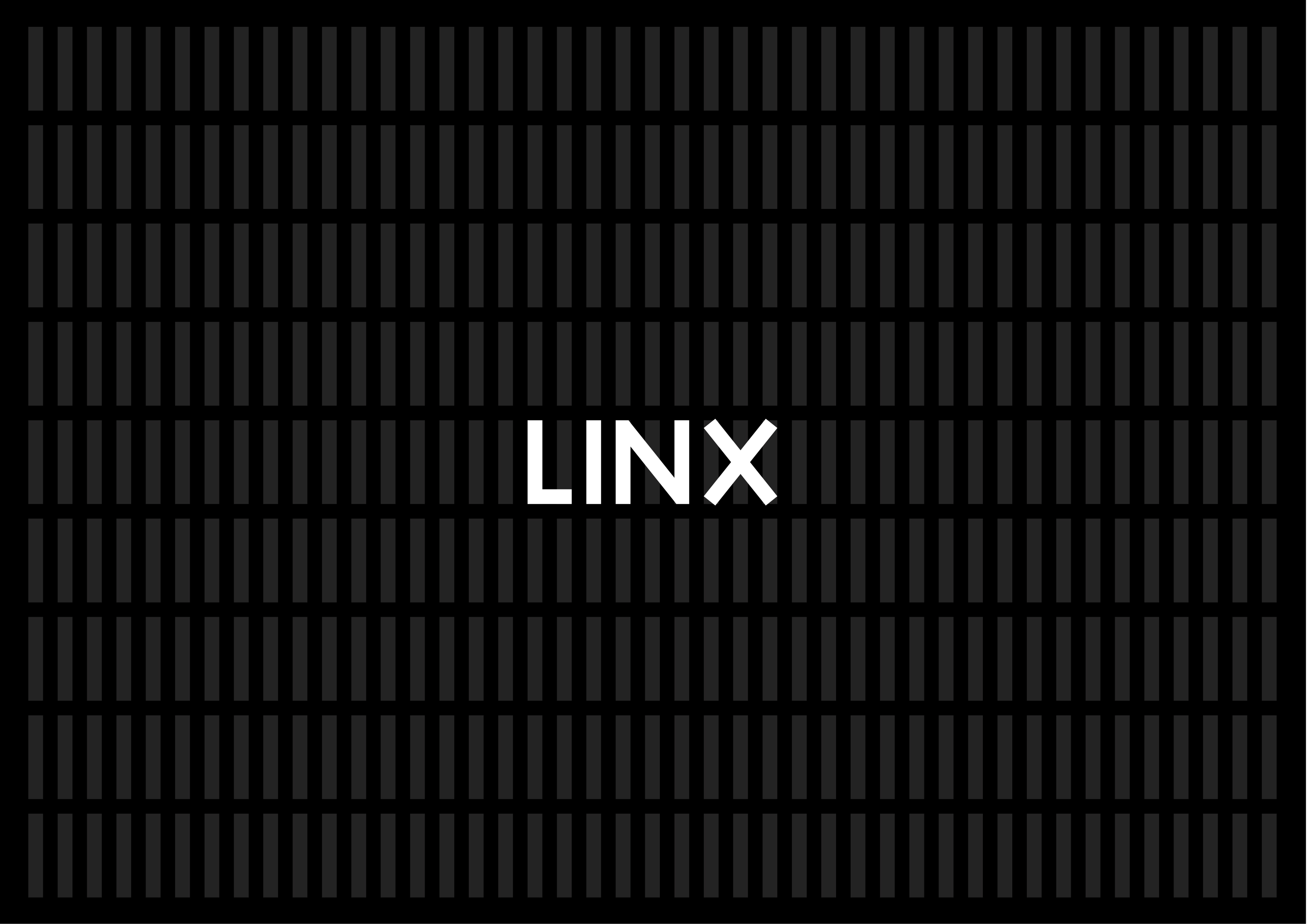
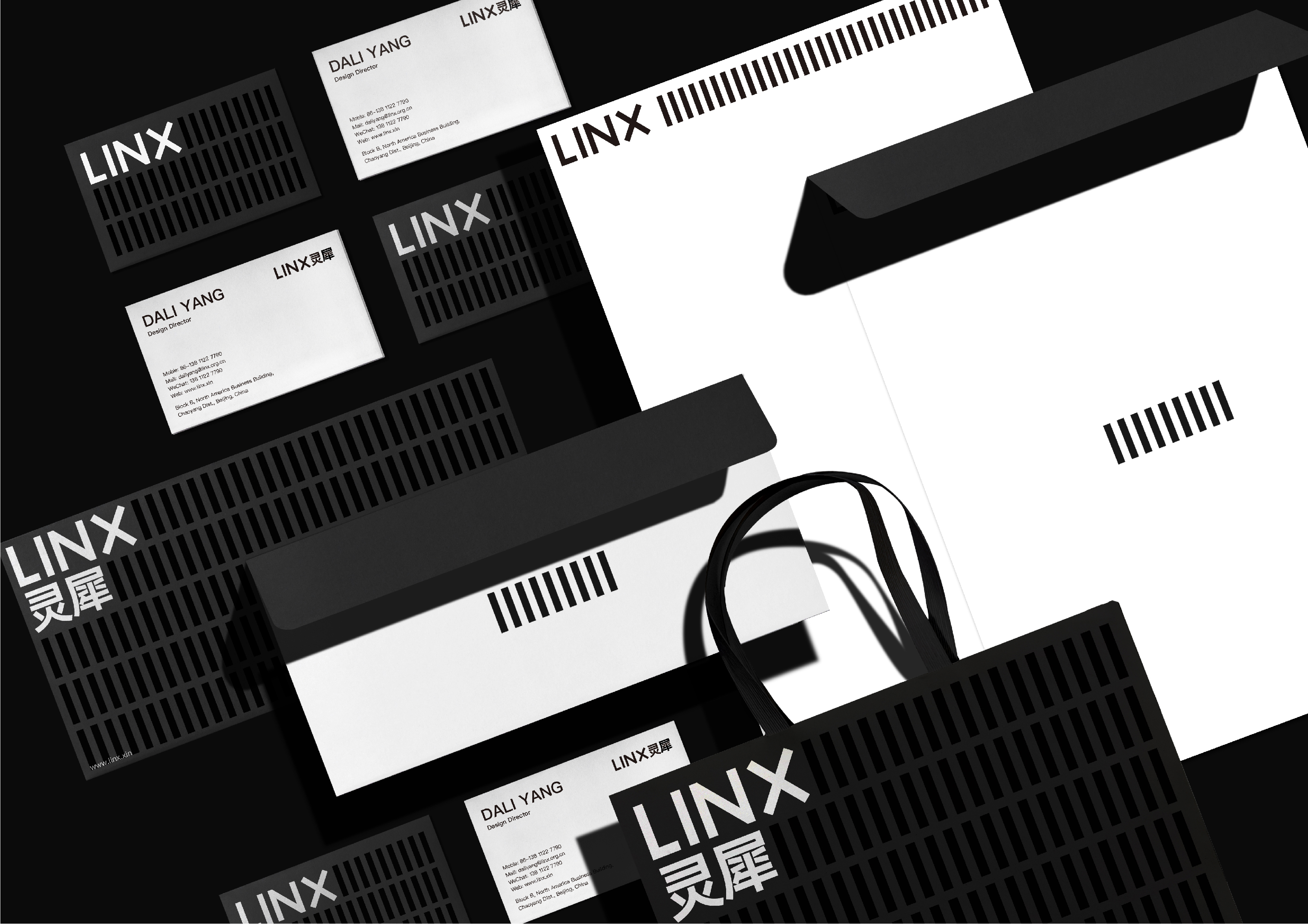
LINX is focused on improving people's daily life and examining the relationship between individuals and groups. When given the task of enhancing the LINX image, we began by reorganizing the brand's visual symbols, allowing the audience to see LINX's emphasis on individuals, reflecting the enterprise’s transition from entrepreneurial products to brand focusing stage. In this design, we use rectangular elements which shaped like the letter "I" as visual symbols, and each rectangle represents a different individual. At the same time, when symbols are grouped together, they convey the strength of unity and represent the visual impact of the whole.
Client / ManufacturerDesign
Beijing Xin You LingXi Technology Co., Ltd.
Beijing, CNShenzhen XIVO Design Co., Ltd.
Shenzhen, CNDate of Launch
2019
Development Time
up to 12 months
Target Regions
Asia
Target Groups
Consumer / User