


Liquid Brand Design Telekom
Brand design evolution
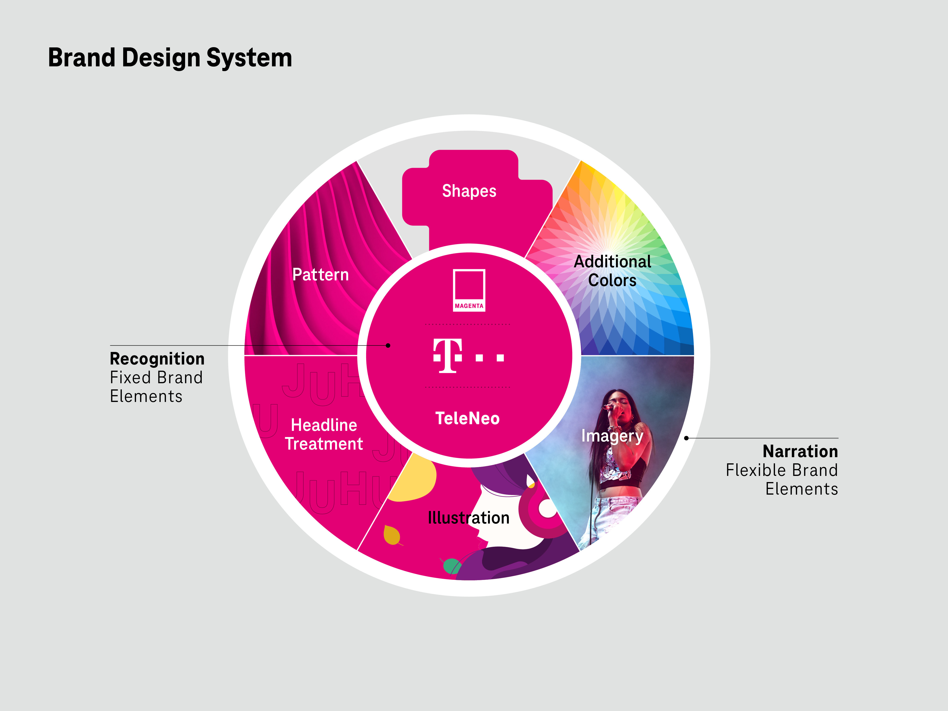
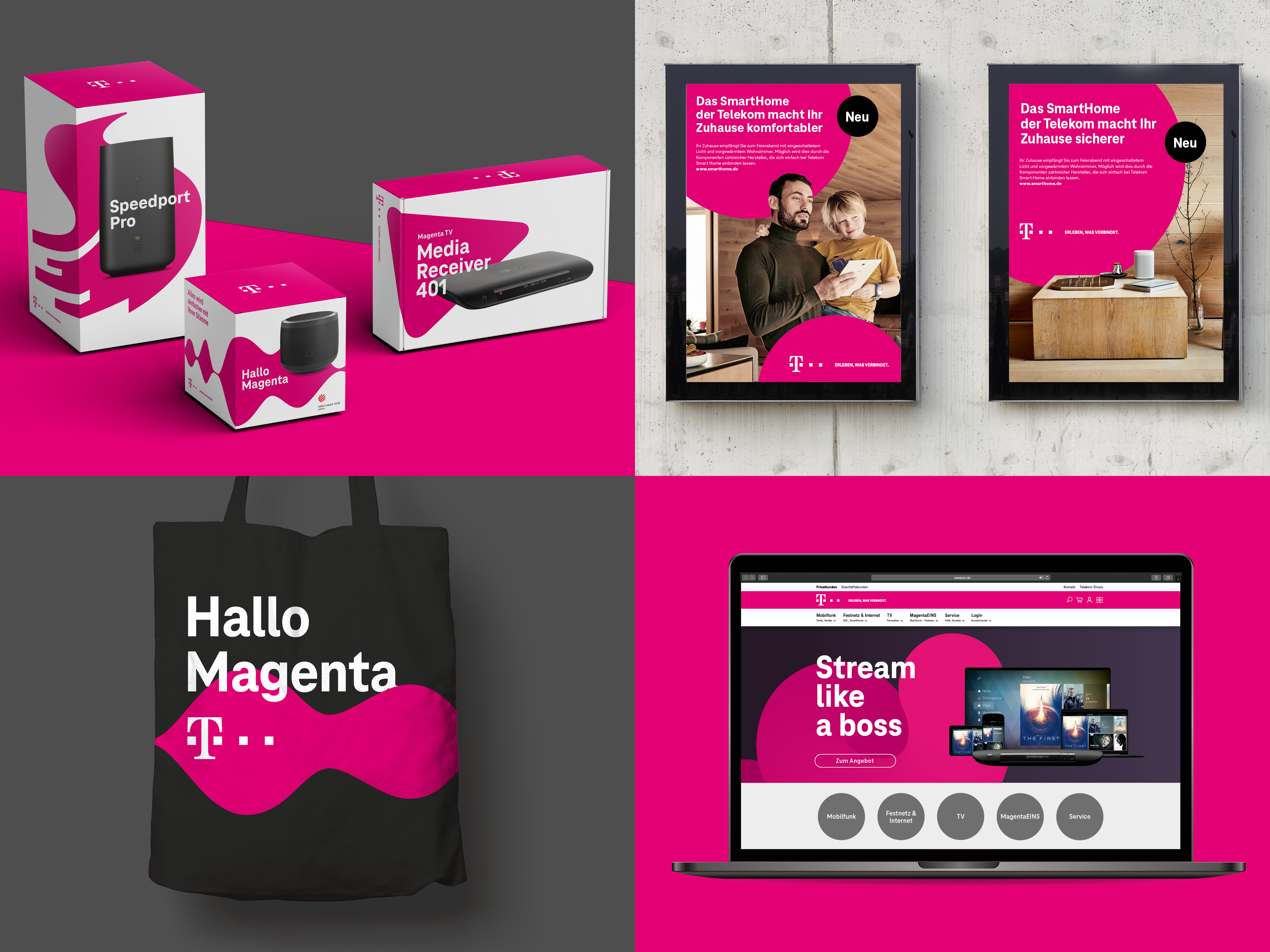
The Future Is Liquid — With Liquid Brand Design, Deutsche Telekom is taking the next big step in the consistent advancement of the brand. Flexible, lively, and future-oriented—the new design strengthens the core elements of the brand and at the same time enables a new level of creativity. The color Magenta, the T logo, and the enhanced TeleNeo typeface are the visual constants in the brand's new design world. As strong and well-known brand elements, they will continue to ensure recognizability in the future. The new brand identity was developed in collaboration with MetaDesign Düsseldorf and is currently being rolled out in all Telekom markets.
Date of Launch
2020
Development Time
13 - 24 months
Target Regions
Europe, North America
Target Groups
Consumer / User, Trade / Industry, Public Sector Government, Other target groups: National/international business clients