
LKP Architecture
Corporate Identity
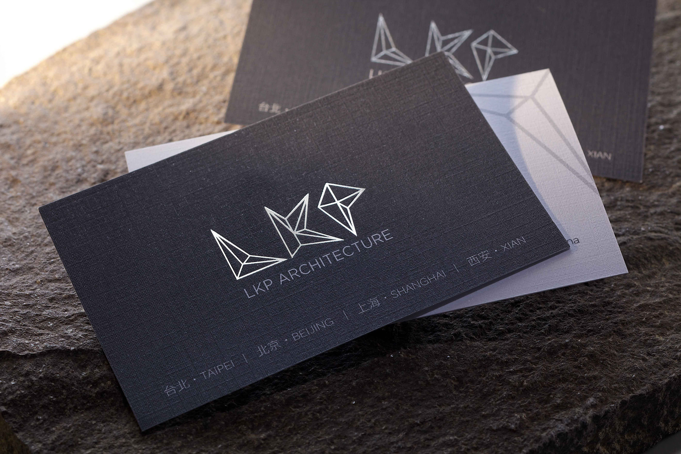
LKP Architecture's CI design uses the concept of the evolution of organisms. It utilizes geometry and aerial perspective to create its brand. Its abbreviation "LKP" takes the form of shapes, interlinking words with shapes. The points, lines and faces of the three English alphabets construct a 3D visual image to demonstrate movements of continual progression and evolution of organisms. It is just like how LKP evolves with the times, surpassing its old self to pursue creativity and changes. The green coned shaped figures are constructed by elements of triangle to represent the basics of measurements and mathematics.
Date of Launch
2016
Development Time
up to 12 months
Target Regions
Asia
Target Groups
Trade / Industry