


Lugano Region
Region branding
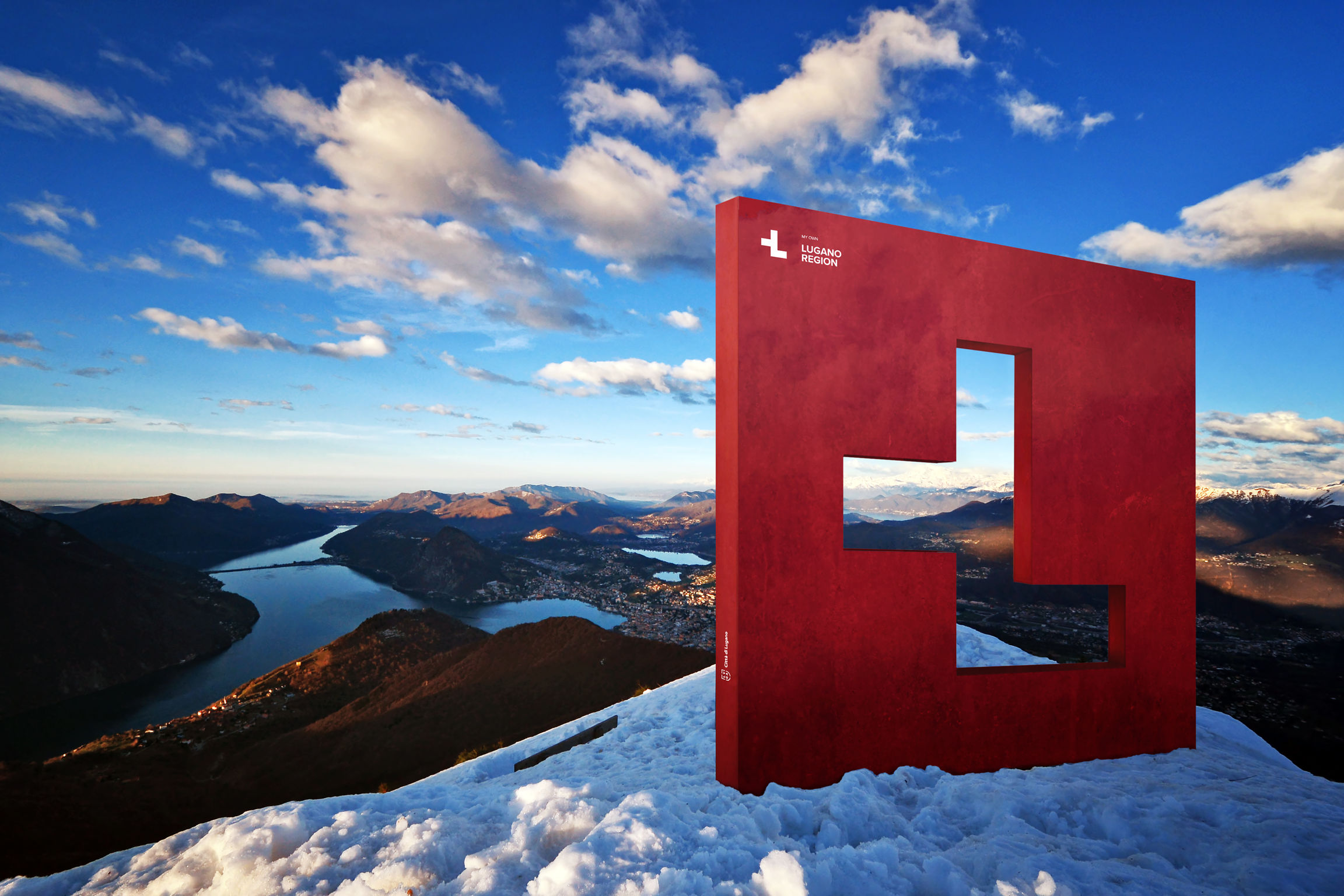
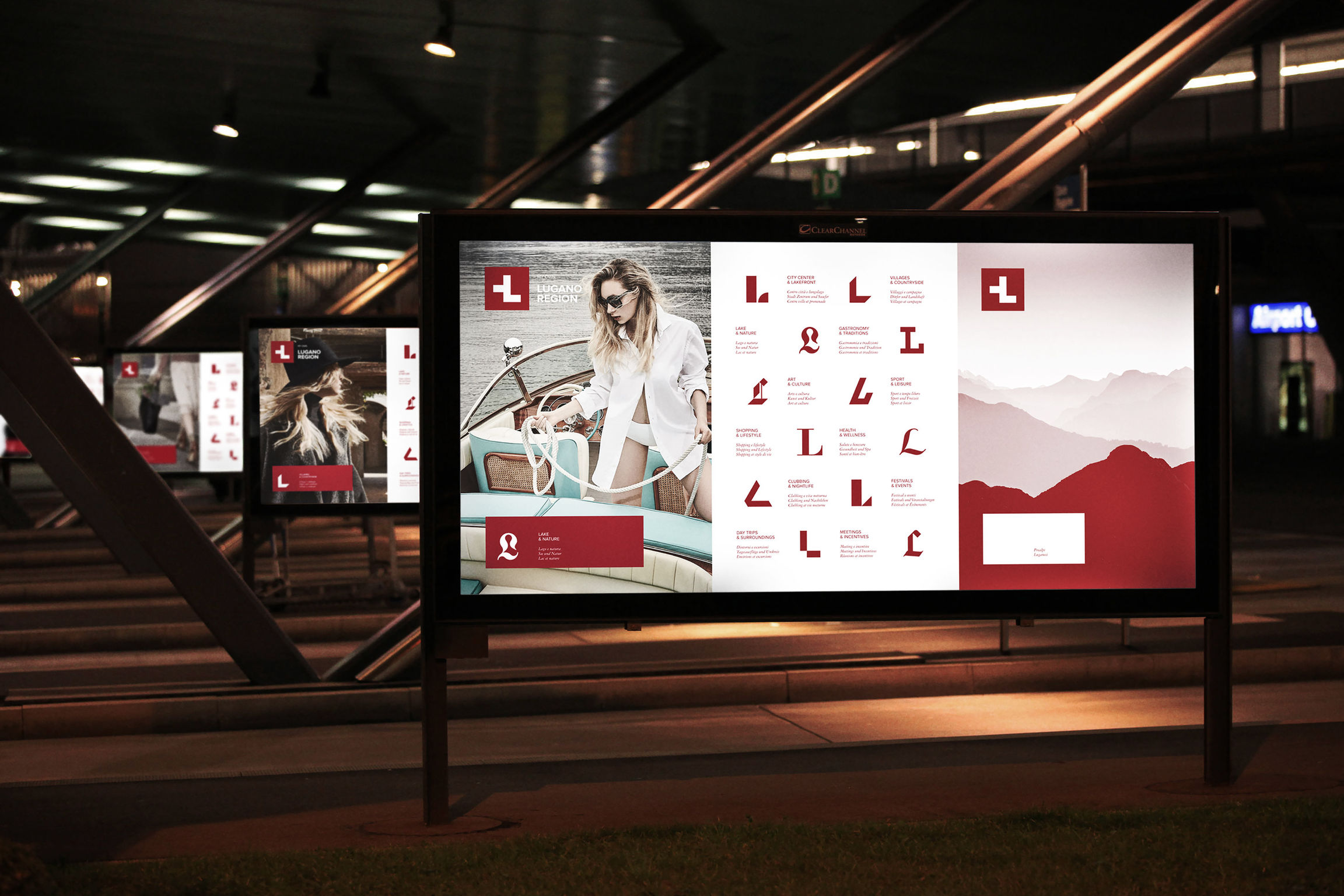
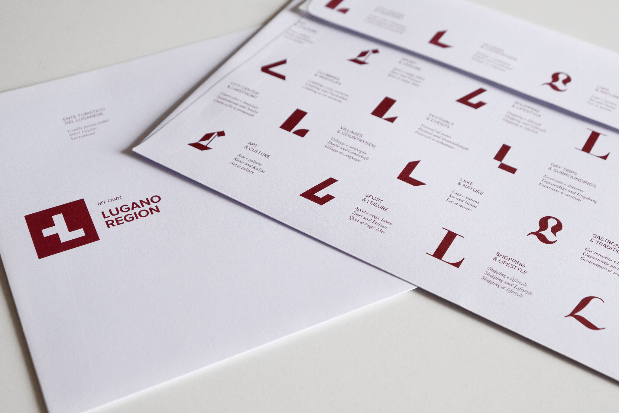
The Lugano Region, situated in the very south of Switzerland, wanted to update its branding. The area is a very atypical destination in Switzerland, boasting palm trees, olive oil, Mediterranean cuisine and weather, but all in the safe, quiet, efficient environment of Switzerland. The new branding sent the message that Lugano is "differently Swiss." As visual symbol of this theme, the Swiss flag's famous white cross was transformed into the letter "L" for Lugano. Designers also created a wide range of fonts for the letter "L" to represent the variety of activities offered by the region, each font in a unique style that matches the corresponding activity category.
Client / ManufacturerDesign
Ente Turistico del Luganese
Lugano, CHCaselli Strategic Design
Mendrisio, CHDate of Launch
2018
Development Time
13 - 24 months
Target Regions
Asia, Europe, North America
Target Groups
Consumer / User