


magique
Restaurant brand design
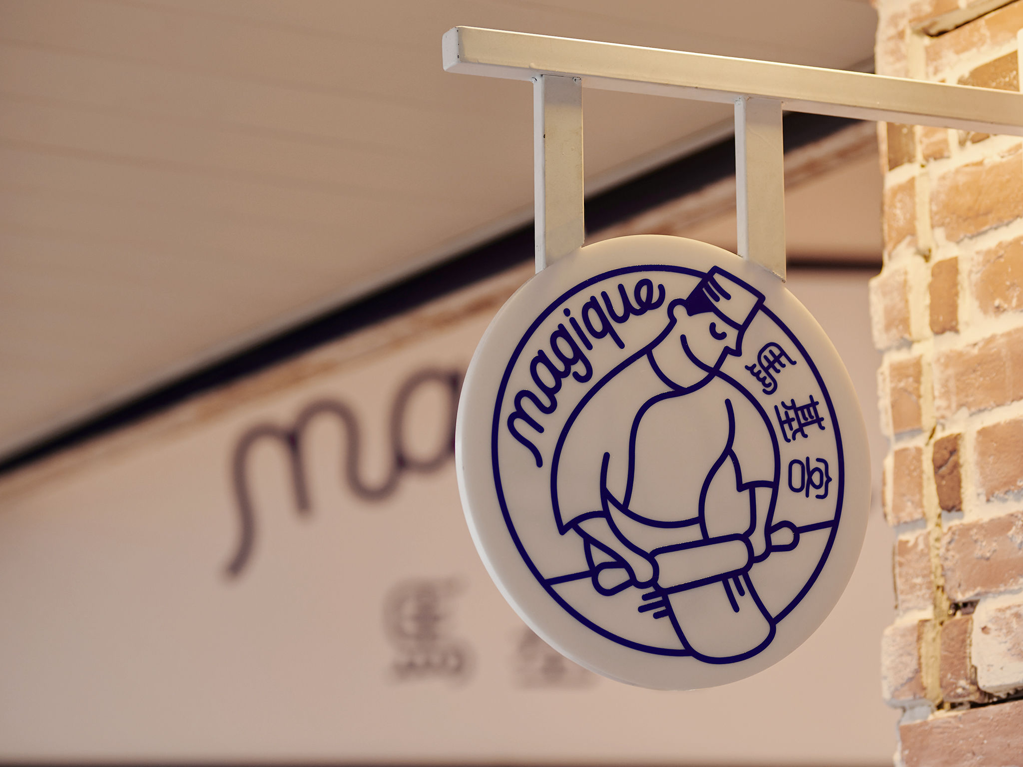
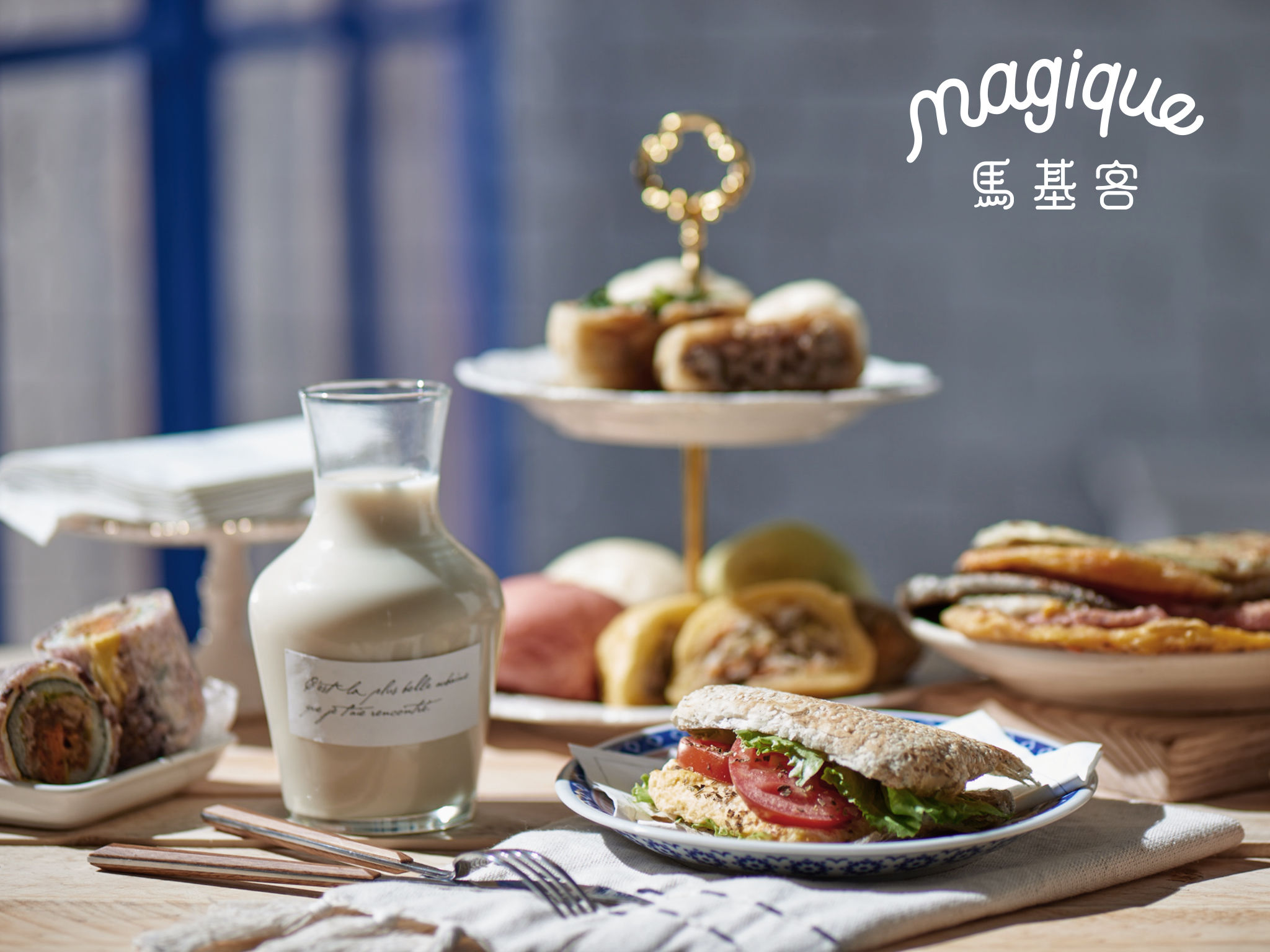
A fusion of Chinese breakfast and French cuisine – "magique" is a place where you will enjoy fresh and handcrafted breakfast and experience the slow food spirits. magique positions as "a master who twists the tastes with magic." The logo with a man making bread represents the tradition of handcrafting. The French and Chinese brand names are paralleled on left and right, which means the harmonic combination of two cultures. The iconic colors of French, deep blue, red and white, are applied into the brand design, too. Deep blue is chosen to be the major color and the interior is restored with red bricks and white walls.
Date of Launch
2016
Development Time
up to 12 months
Target Regions
Asia
Target Groups
Consumer / User