MAISON DE MARIANNE
Brand Identity
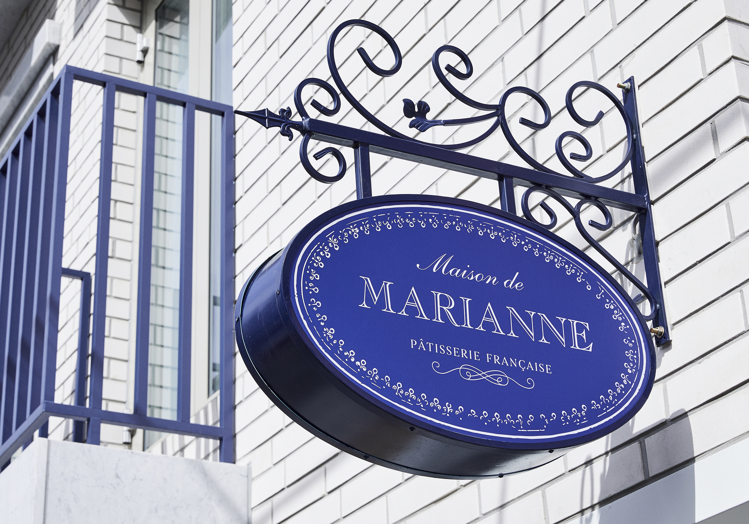
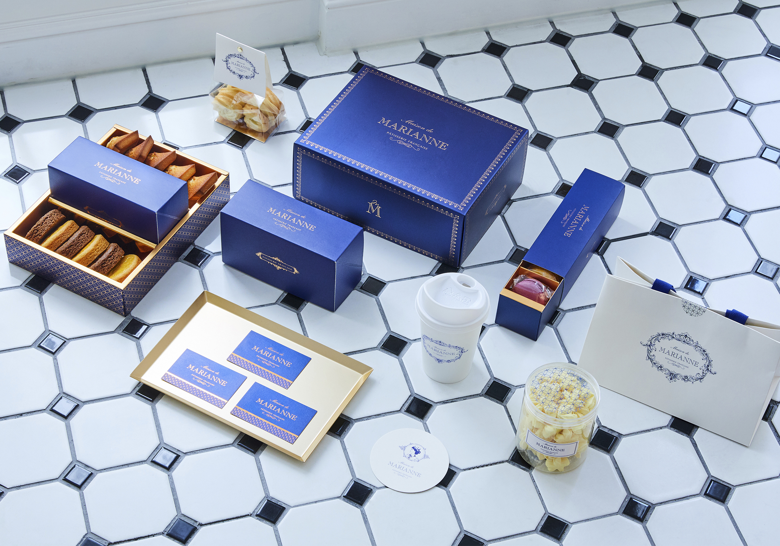
This brand concept was expressed with classic and elegant decorations of the French court, an elaborated font and color system including royal blue as the primary color. In addition, logo, symbol, tagline, and emblem were created for use in dessert packaging in various ways. YNL DESIGN has built a total brand system for Maison de Marianne by not only creating a brand identity, but also providing proposals for application, packaging, illustration, and photo shooting style.
Date of Launch
2019
Development Time
up to 12 months
Target Regions
Asia
Target Groups
Consumer / User