Mercado Da Boca
Signage and typography
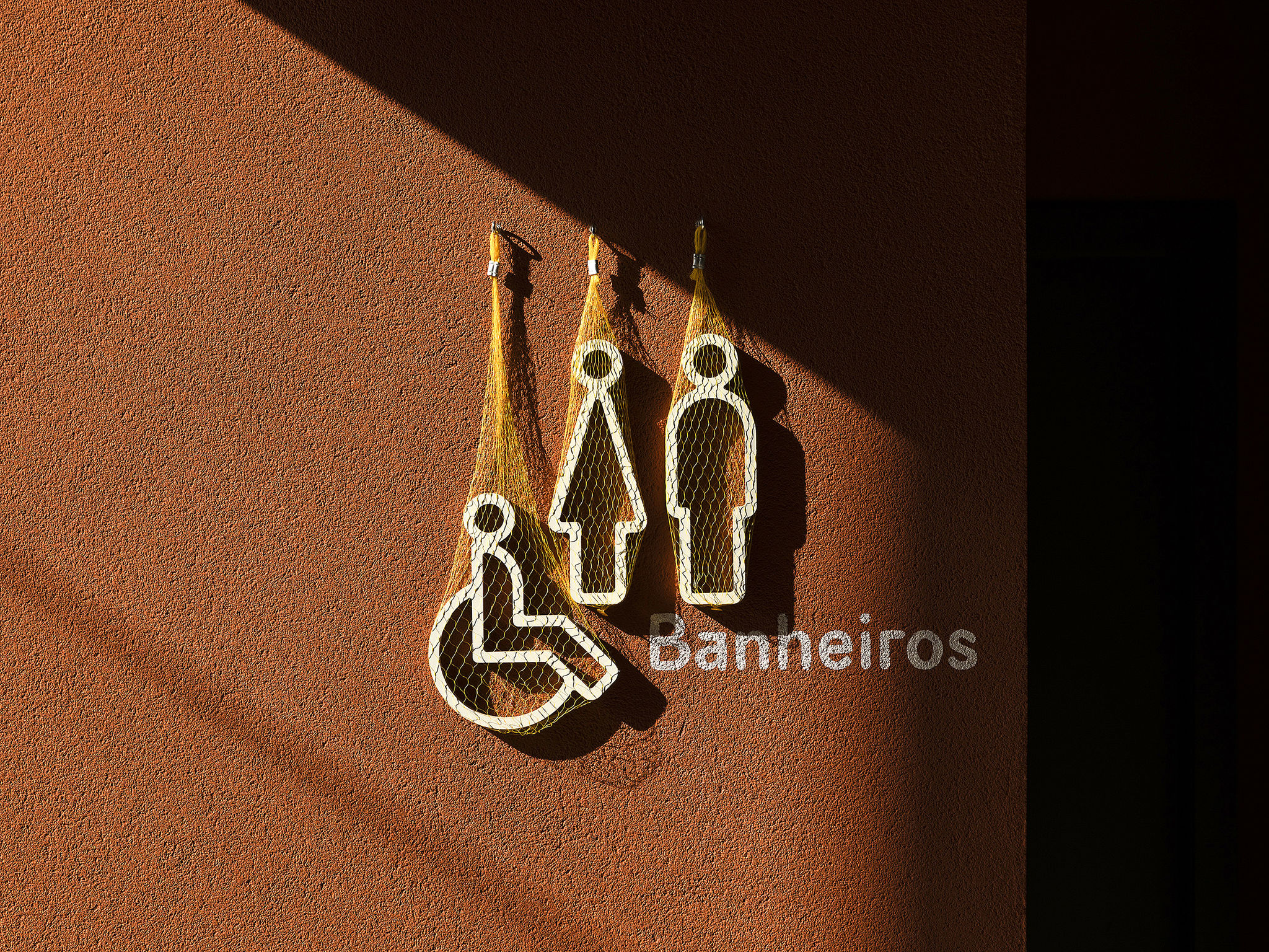
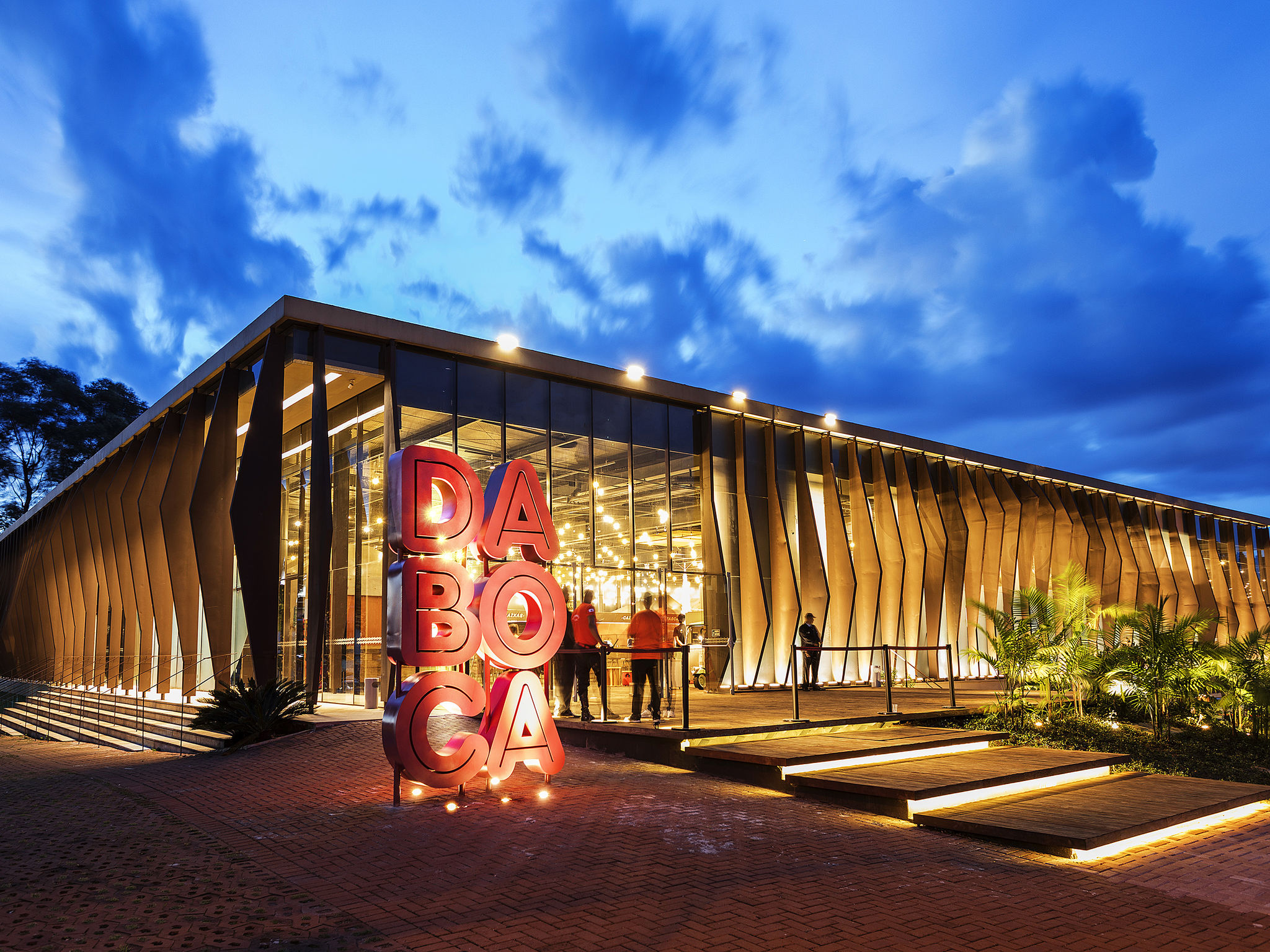
Mercado da Boca (Market of the Mouth) is a local Brazilian Food Market. Its new logo places the D and B initials side-by-side to form a mouth, the symbol of the market. The logo stands for an open space conducive to conversation, smiling faces, and trying new tastes and foods. The warm and earthy color pallet underscores this welcoming atmosphere and is also a nod to the color of the earth and soil. The typography used in the project has a super-extensive family that allows flexibility in how the brand's signage is used in its contact points. Fruit nets, very common at Brazilian street markets, are used to suspend small informational signs and pictograms.
Date of Launch
2018
Development Time
up to 12 months
Target Regions
South America
Target Groups
Consumer / User