
Metropolitan
Book
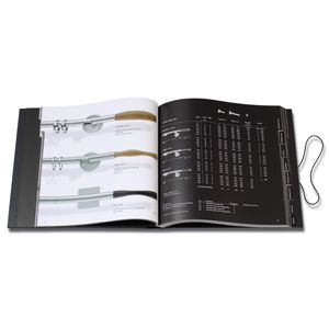
JAB Anstoetz KGThe typography of this METROPOLITAN system collections book harmonises with the companys products, speaking the same clear language. The font is succinct and linear, and is relaxingly readable even in tables and reverse type. The overall impression is one of elegant lightness and effortless transparency.
