MOVANUM
Corporate Design, logo
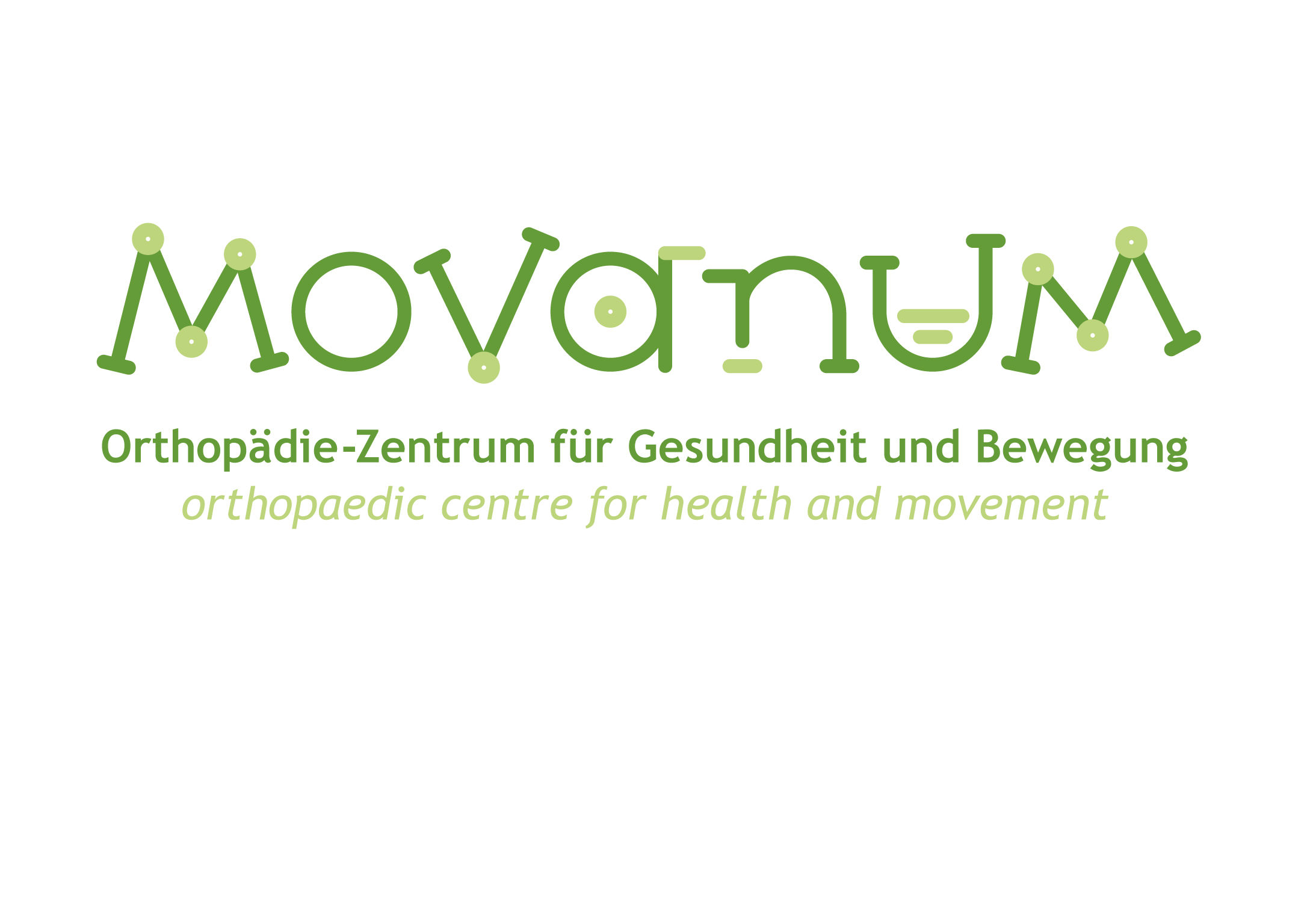
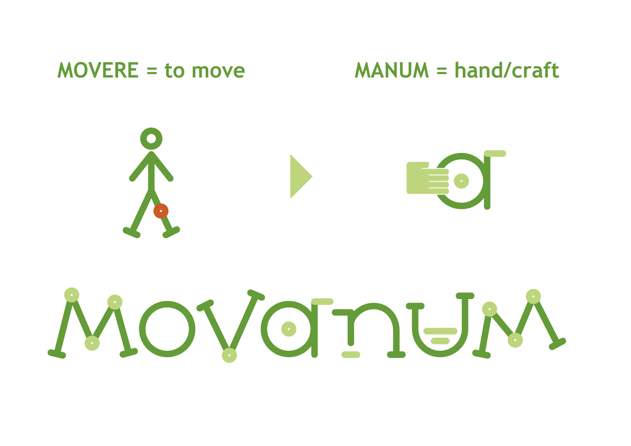
MOVANUM is an orthopedic center which provides treatments for people suffering from restrictions in movement. The name MOVANUM consists of the Latin words "movere" and "manum." "Movere" stands for movement and agility. "Manum" means the helping hand which supports the healing of patients through the use of customized prostheses. This non-intimidating logo design aims at taking the patients’ fears away and encourages them to seek the necessary help following a serious operation. It should provide patients with renewed courage to face life once again. The color green symbolizes hope for a healthy future intended for more freedom of movement.
Client / ManufacturerDesign
MOVANUM Inh. Daniel Fust
Beckum, DErussigdesign GmbH & Co. KG Werbeagentur und Fotostudio
Beckum, DEDate of Launch
2014
Development Time
up to 12 months
Target Regions
Europe, "Deutschland / NRW / Kreis Warendorf"
Target Groups
Consumer / User