MyLOTTE Typeface Design
Typeface design
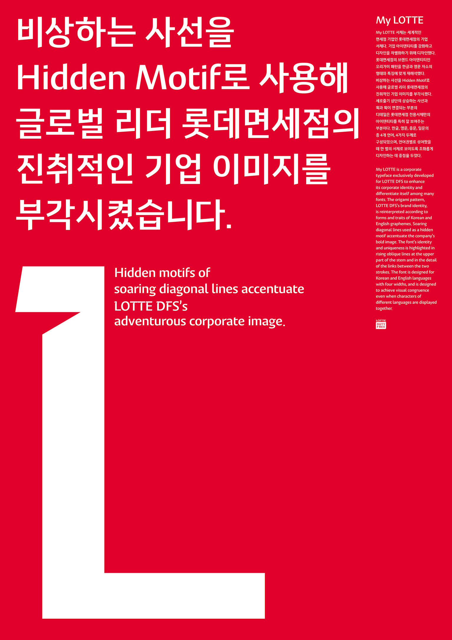
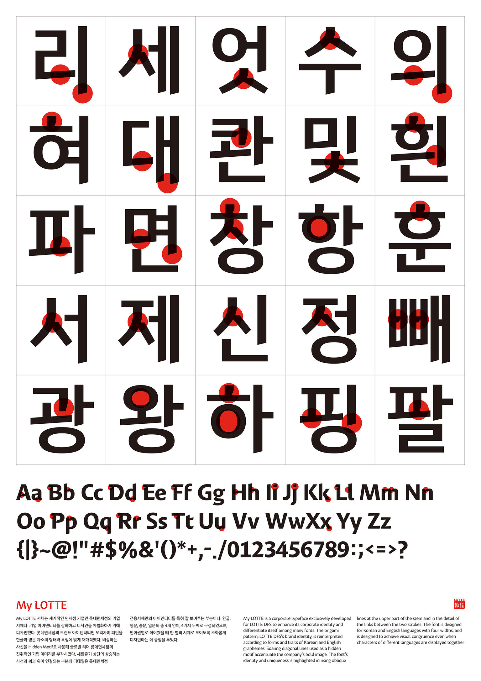
MyLOTTE is a corporate typeface developed for LOTTE DFS to enhance its corporate identity and differentiate itself. The origami pattern, part of LOTTE DFS’s brand identity, is reinterpreted according to the forms and traits of Korean and English graphemes. Soaring diagonal lines used as a hidden motif accentuate the company’s bold image. The font’s identity and uniqueness is highlighted in rising oblique lines at the upper part of the stem and in the detail of the links between the two strokes. It is designed for use in the Korean and English languages with four widths to achieve visual congruence, even when characters of different languages are displayed together.
Client / ManufacturerDesign
LOTTE DUTY FREE
Seoul, KRTotal Impact English Typeface Design
Seoul, KRYoondesign Group Korean Typeface Design & Poster Design
Seoul, KRLOTTE DUTY FREE Design part
Seoul, KRDaehong Communications
Seoul, KRDate of Launch
2017
Development Time
up to 12 months
Target Regions
Africa, Asia, Australia/Oceania, Europe, North America, South America
Target Groups
Consumer / User, Specific sub-group: People who visit LOTTE DUTY FREE STORE