

National Peking Opera
Logo design
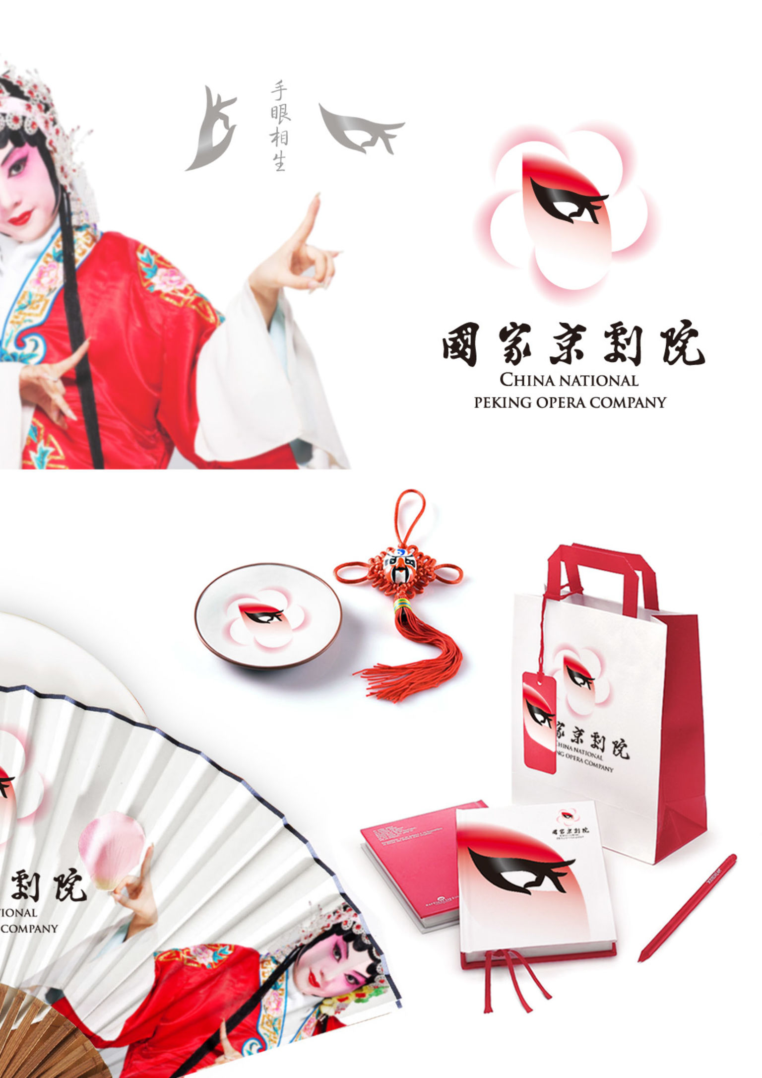
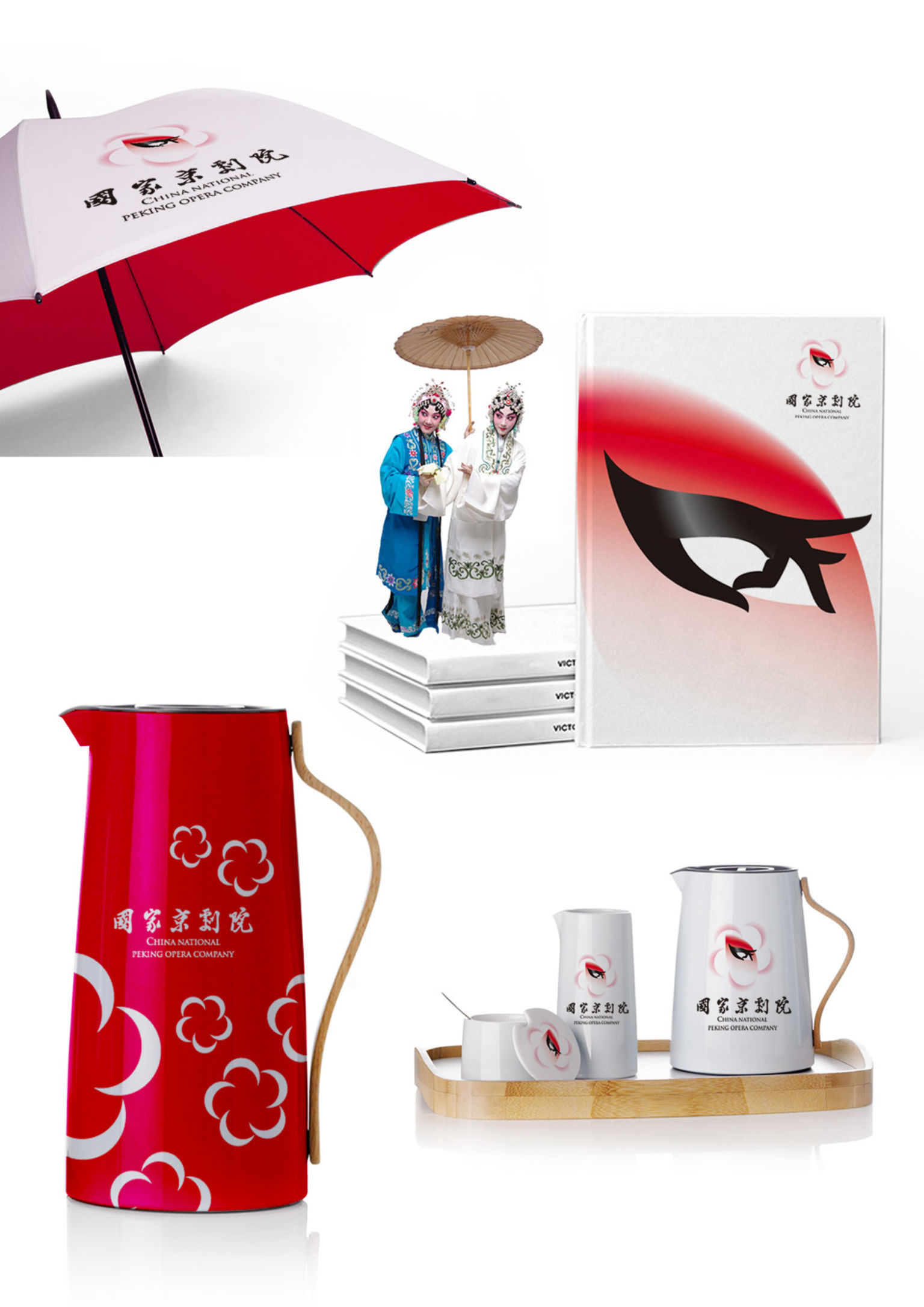
Zhengbang Creative (Beijing) Branding Technology Co., Ltd.Explanation of the Logo (National Peking Opera): the logo is the gesture of pressing fingers together; it is also the eye of a female performer. This concept expresses the concept of Peking Opera – gestures and eyes are complementary to each other. The logo is based on the feature of the eye in the face of “Dan” (Dan means the female actor). The designer uses the method of artistic exaggeration letting the logo position between similar and dissimilar to express the spirits of the Chinese beauty and the Chinese traditional virtues.
