


New Brand LATAM
Brand Identity
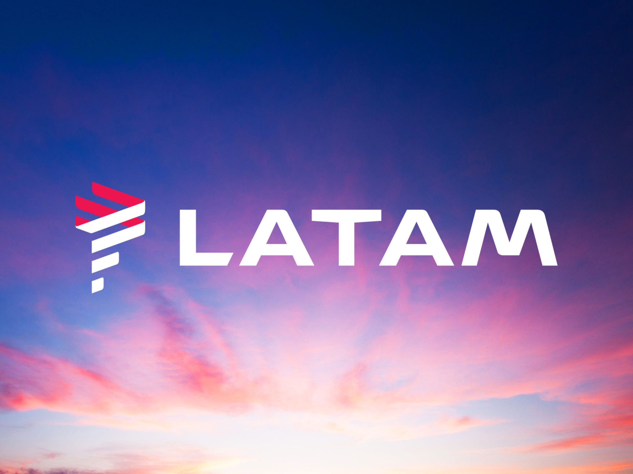
TAM and LAN joined forces and decided to build a new brand. We drew the strategy and identity to connect the best of this two major airlines. The new logo is inspired by the region’s geography. Lines represent the movement from Latin America to the world. Symbol and typography combine straight and rounded corners bringing a sense of efficiency and proximity. An intersection of red and blue – TAM and LAN colors – the Indigo color symbolizes efficiency and elegance. The coral represents passion and care. Praised from market and media, the new identity respects the company's legacies and illustrates the first Latin American global brand.
Date of Launch
2015
Development Time
"2 years"
Target Regions
South America
Target Groups
Consumer / User, Trade / Industry, Public Sector / Government, Supliers, Journalists, "Employes: all brand's stakeholders are considered for this project."