
NHN Rebrand
Rebrand
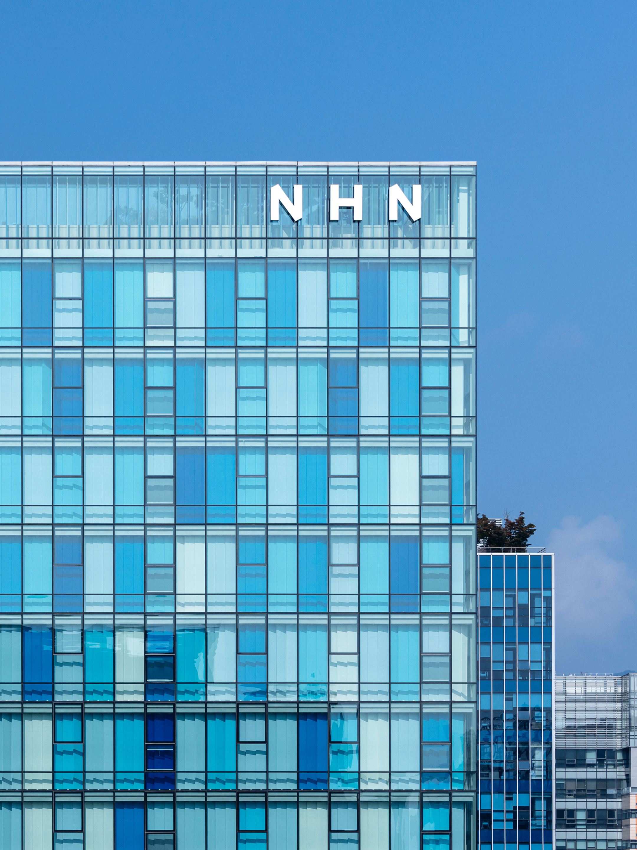
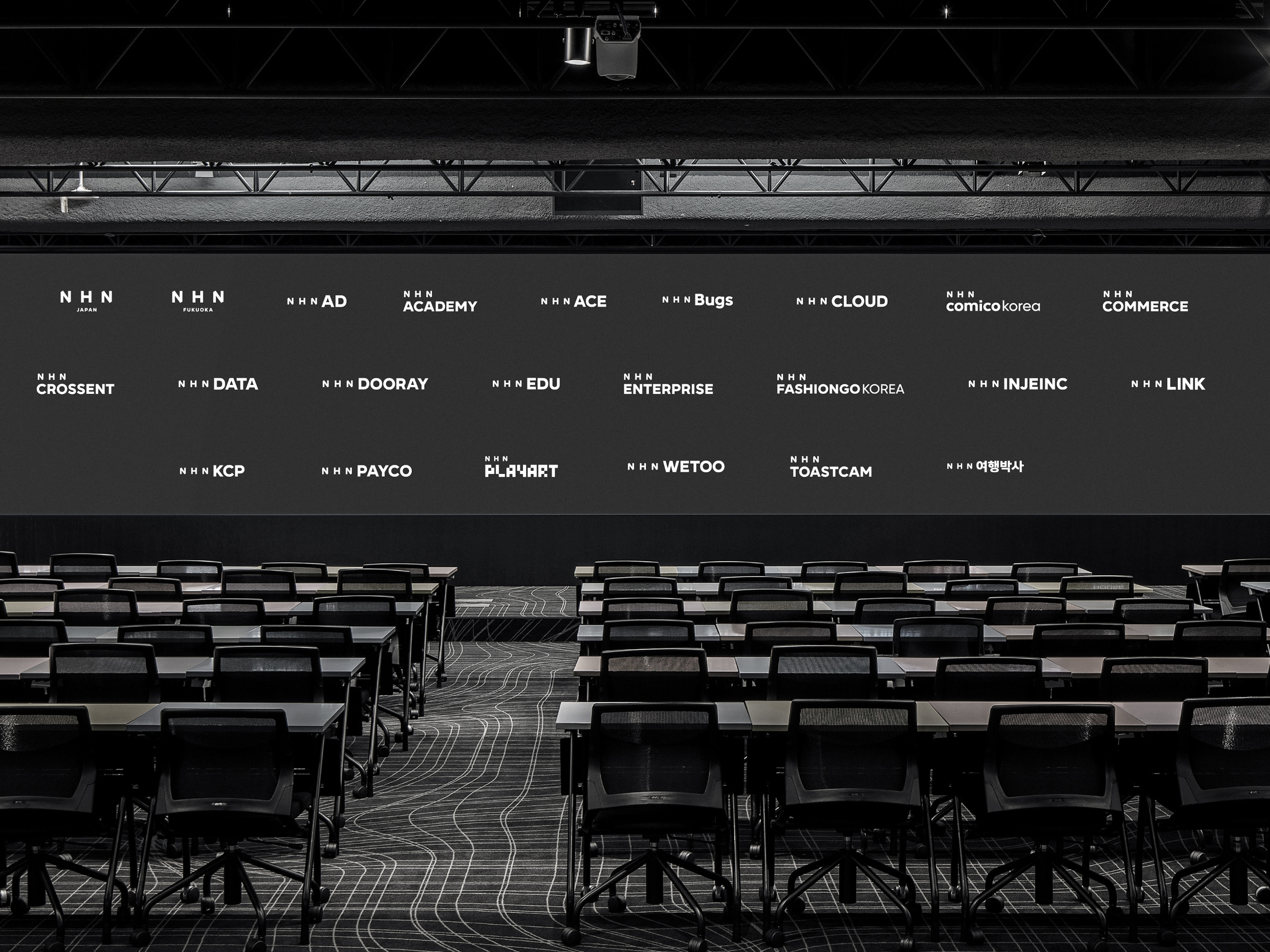
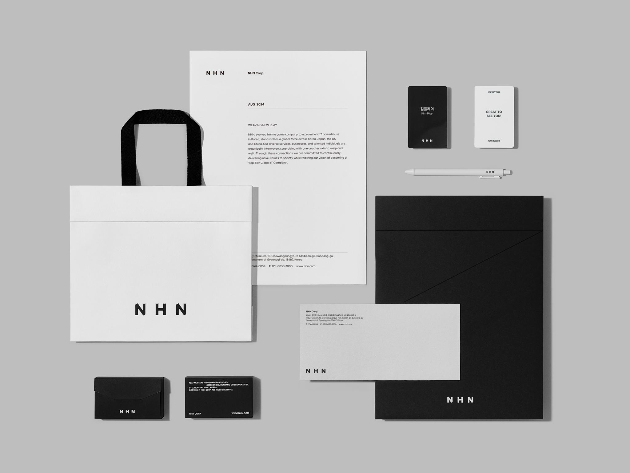
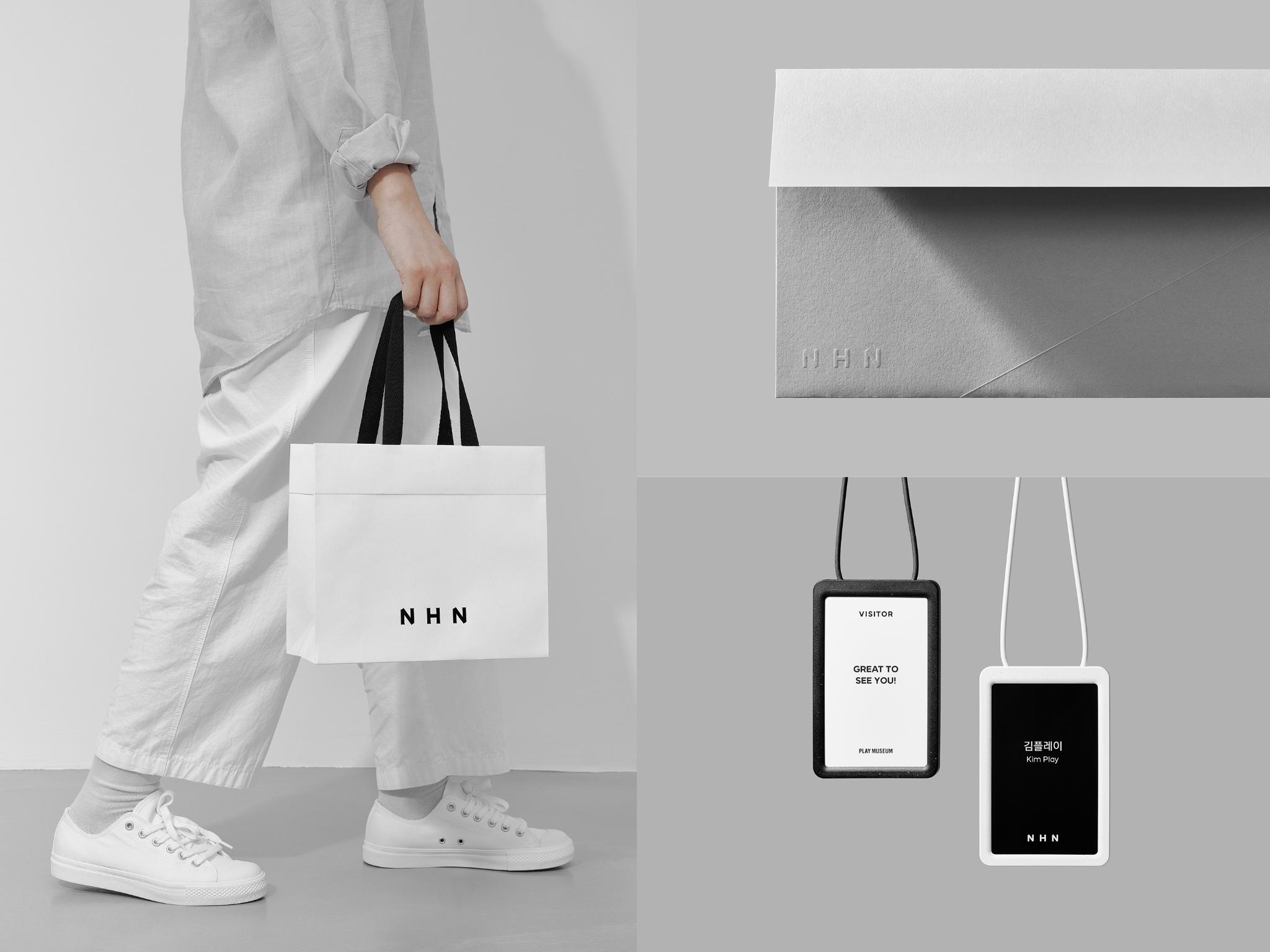
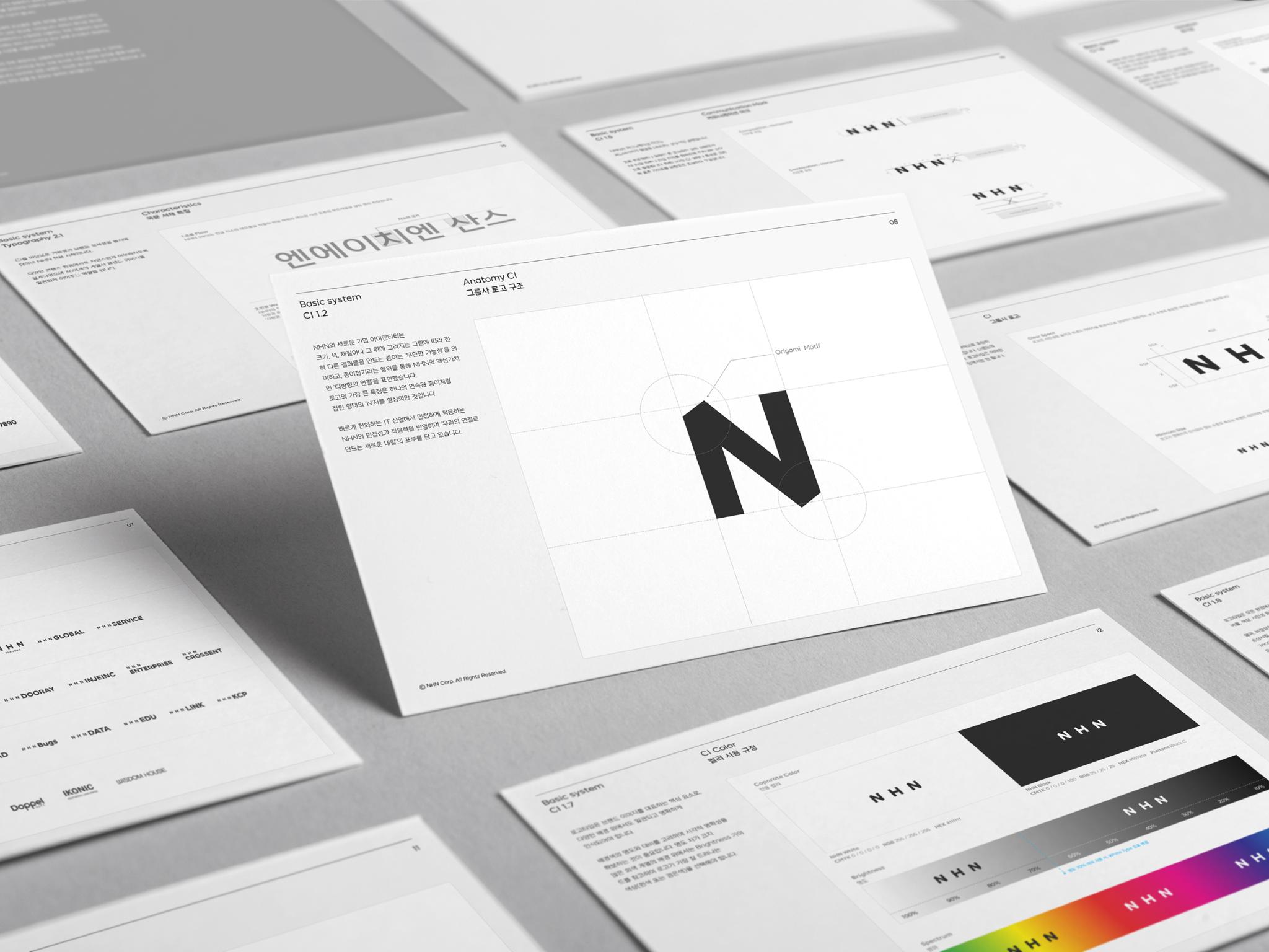
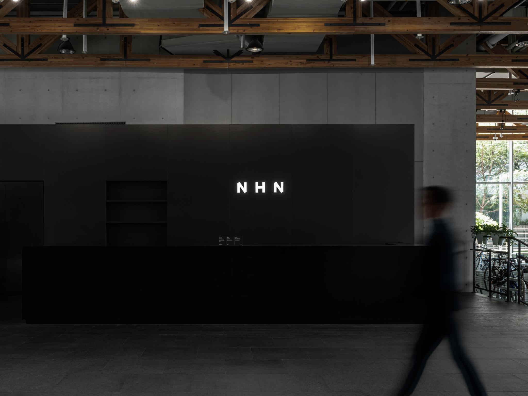
To break away from conventional IT branding, NHN collaborated with Kenya Hara to create a visual identity inspired by origami—symbolizing connectivity, scalability, and creativity. The new folded ‘N’ logo, monochrome palette, and NHN Sans typeface together form a unified yet flexible system that aligns over 36 subsidiaries under one brand. This rebranding is not just visual—it enhances internal cohesion, operational efficiency, and brand recognition, positioning NHN as a future-ready global IT leader with a thoughtful, distinctive identity.
Client / Manufacturer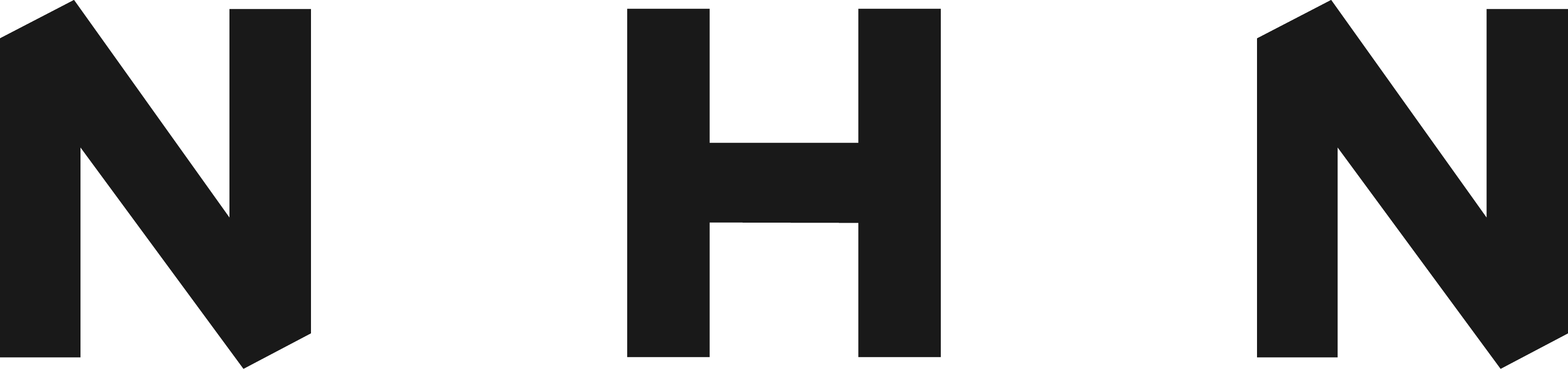 Design
NHN Corp.
Seongnam-si, Gyeonggi-do, KRNHN Corp.
Seongnam-si, Gyeonggi-do, KRHa Jaeyun, Lee Youngsun, Jung DaheeNippon Design Center, Inc.
Tokyo, JPKenya Hara, Tomoko Nishi, Yongqiang DaiDate of Launch
2024
Target Regions
Asia, North America
Target Groups
Consumers / Users, Trade / Industry, Public Sector / Government