

OOA®
Visual identity
Guangzhou OOBiotechnology Co., Ltd.
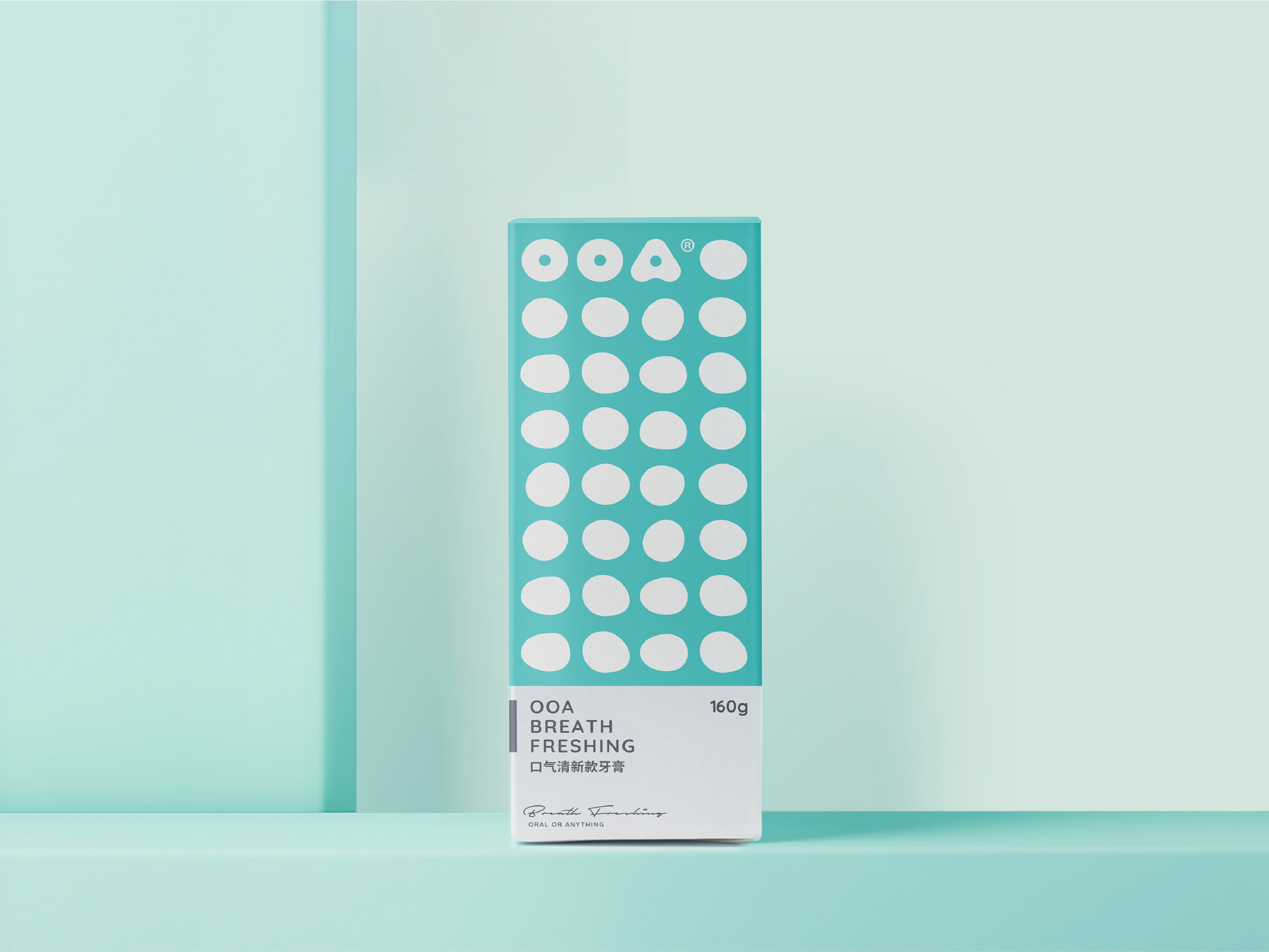
OOA is an oral care brand meaning “Oral Or Anything”. The graphic design is inspired by everyday life: While performing daily hygiene, a mirror, a drop of water, or even a bubble of foam can be regarded as a simple circle. Moreover, the combination of drops of water can turn into a sea, and the accumulation and reorganization of anything can unleash great power. Therefore, starting from the “O”, a series of irregular circles are extended with the basic graphic circle and applied to the product design. The comprehensive use of the circle of the logo and auxiliary graphics creates a unified visual language for the brand.
Client / ManufacturerDesign
Guangzhou OOBiotechnology Co., Ltd.
Guangzhou, CNTHE END DESIGN®
Guangzhou, CNDate of Launch
2019
Development Time
13 - 24 months
Target Regions
Asia, Specific country/region: China
Target Groups
Consumer / User