

P+
Commercial interior design
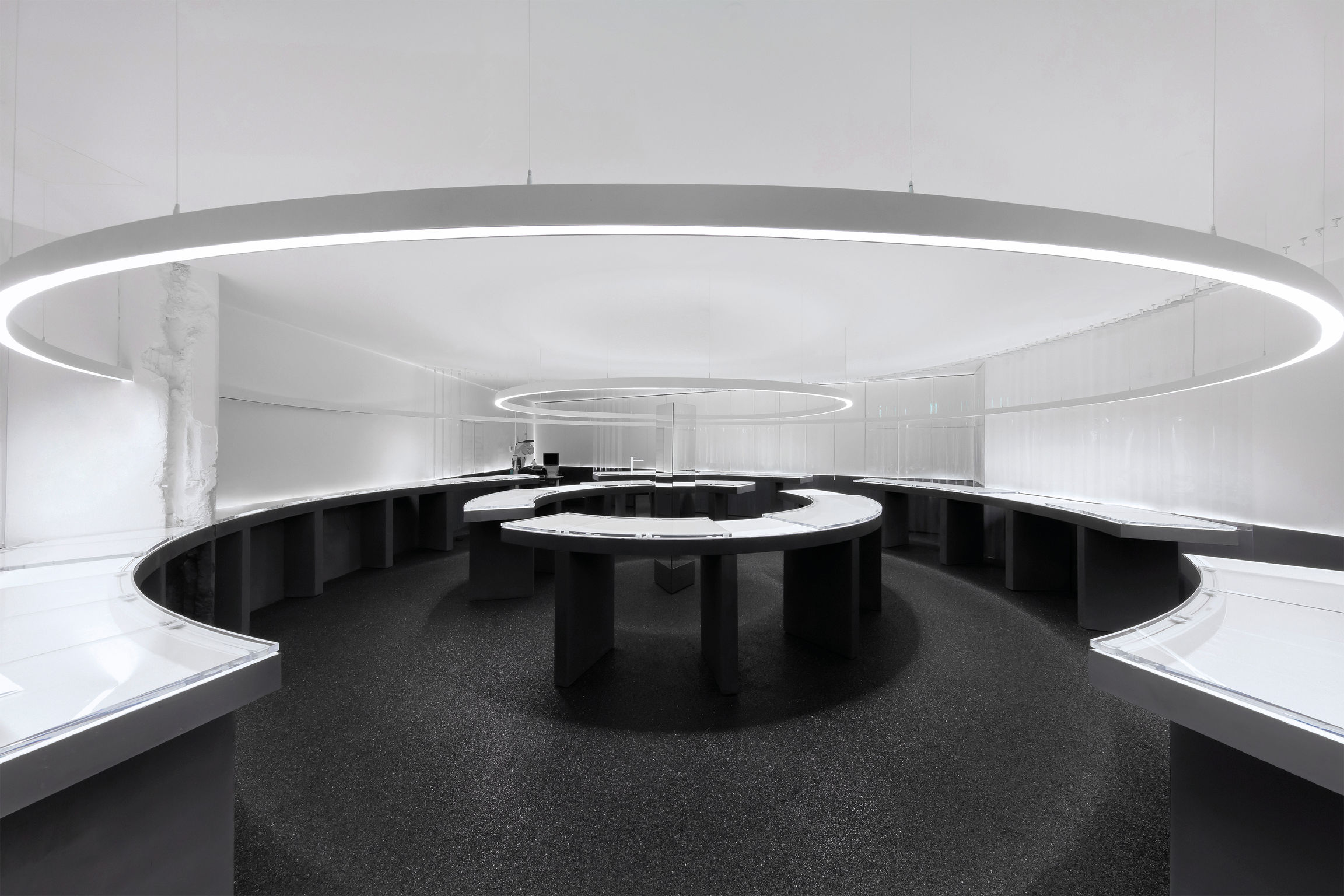
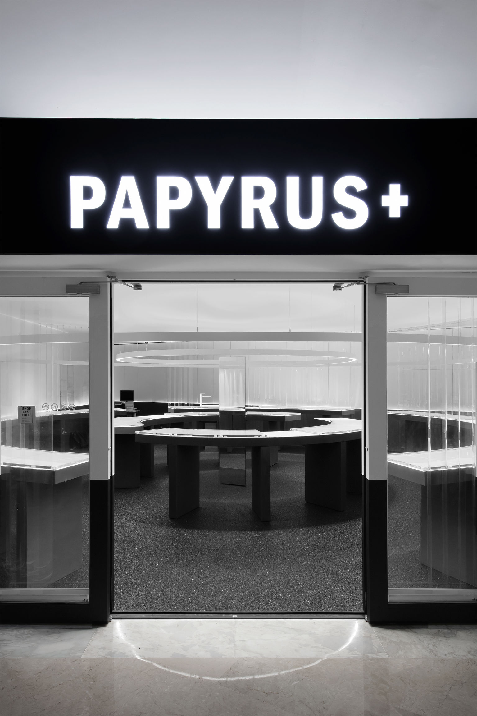
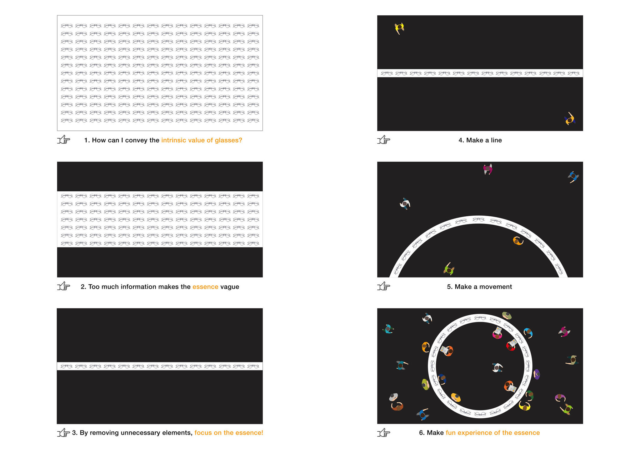
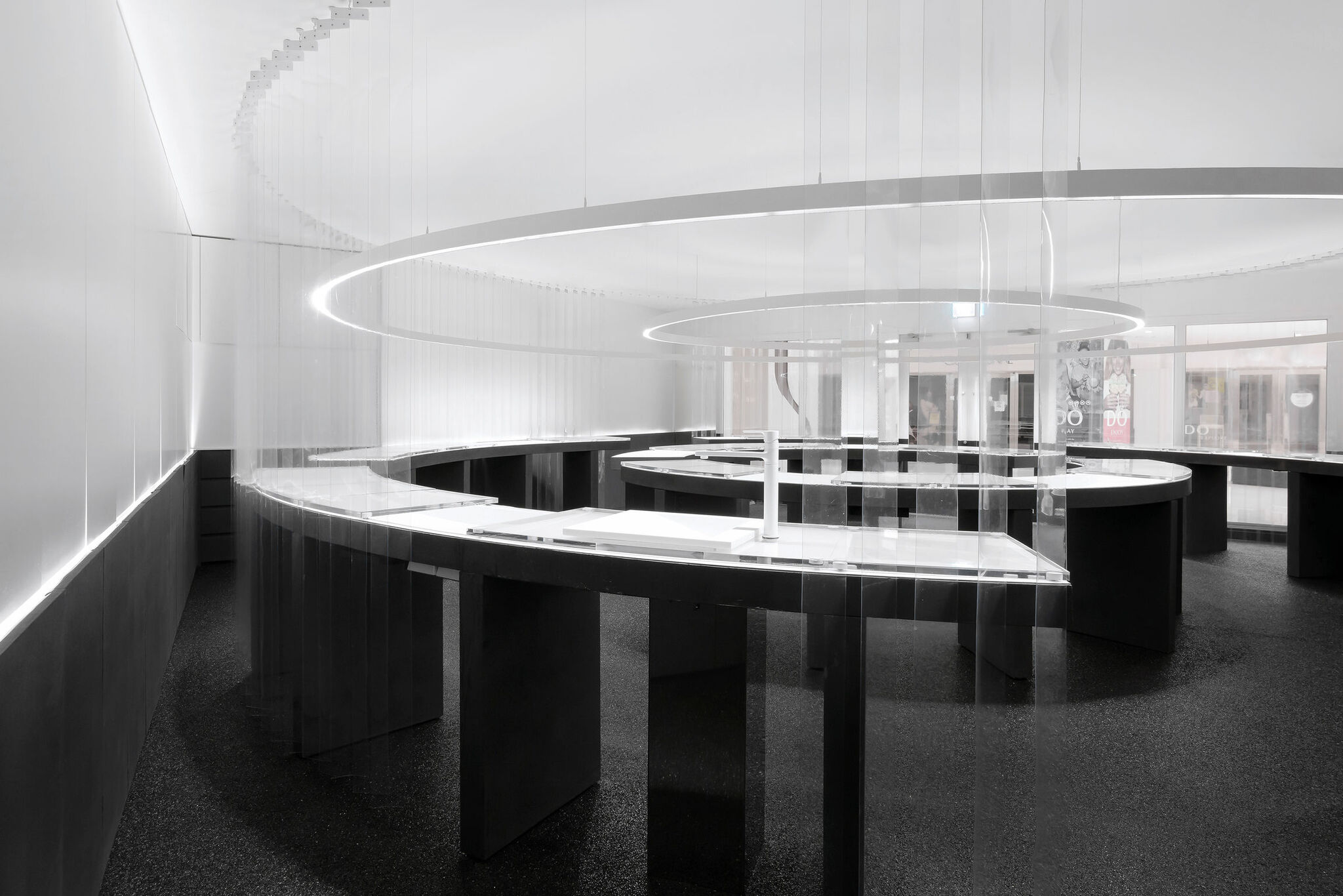
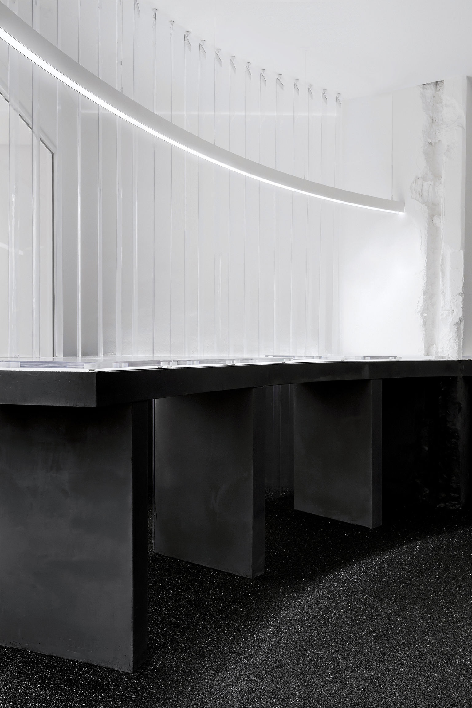
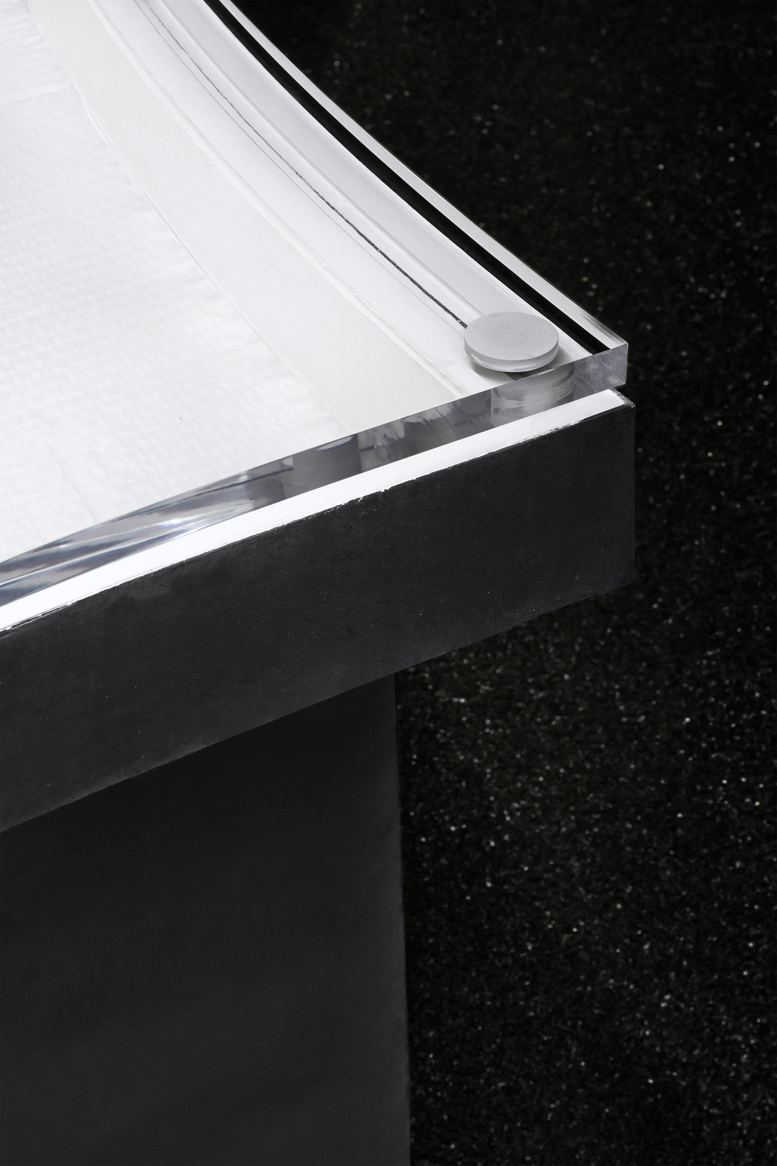
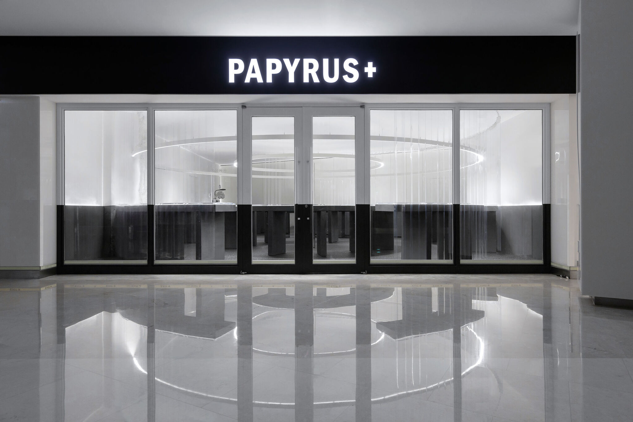
PAPYRUS+This store was designed for PAPYRUS, the leading eyewear company of Korea. For the new P+ concept store, they developed a concept called 'p+ swag' designed to communicate with and appeal to millennials. The core concept is 'fun minimalism'; 'fun' being an intriguing experience for the customer, and 'minimalism' being an exposition of only the essence of eyewear. The two overlapping ring tables exclusively focus on eyewear and the consultation experience. This arouses curiosity for those passing by. In addition, the assembly process of the eyewear is visible, providing an interesting and fun experience to the customers.
Date of Launch
2017
Development Time
other period: 1-2 MONTHS
Target Regions
Asia
Target Groups
Consumer / User
