Qinghai-Tibet LOGO
Logo
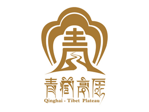
The Chinese character 青 (pinyin: [Qīng]; meaning green / blue) forms the basis of this creation, using the most direct way to express the geographical characteristics of Qinghai and the concept of the Qinghai-Tibet culture. The whole logos stable structure reviews the corporate social mission from multiple angles and levels. By fully unfolding health, safety and sustainable development as the corporate development objectives, leading the company to use harmony as a guide, bringing benefits to people, producing truly green organic food as oneselfs lofty responsibility, it created Qinghais this worlds healthy food brand!
Client / ManufacturerDesign