Qingziyou
Brand identity
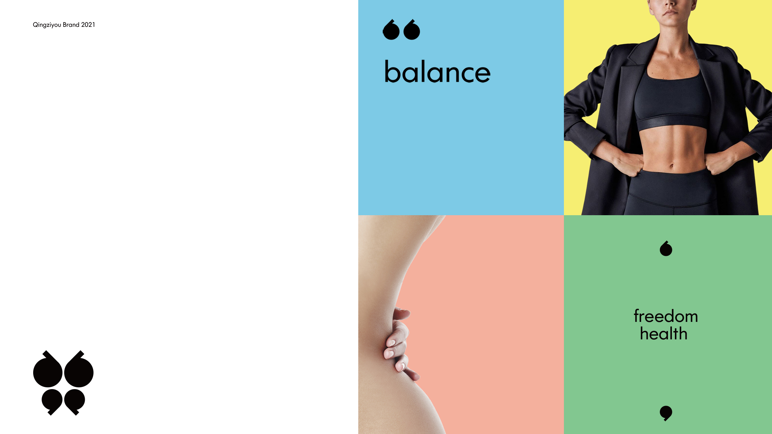
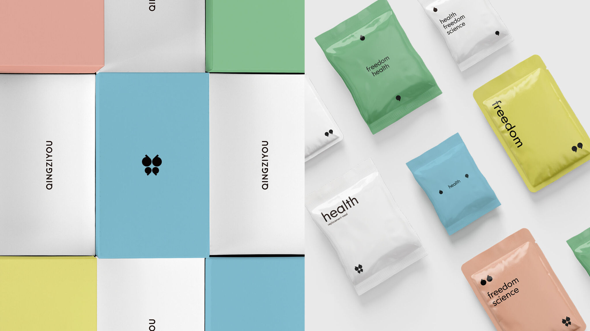
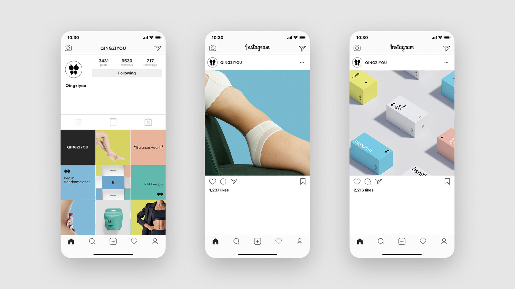
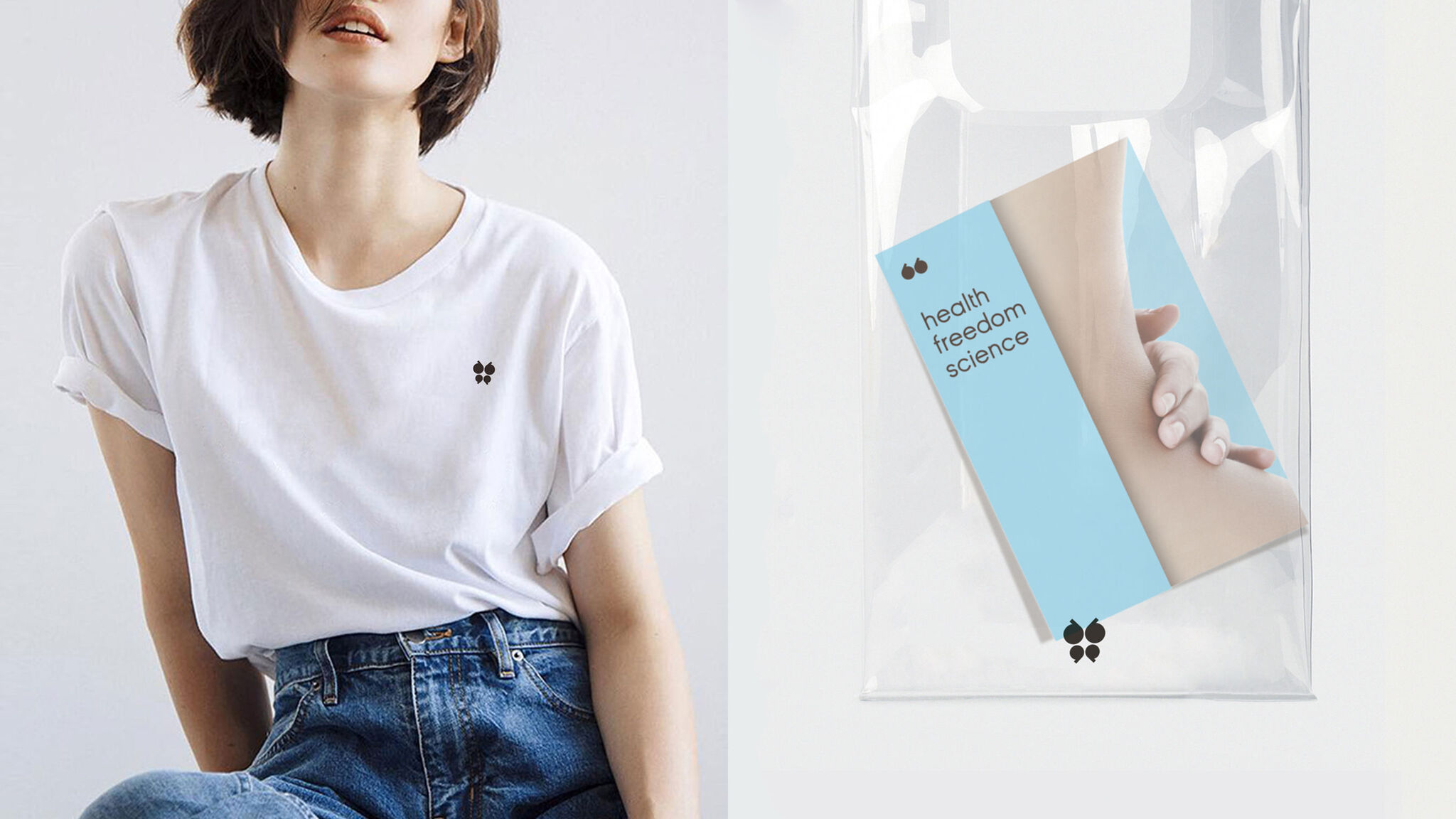
The core concept of the brand Qingziyou is good health. The logo's minimalist design language of a butterfly with its wings spread out and flying freely symbolizes beauty and freedom. Human creativity as a whole is that of axial symmetry, representing the value of gentle freedom or balance. Balance is a healthy and unburdened way of shaping an energetic mental state and a relaxed and free lifestyle. The negative shape (logo center) is like a cross star, bursting with dazzling light. The logo is cleverly composed of four-letter Qs in a nod to the brand name.
Client / ManufacturerDesign
Hunan Bitifu Trading Co., Ltd.
Changsha, CNDongdao Creative Branding Group
Beijing, CNDate of Launch
2021
Development Time
up to 12 months
Target Regions
Asia
Target Groups
Consumer / User, Trade / Industry