

Rebranding for Matthäi Group
Corporate identity redesign
MATTHÄI Bauunternehmen GmbH & Co.KG
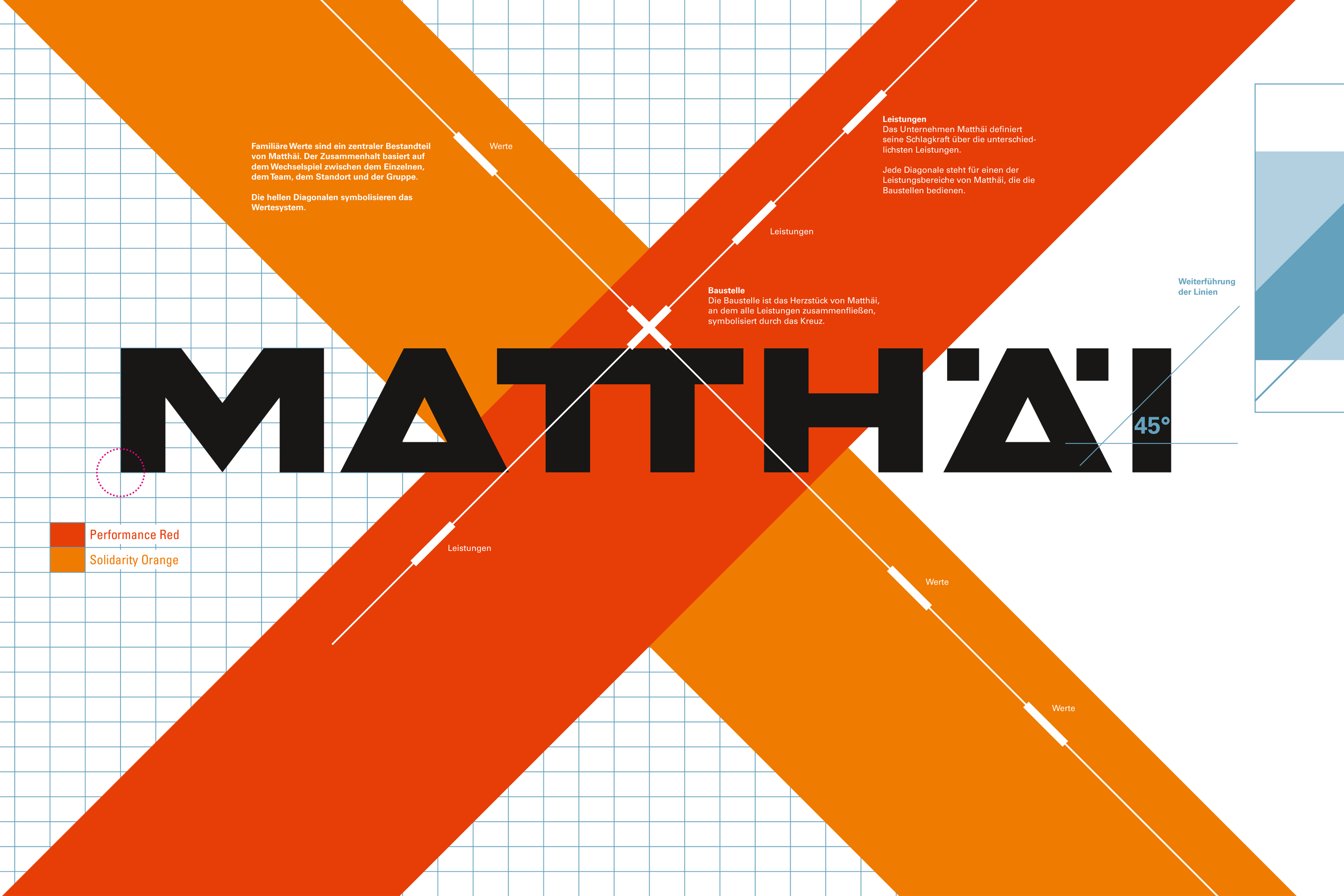
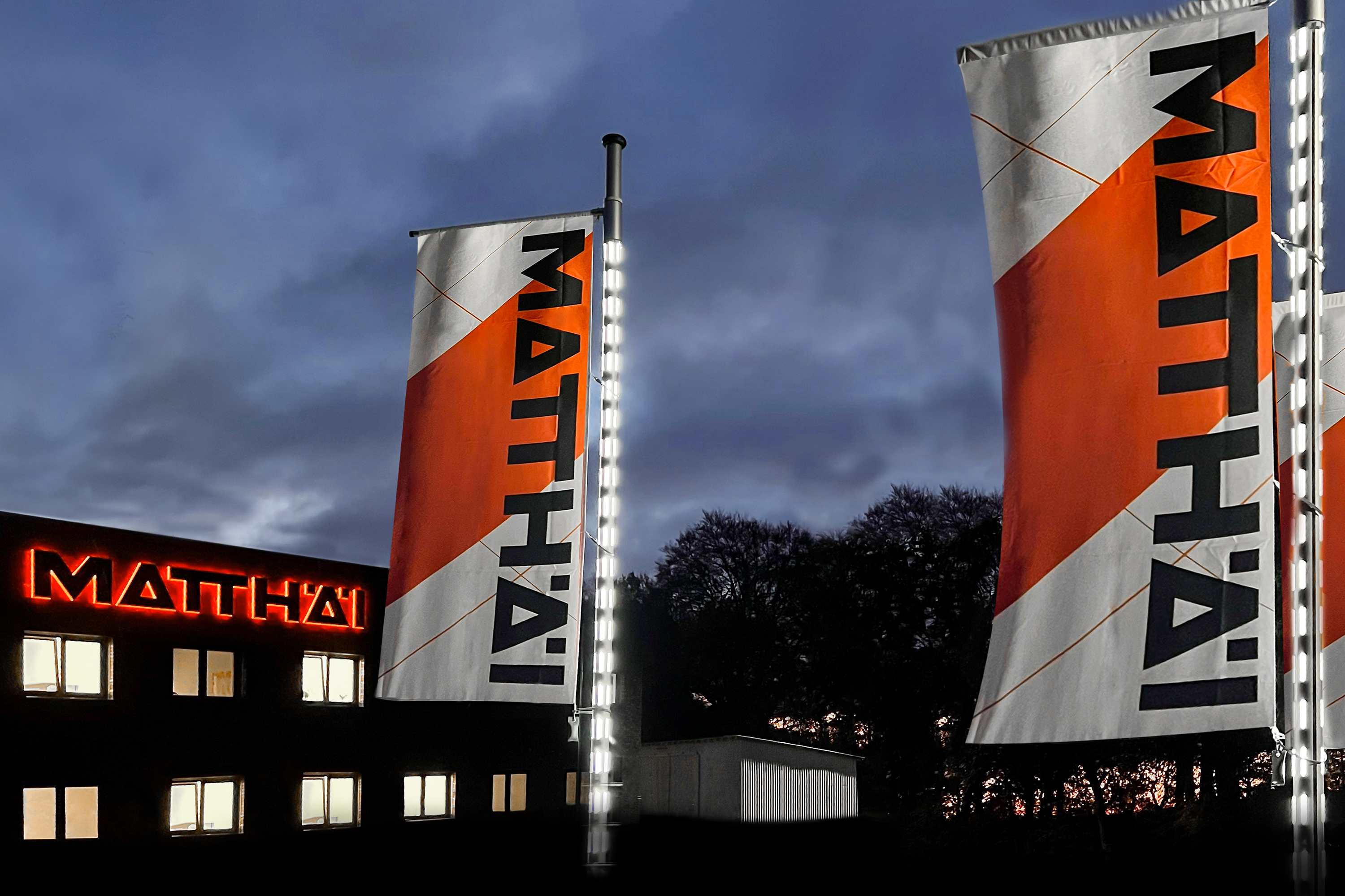
The redesign of Matthäi construction company's branding promotes the group's services in combination with its value of cohesion, openness, and trust. The company sees these two assets as the core drivers of the experience on its construction sites. The redesign features a graphic element of two lines that form a cross representing the company's values and services, the colors of which emphasize each of these areas. The line representing the group´s services appears in "Performance Red." The line symbolizing the value system appears in "Solidarity Orange." The Matthäi lettering appears in "Solution Black."
Client / ManufacturerDesign
MATTHÄI Bauunternehmen GmbH & Co.KG
Verden, DEmonsun media GmbH
Osnabrück, DEDate of Launch
2021
Development Time
up to 12 months
Target Regions
Specific country/region: Germany
Target Groups
Consumer / User, Trade / Industry