Redesign Rotstift AG
Corporate Identity
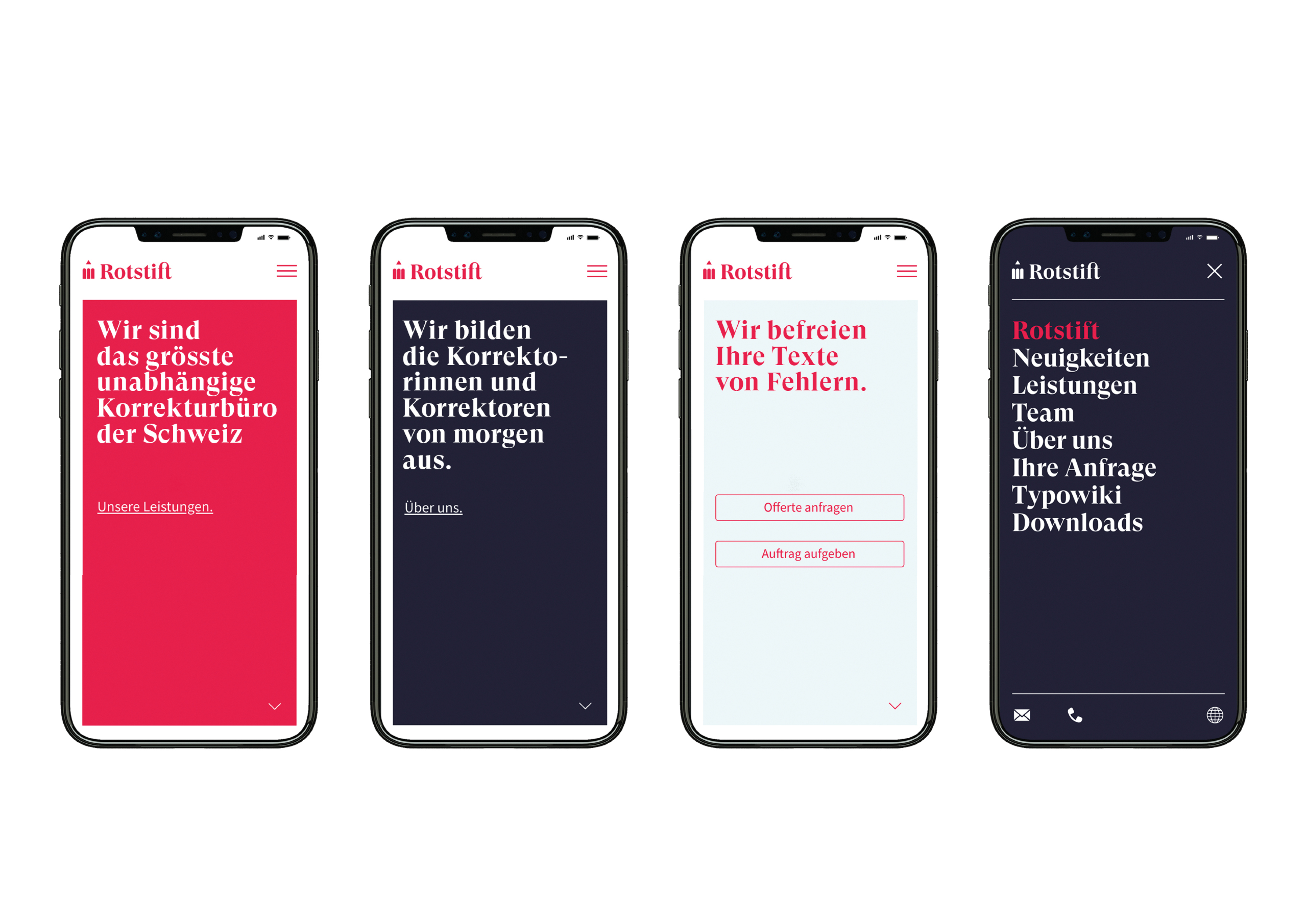
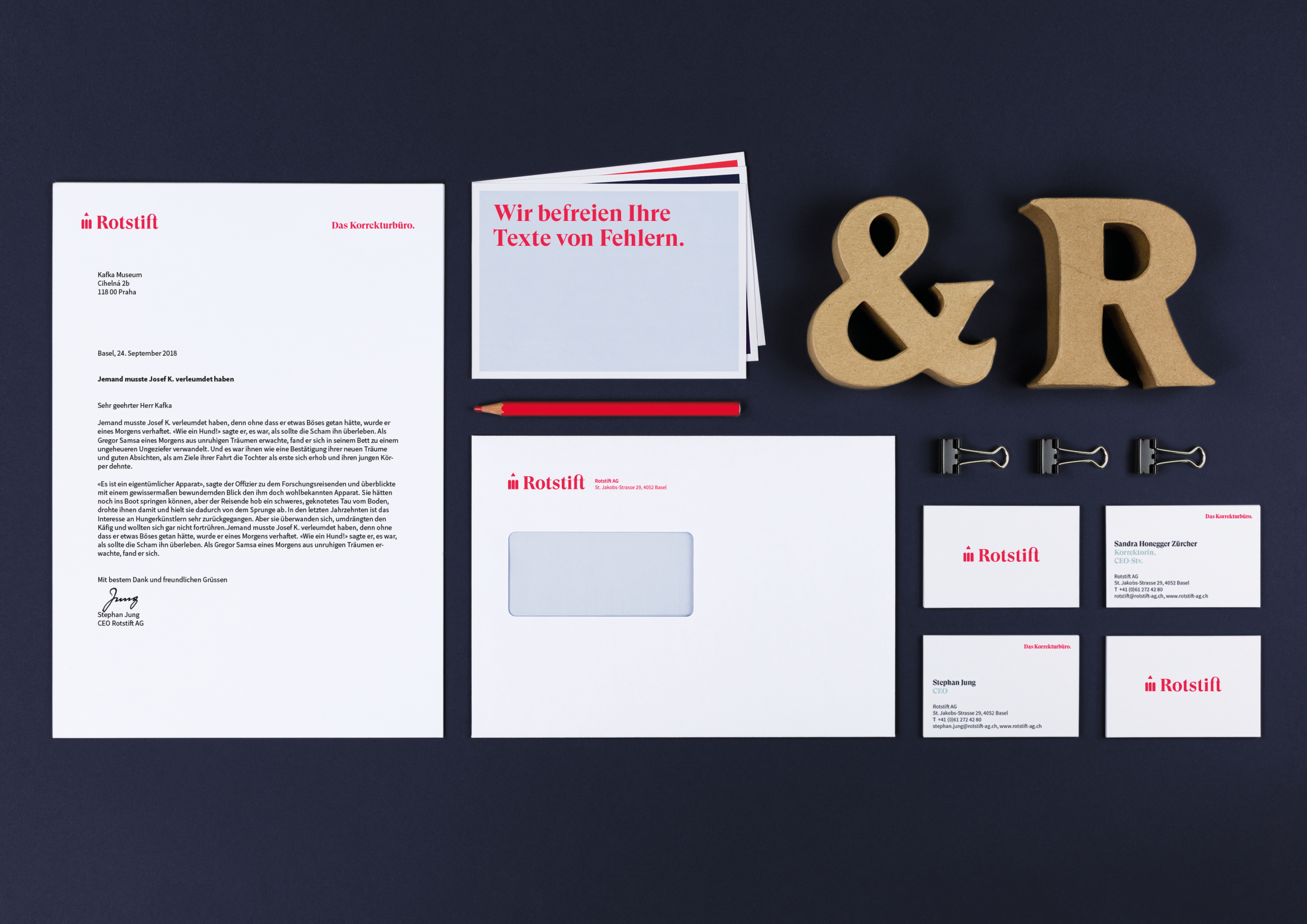
Anyone writing or publishing in Switzerland knows Rotstift AG – and has thus probably learned a lot about orthography, grammar, and punctuation. In close cooperation with the client, SUAN reworked the brand strategy and sharpened the brand value. On this basis, a branding was developed that vaults Rotstift into the digital age. The display font GT Super is made for Rotstift and underlines the digital aspect as well as the company's long tradition. In all communications, a fresh red shade combined with two secondary colors is used. That way, color and typography alone create a corporate identity that provides the long-established company with a new charisma.
Date of Launch
2019
Development Time
up to 12 months
Target Regions
Specific country/region: Switzerland
Target Groups
Consumer / User, Trade / Industry, Public Sector / Government, Specific sub-group: Marketing departments of different companies