


RegularBold
Brand Identity and Brand Guide Manual
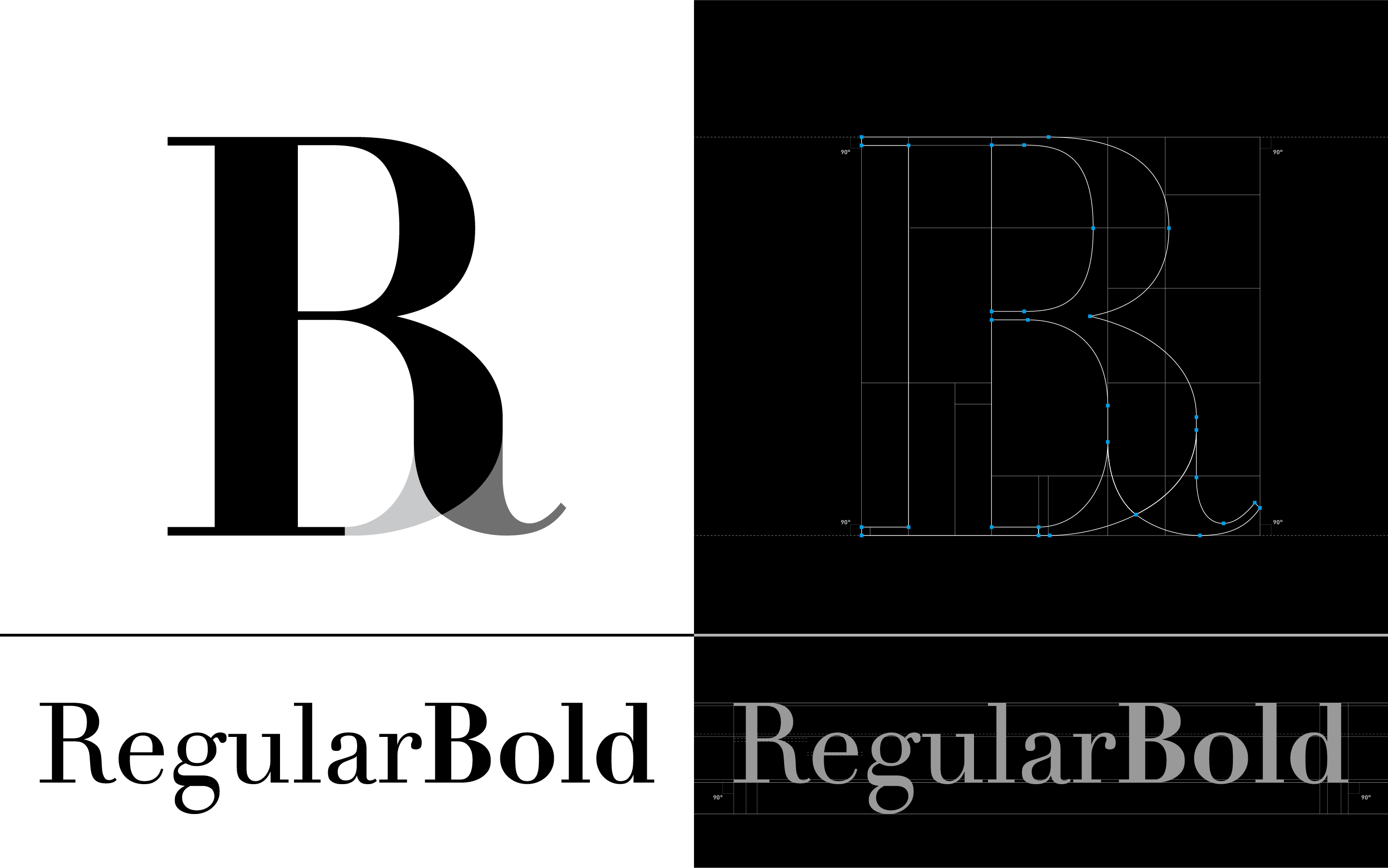
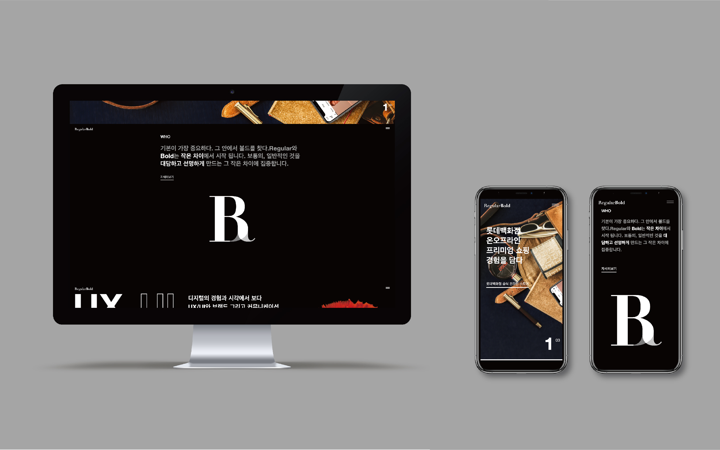
RegularBold is a creative group of outstanding directors from various fields. Along with building a BI, we also developed a brand guide manual for a holistic experience. The logo was created on a geometric principle where the horizontal stroke and thick vertical stroke meet at the right-angle without serifs and conveys the value of RegularBold, which provides a systematic and balanced solution. All graphics maintain a perfect 1:2 proportionality that visually symbolizes the meaning of words ‘regular’ and ‘bold.’ Giving consistent structural proportionality to every graphic element, it maintains a clear identity on every kind of device.
Date of Launch
2019
Development Time
up to 12 months
Target Regions
Specific country/region: Republic of Korea
Target Groups
Other target groups: Clients