

Relaunch Tillman´s Toasty
Relaunch
Tillman’s Convenience GmbH
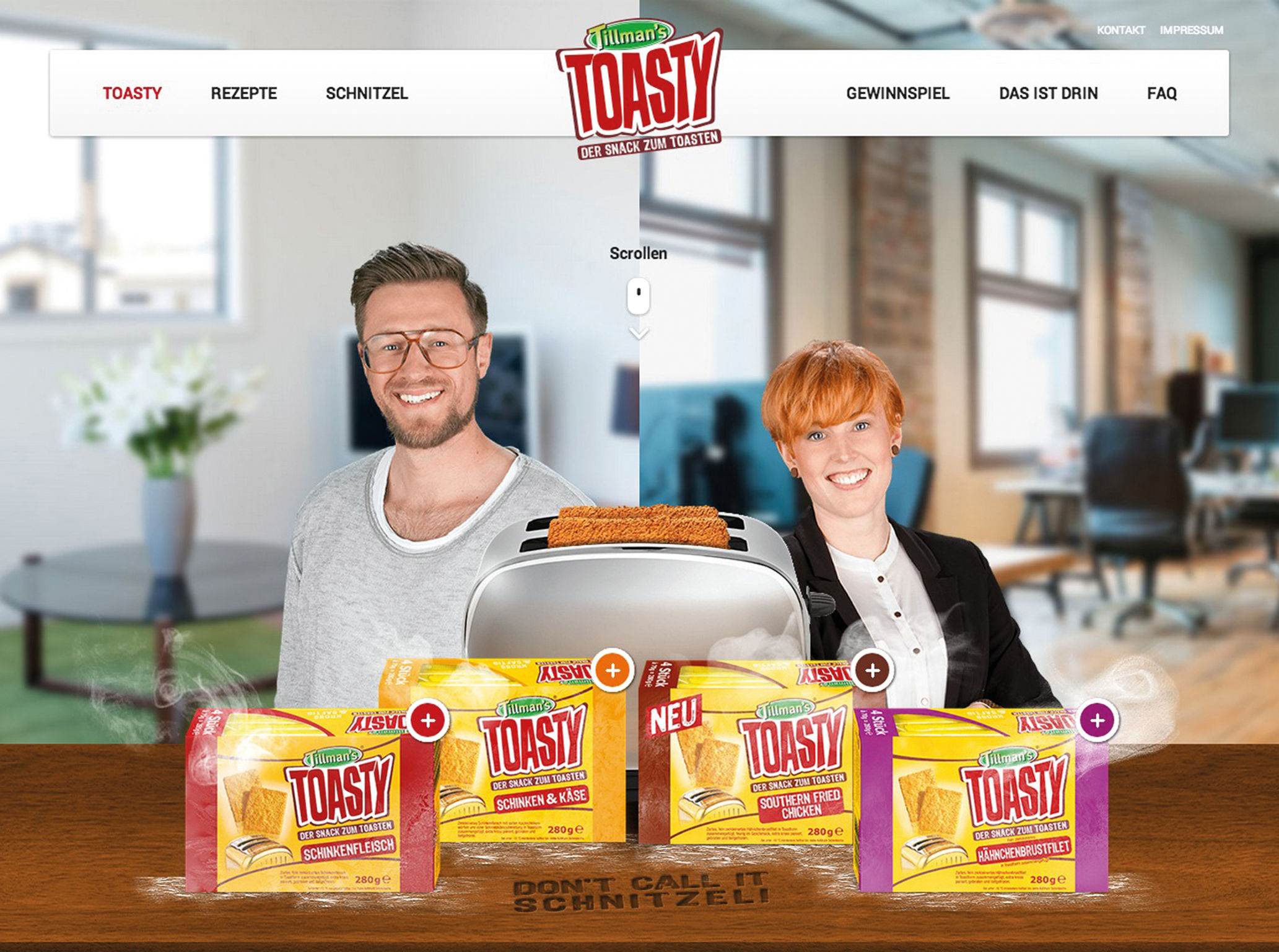
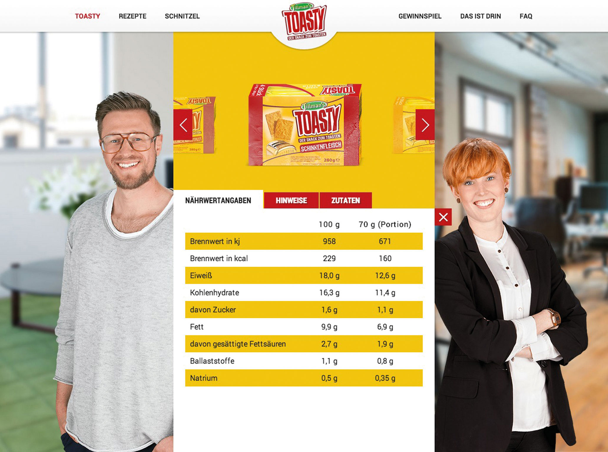
Don' Call It Schnitzel! Tillman’s Toasty is one of the most innovative snacks in recent years. The brand website should reproduce the special brand characteristics in a consequent and creative way. The adaptability, the simple preparation and the high quality of the hearty snacks should be displayed – both conceptually and visually. The new Toasty one-page website convinces with playful explanations how to prepare the snack, along with other preparation possibilities and infotainment elements. The mobile optimization completes the presentation and ensures that the customer receives further information of Toasty directly at the point of sale.
Client / ManufacturerDesign
Tillman’s Convenience GmbH
Weißenfels, DE