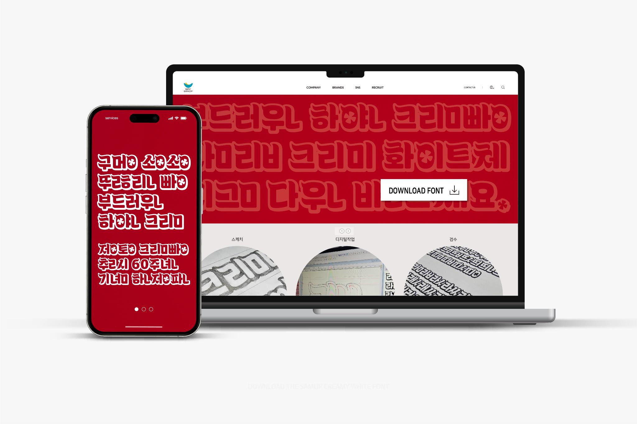
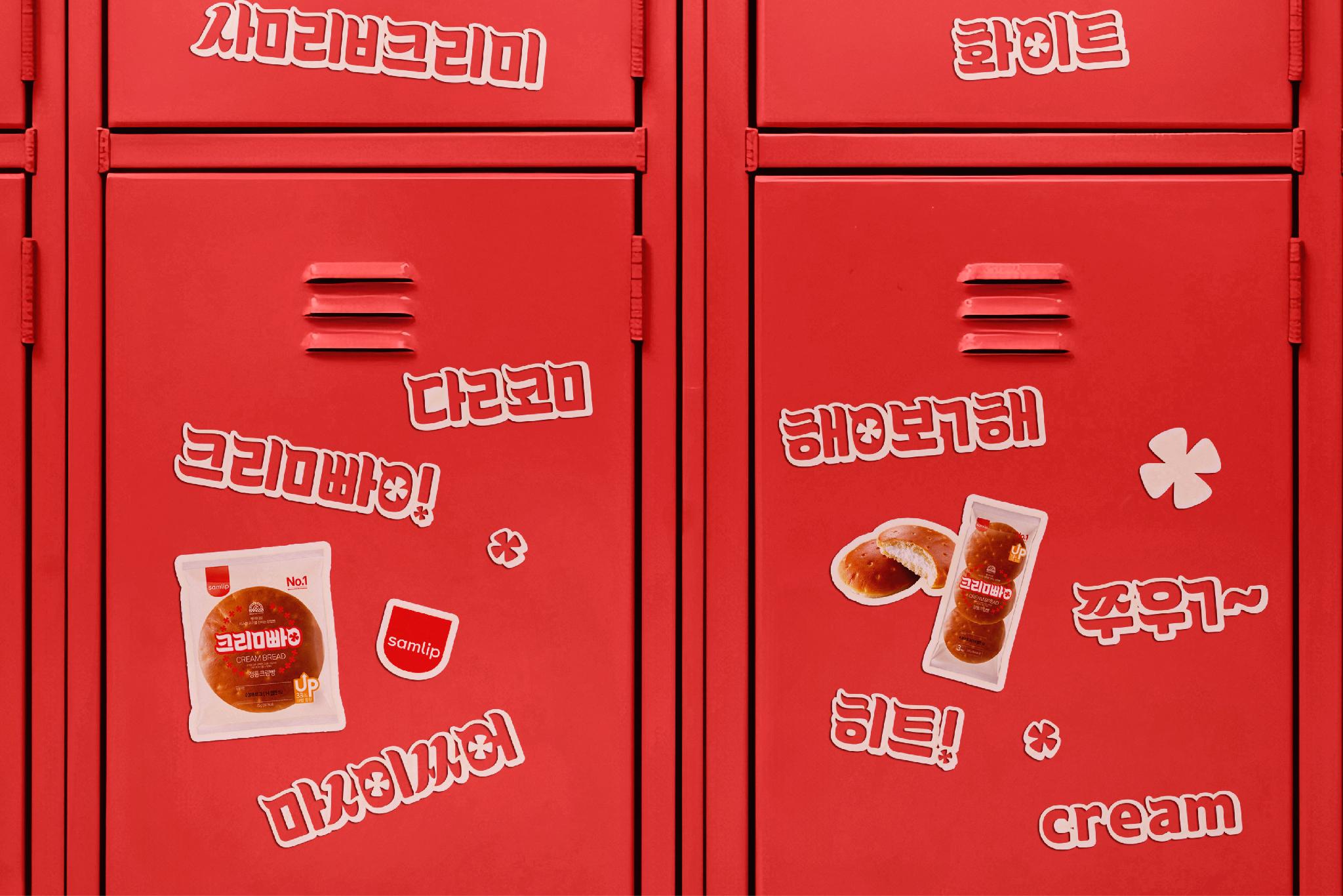
Samlip Creamy White Font
Typography Design for Samlip Creamy White
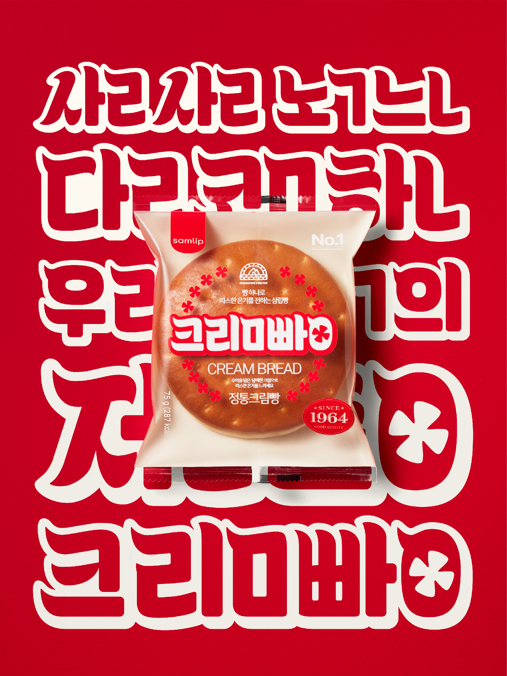
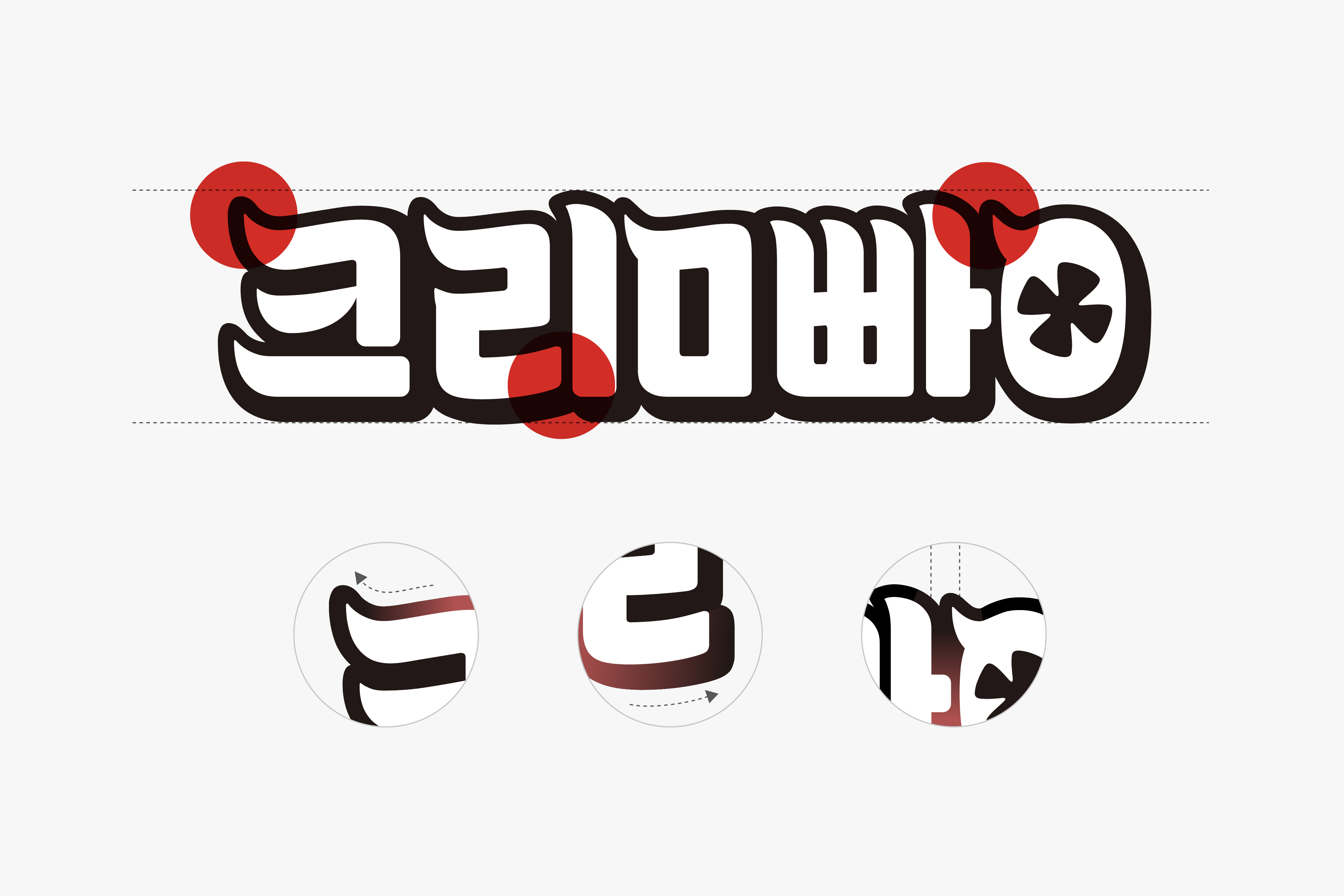
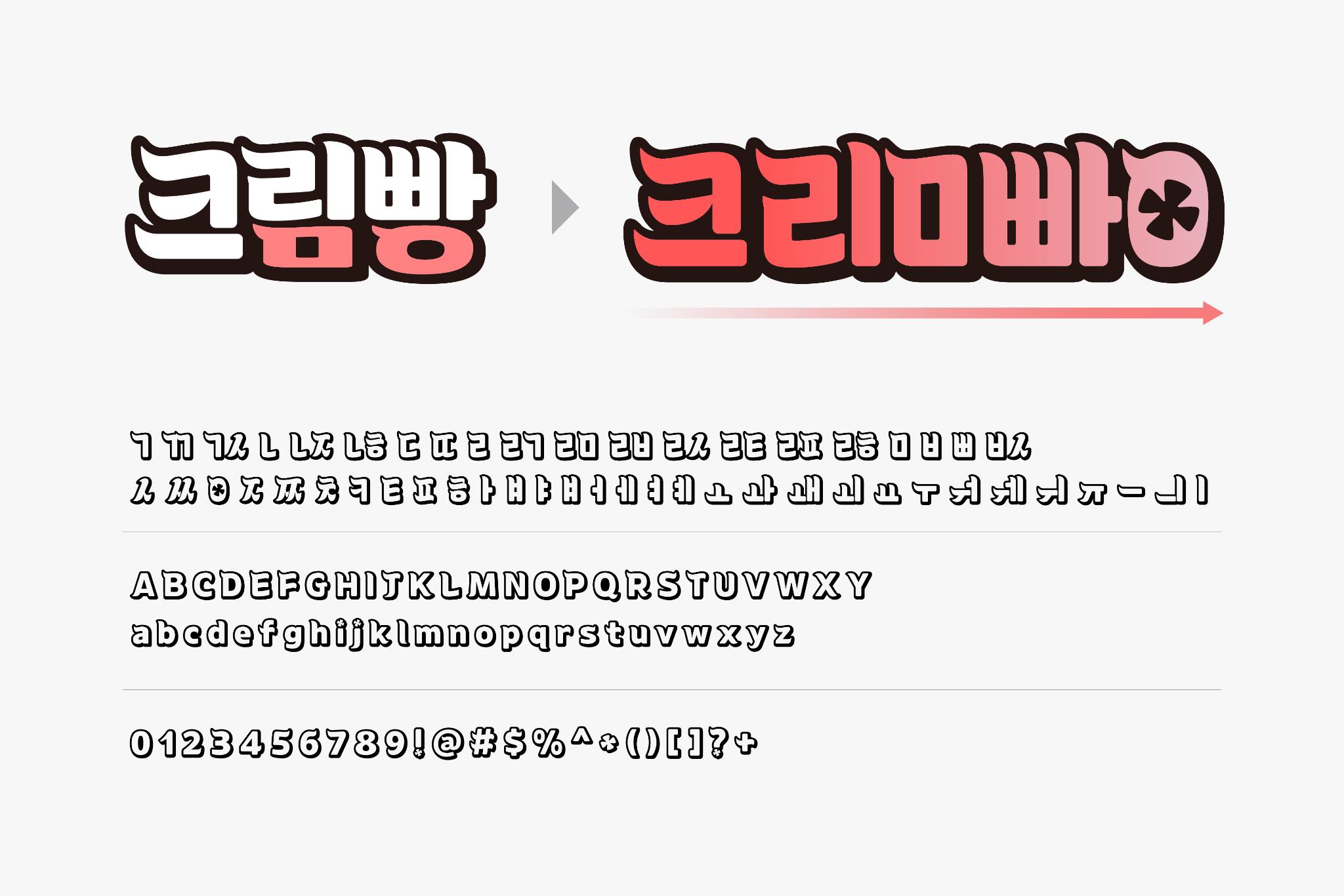
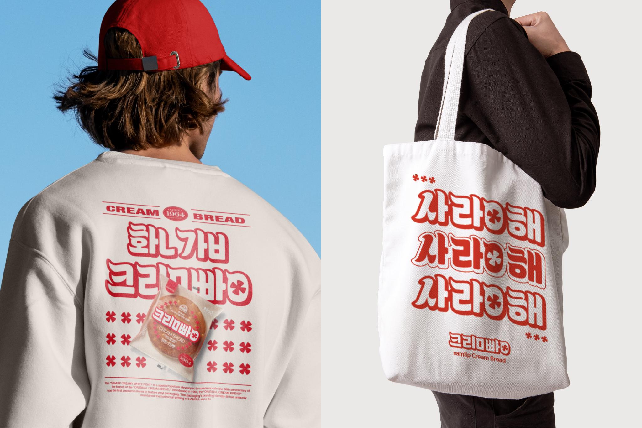
The Samlip Creamy White Typeface was developed to celebrate the 60th anniversary of Samlip’s classic "Cream Bread," aiming to solidify the brand's iconic status in Korea. This typeface reflects the brand’s 60-year history with the public, crafted based on the natural evolution of its logo. Unlike other fonts that lack direct ties to their brands, the Samlip Creamy White Typeface visually represents Samlip’s unique and warm image, deepening consumer-brand connection. Through this typeface, users feel a sense of familiarity and nostalgia, making it a meaningful embodiment of Samlip’s legacy and a standout project in its category.
Client / ManufacturerDesign
SPC Samlip
Seoul, KRSPC Samlip
Seoul, KRHee Kyung Chun(Creative Director), Seoyoon Yang(Design Director), Sungbeom Kim(Designer), Yumi Lee(Designer)Design 210 Co., Ltd.
Seoul, KRDoo-yeol Kwak(Designer)Date of Launch
2024
Development Time
up to 6 Month
Target Regions
Asia
Target Groups
Consumers / Users