Samyang Corporation Identity Renewal
Corporate identity and branding
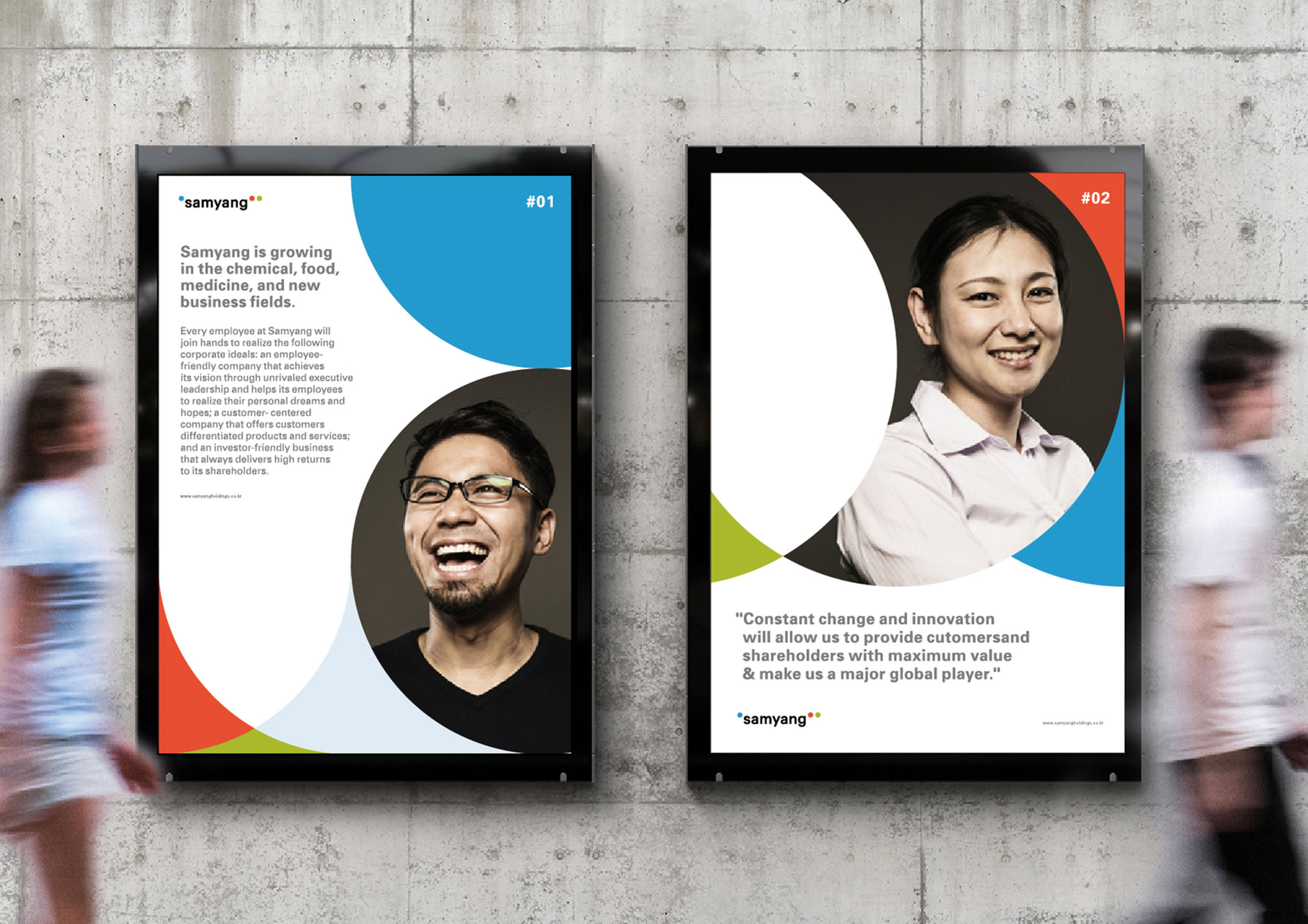
Samyang Group specializes in material technology in food, chemicals and biopharmaceuticals. The company's corporate vision calls for “a company that makes life more affluent and convenient.” The redesign of the new Samyang logo is a reconstruction of the group's brand concept, "life's ingredients," combined with the three colors of light. The blue dot in the logo represents an apostrophe, symbolizing Samyang's material technology applied to diverse products. The red and green dots represent a double quotation mark, a reference to Samyang employees communicating with customers. The goal of this CI and branding project is to transform the brand's static image into a broader, more dynamic one.
Client / Manufacturer Design
Samyang Holdings
Seoul, KRNamed Studio
Seoul, KRSodiumpartners
Seoul, KRSamyang Holdings
Seoul, KRDate of Launch
2018
Development Time
up to 12 months
Target Regions
Asia, Europe, North America
Target Groups
Consumer / User