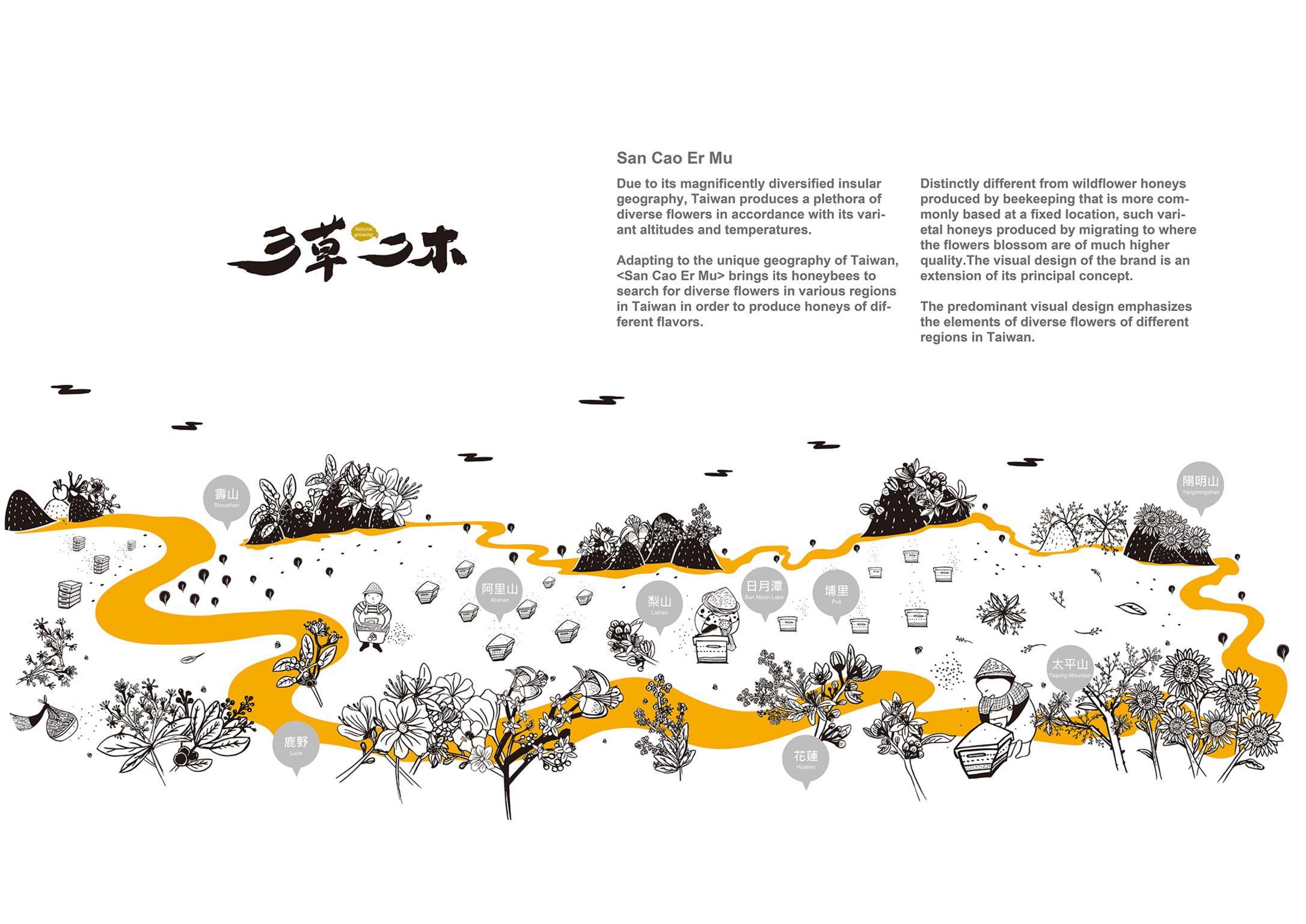
San Cao Er Mu
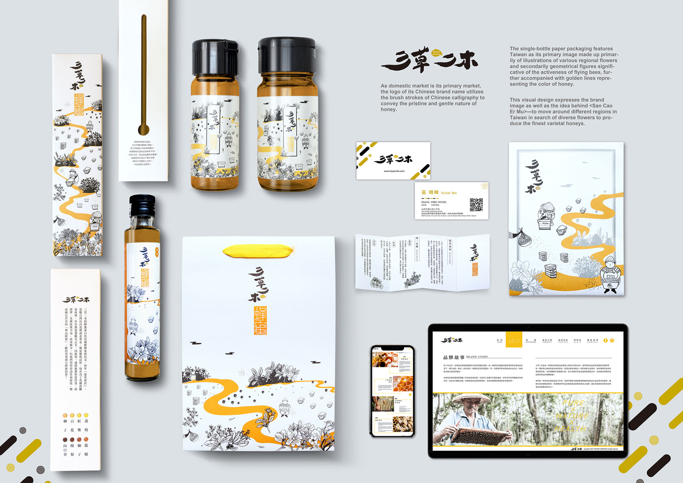
Honey packaging
The packaging of San Cao Er Mu honey shows honeybees in search of flowers in the diverse landscape of Taiwan, resulting in honeys of different flavors. This visual design expresses the core value of this product and its brand image – honeys from all corners of the countries with an unparalleled range of flavors and varieties.
Client / ManufacturerDesign
Easy Vitality Marketing Studio
Yunlin, TWIF MULTIMEDIA DESIGN WORKSHOP
Taichung, TWDate of Launch
2018
Development Time
up to 12 months
Target Regions
Asia
Target Groups
Consumer / User