

Schneider Schreibgeräte
Corporate design
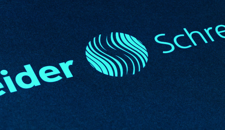
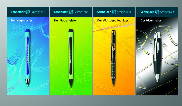
Schneider Schreibgeräte GmbHThe corporate design of Schneider Schreibgeräte is derived from the world of writing: the new logo consists of lines of varying weights that form an S to symbolize handwriting. The combination of dark blue, a common ink color, and light blue is unique in the market. The tagline, Schreibs auf (Write it), reflects the Schneider principle Jeder Gedanke ist es wert, aufgeschrieben zu werden (Every thought is worth writing down.). Catchy product names such as Der Kugelsurfer (The page surfer) or Der Notizmeister (The note master) create positive associations with important product features to set them apart from the competition.
