

Schokodeern
Packaging design
deernsundjungs design
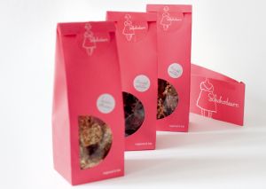
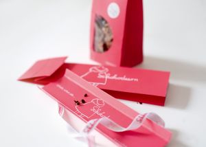
The visual appearance of the Schokodeern includes all important attributes of the gourmet-brand. The high grade of quality of the organic ingredients from regional sources, the loving producing of the hand-crafted candies as well as the modern nature. A blatant, self-confident coloring which supports its autarchy combined with a hand-drawn figure and a handwritten word mark every grade anew. Tender lines contrast the cool coloring and yield to a fascinating combination of naturalness and professionalism. The center of all is the Schokodeern herself a girl wearing traditional clothing who composes the logo in an emotional way.
Client / ManufacturerDesign