

SELF RX
Nutritional supplement packaging
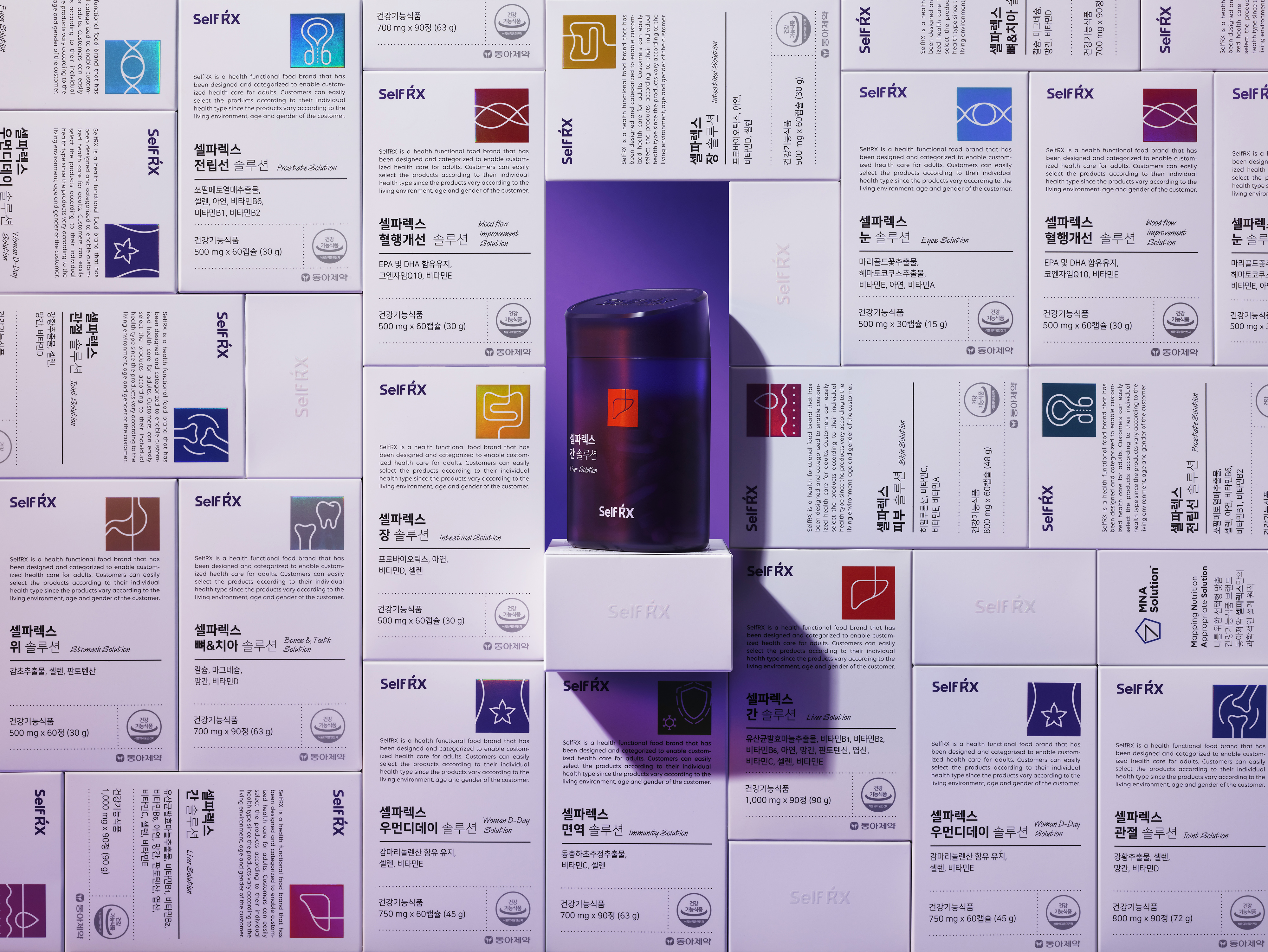
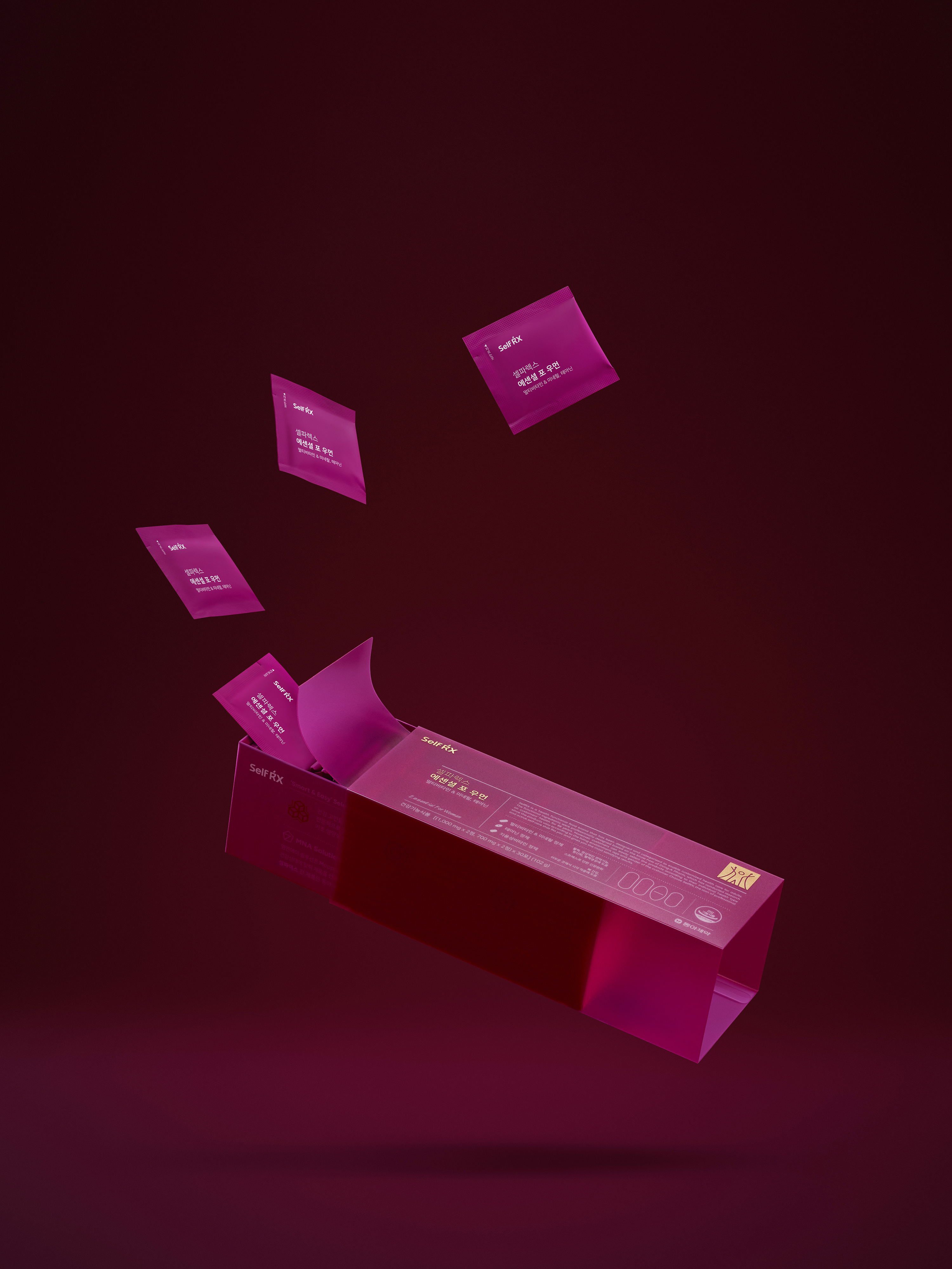
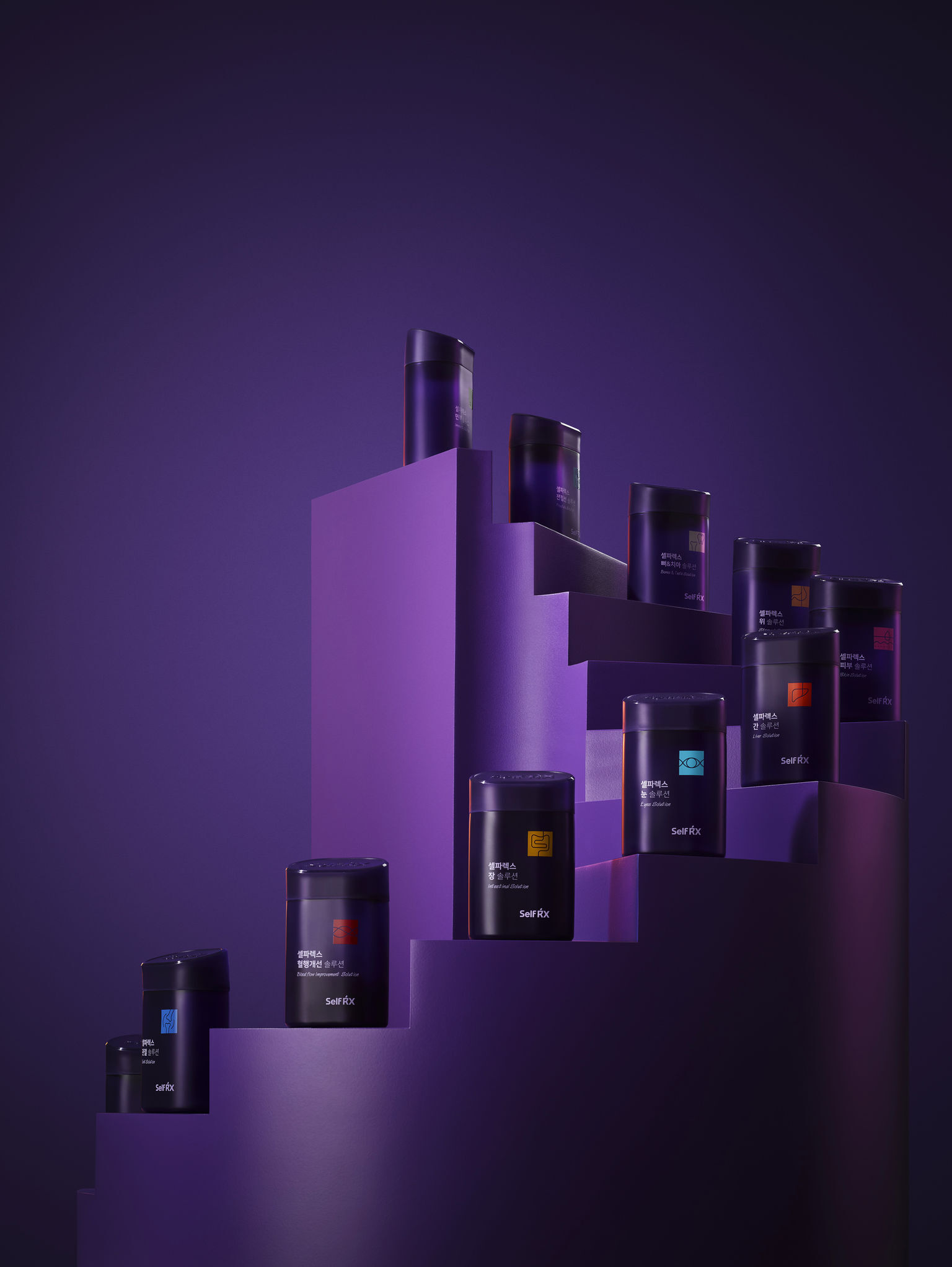
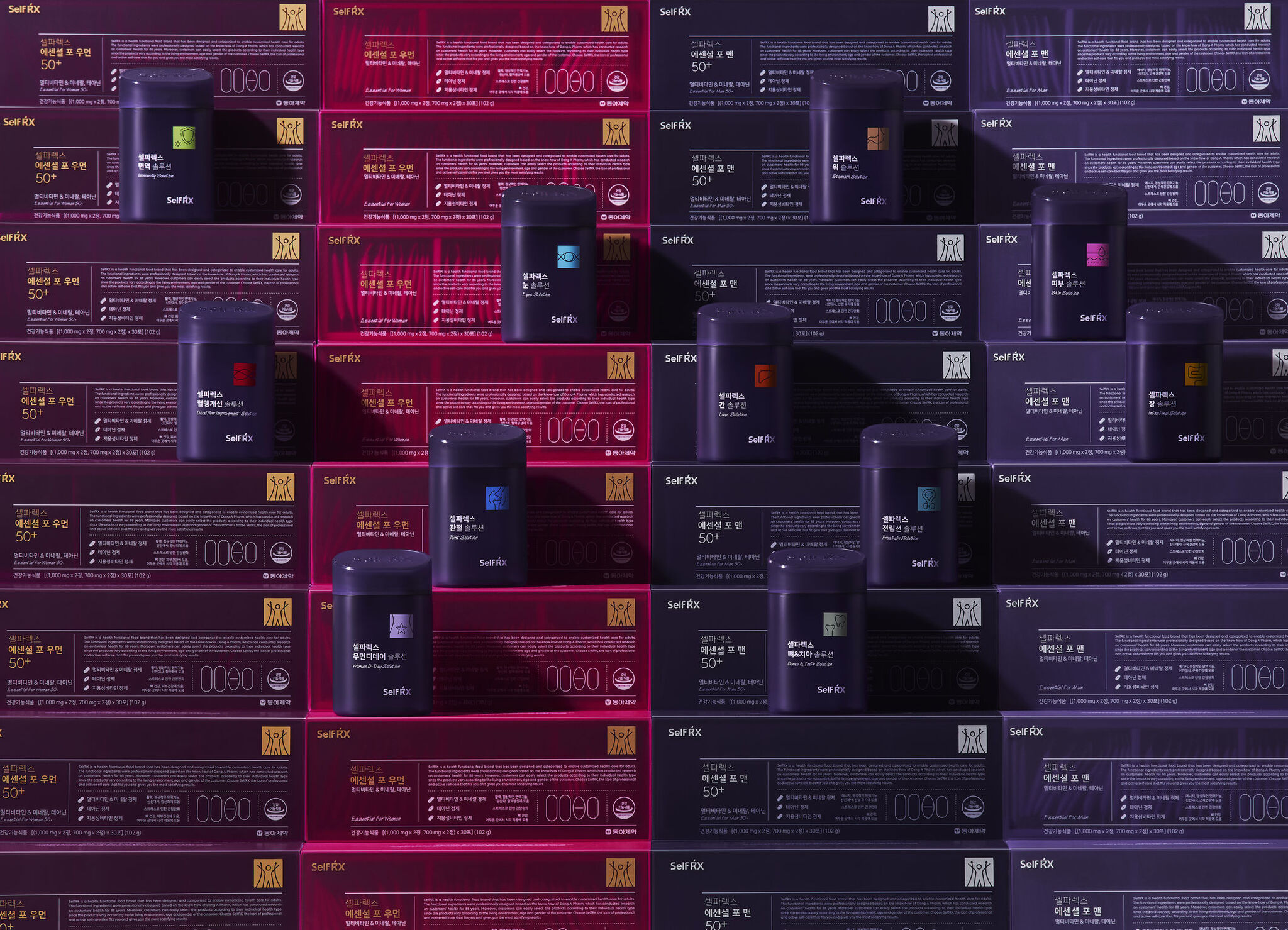
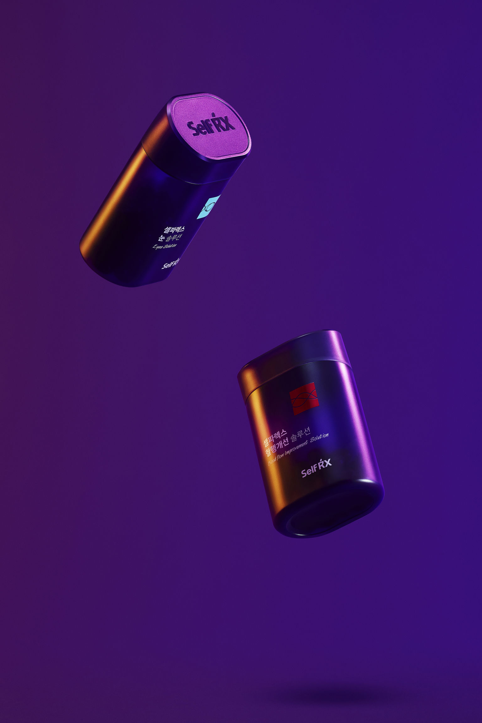
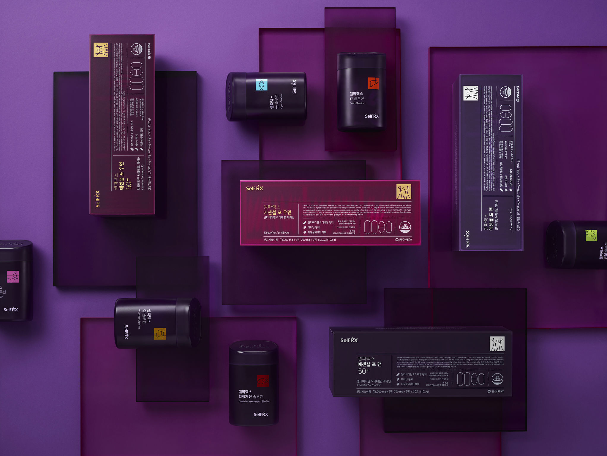
Dong A Pharm.This packaging's primary graphic motive is a grid design used to communicate the important information consumers need to know about the product. The design uses a systematic color system and intuitive pictograms to indicate which symptoms and organs the product treats. The container is the shape of a cut pill, reinforcing the product concept of the need to refrain from taking too many supplements. The container cap is cut at an ergonomic15-degree angle with a protruding grip, making it easier to dispense the contents.
Date of Launch
2020
Development Time
13 - 24 months
Target Regions
Asia
Target Groups
Consumer / User
