
She Why
Pub branding
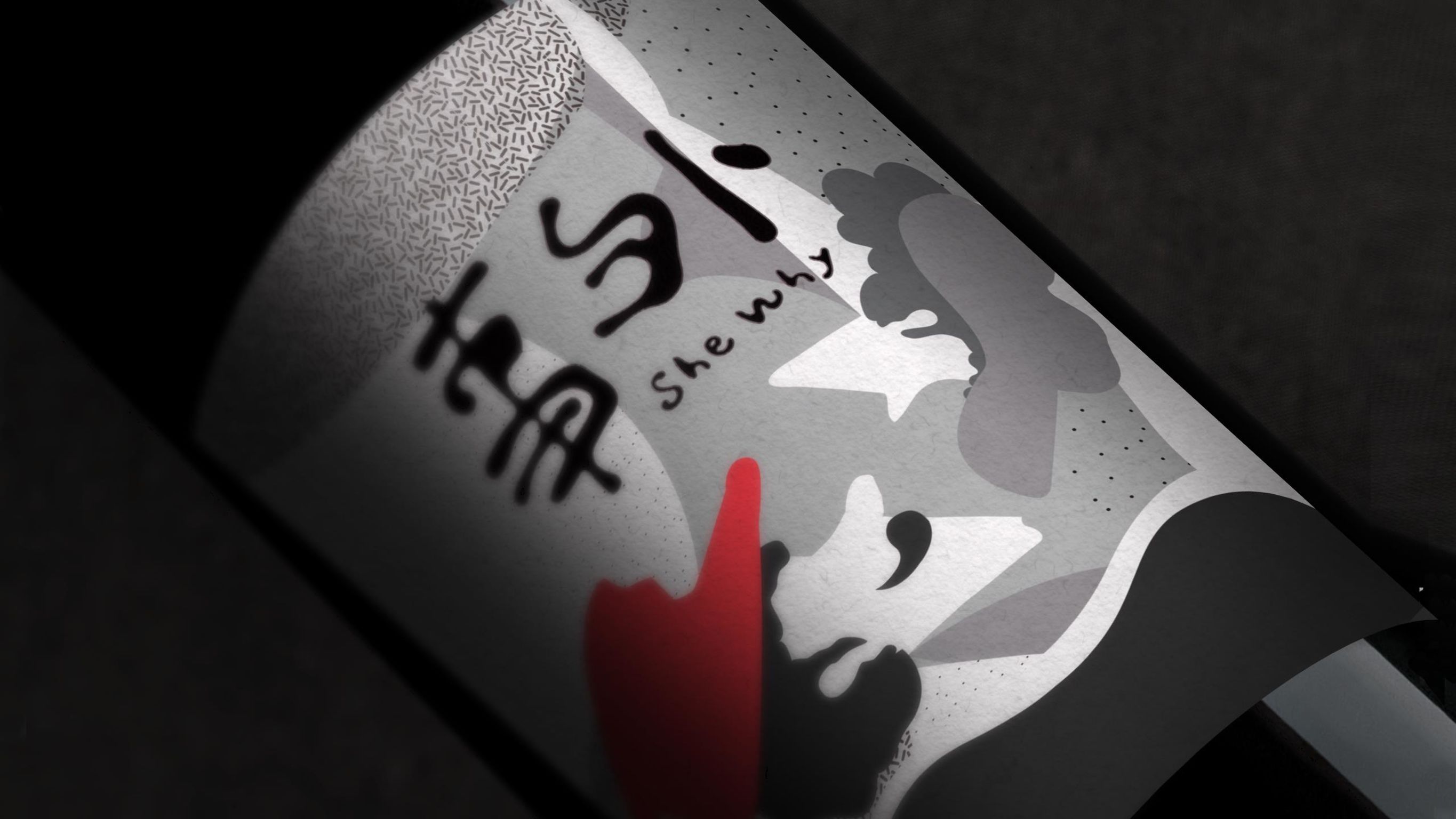
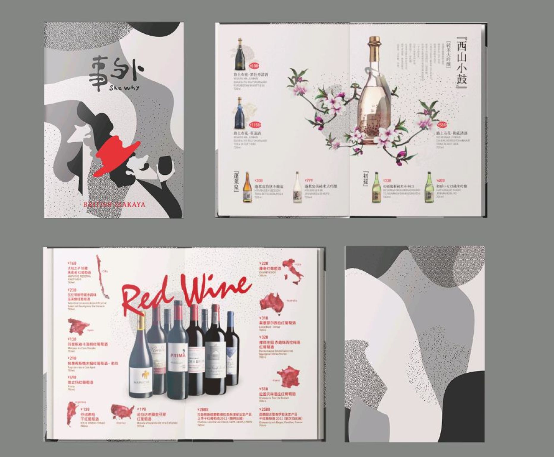
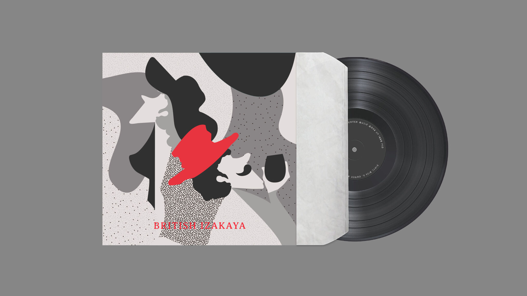
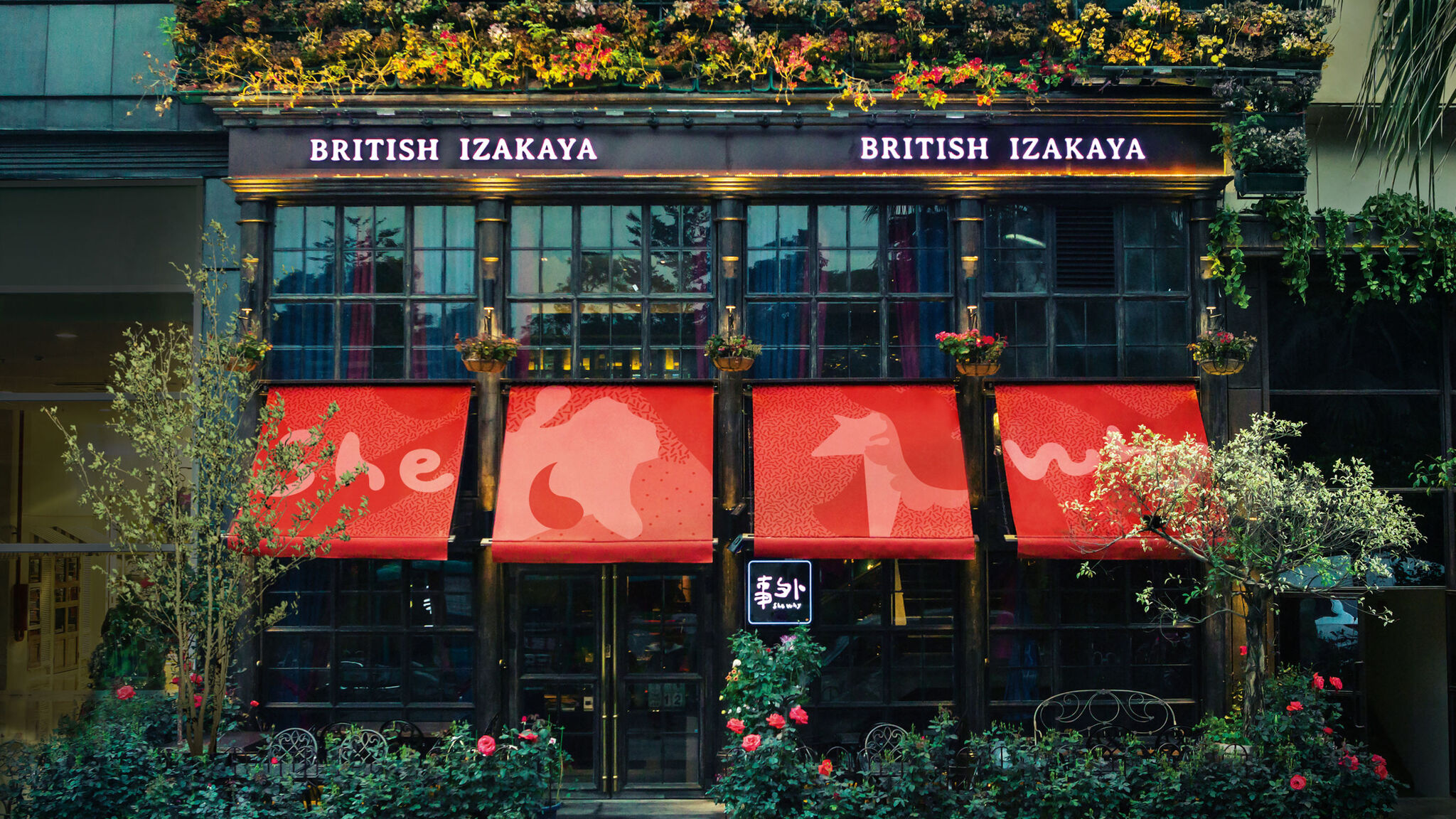
The writing is simple, combining expressions of nature and freedom in the menu of the "She why" izakaya (a type of informal Japanese pub). The designer chose Chinese calligraphy for the main of logo, making slight changes in details so that the characters appear 'drunk'. The irregularity of the font boundary represents the hazy, beautiful, clear, and free innovation of the "She why" brand.
Client / ManufacturerDesign
Alliance Art Group
Shenzhen, CNShenzhen Xinsen Culture Communication Co., Ltd.
Shenzhen, CNDate of Launch
2017
Development Time
other period: 六个月
Target Regions
Asia
Target Groups
Consumer / User