

Südtirol
Corporate Identity / Corporate Design
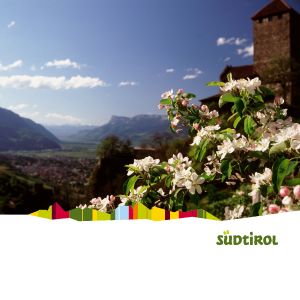
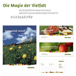
Countries and regions are increasingly subject to competitive pressures that are forcing them to pool their energies and sharpen their images. South Tyrol has embraced this challenge: in an unprecedented process in Europe, it has developed an umbrella brand that ensures a powerful common presence for its tourism industry and high-quality products. The new visual identity illustrates the regions strategy and new positioning those things that make South Tyrol so unmistakable and unique. It consists of two main elements: a logotype that is based on a specially developed font, and a stylized Dolomite panorama whose colors symbolize the regions contrasts and diversity. Not even six months after its launch in early 2005, the umbrella brand has enabled the region to effectively pool resources, as illustrated by the over 1,000 licensees.
Südtirol Marketing Gesellschaft
Bozen, IT