

Taipei Smart City
Brand identity and applications
Taipei City Government
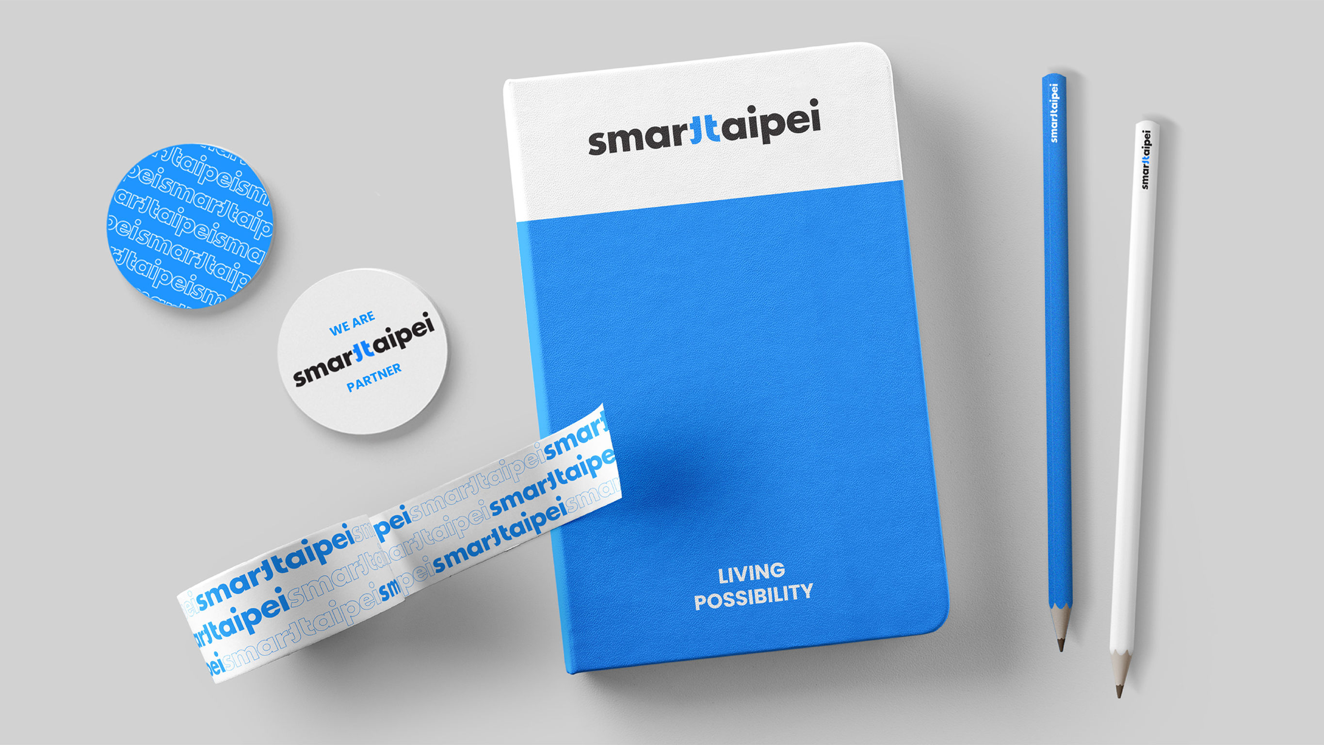
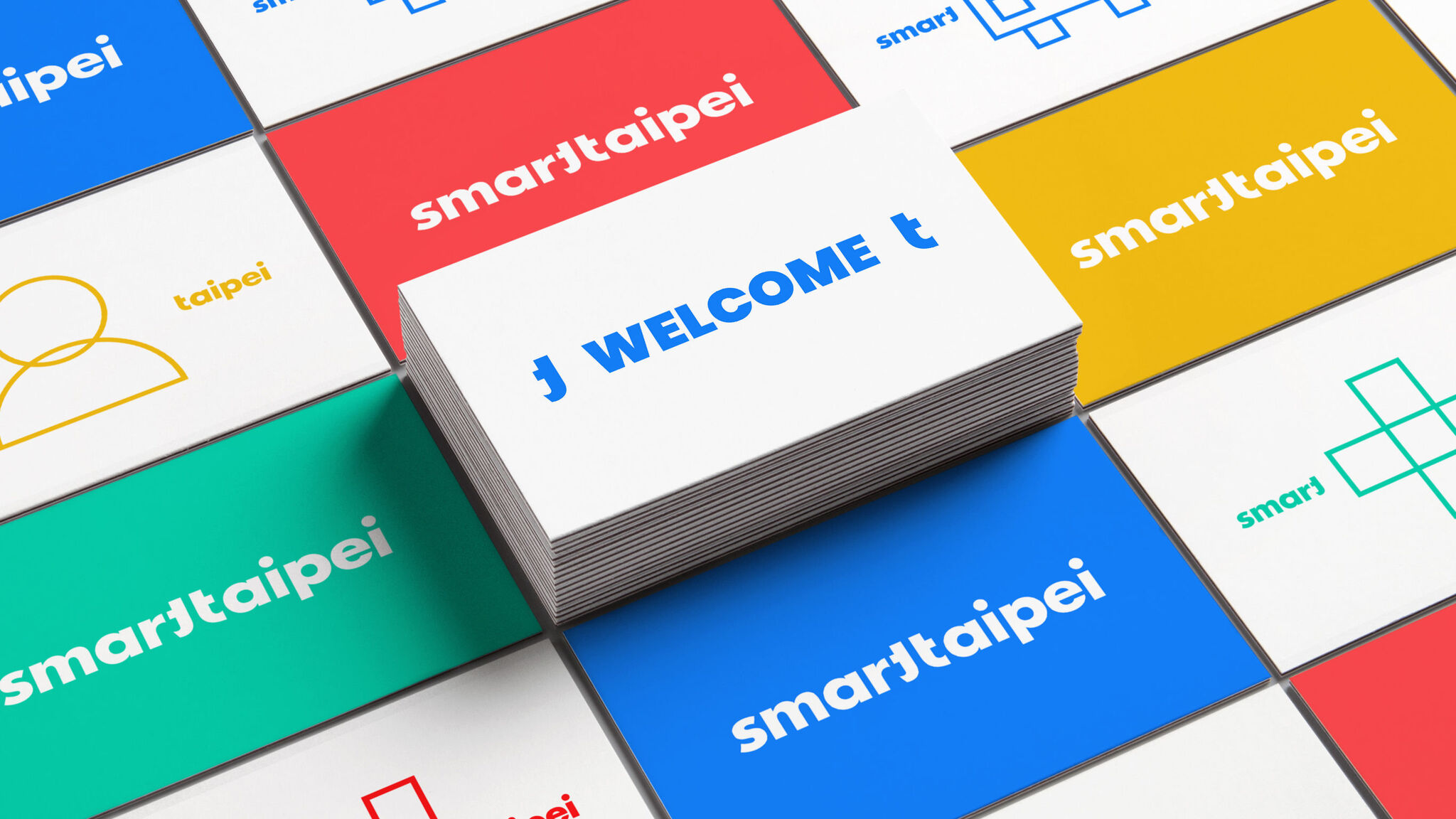
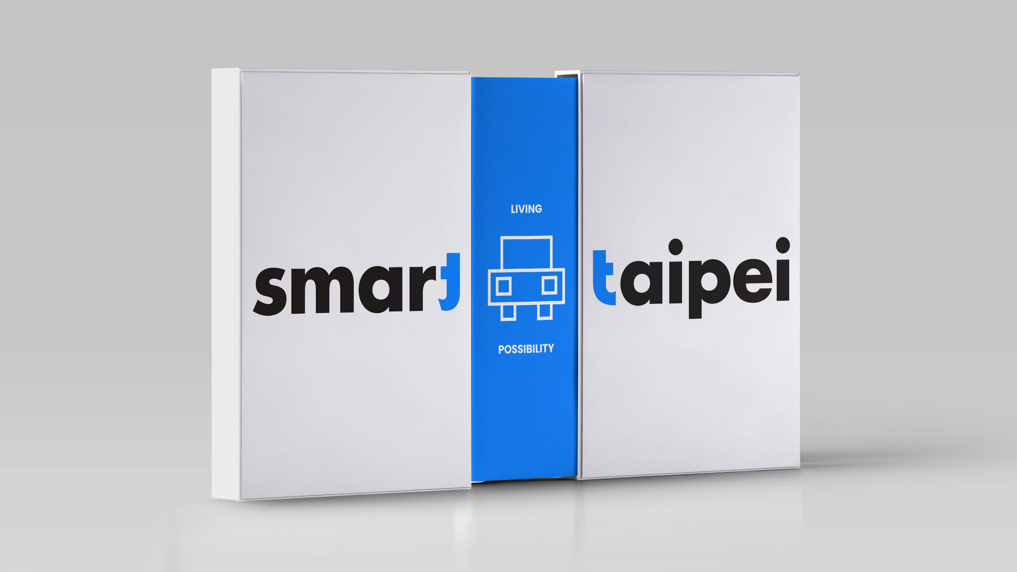
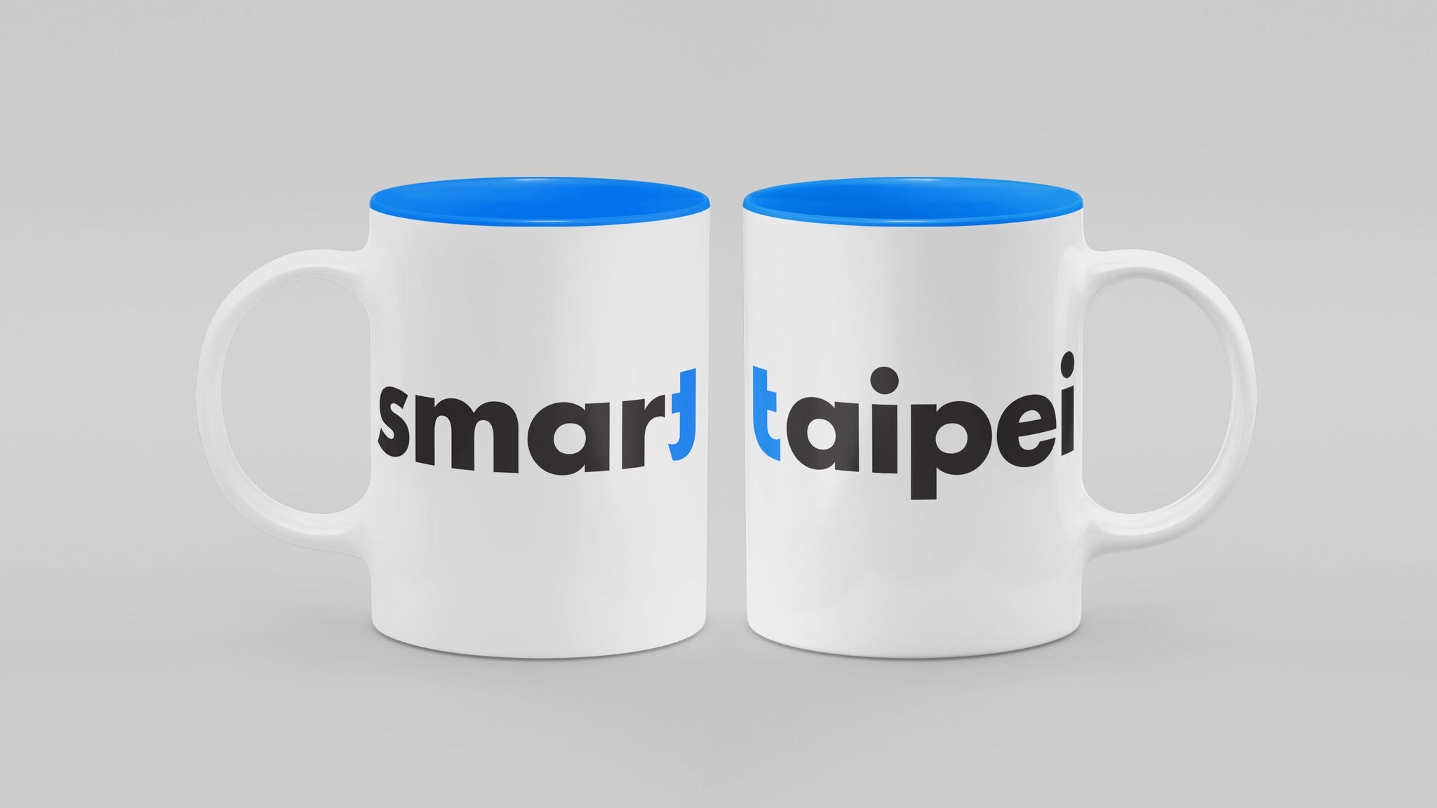
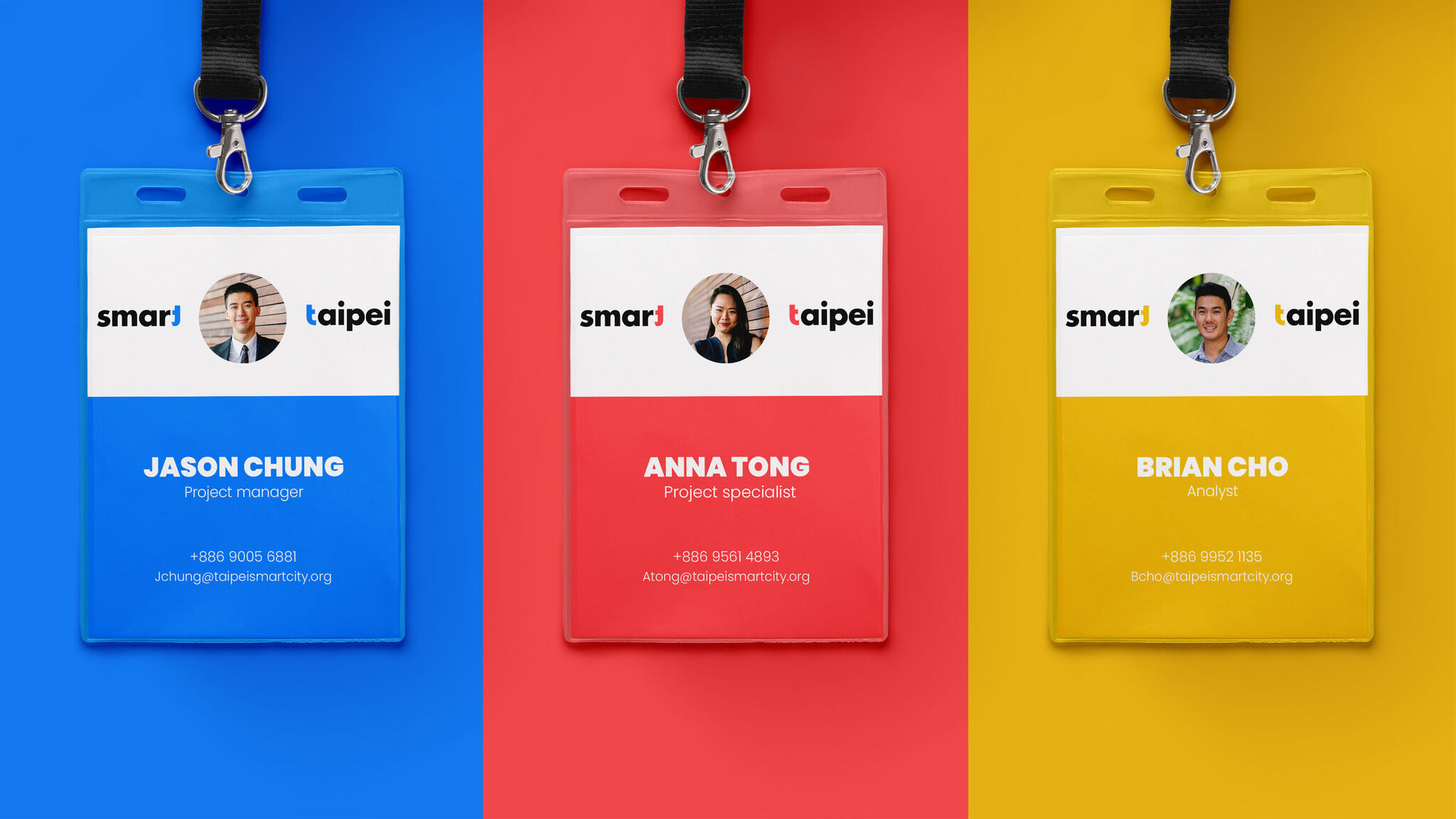
Smart Taipei is a city transformation program that turns the city into a testing ground for innovations. In the logo design, the two “t’s” from “Smart” and “Taipei” are connected to form the Chinese character for Taipei. In applications, the character can open up (separation of “Smart” and “Taipei”) to symbolize a welcoming attitude, while the space between alludes to endless possibilities. Vibrant colors reflect diverse aspects of smart living in Taipei. Dynamic and vibrant, the brand design presents Taipei as the breeding ground for pioneering ideas, where possibilities take shape and grow.
Date of Launch
2018
Development Time
up to 12 months
Target Regions
Asia
Target Groups
Consumer / User, Public Sector / Government
