

Taïrrior
Brand identity, applications
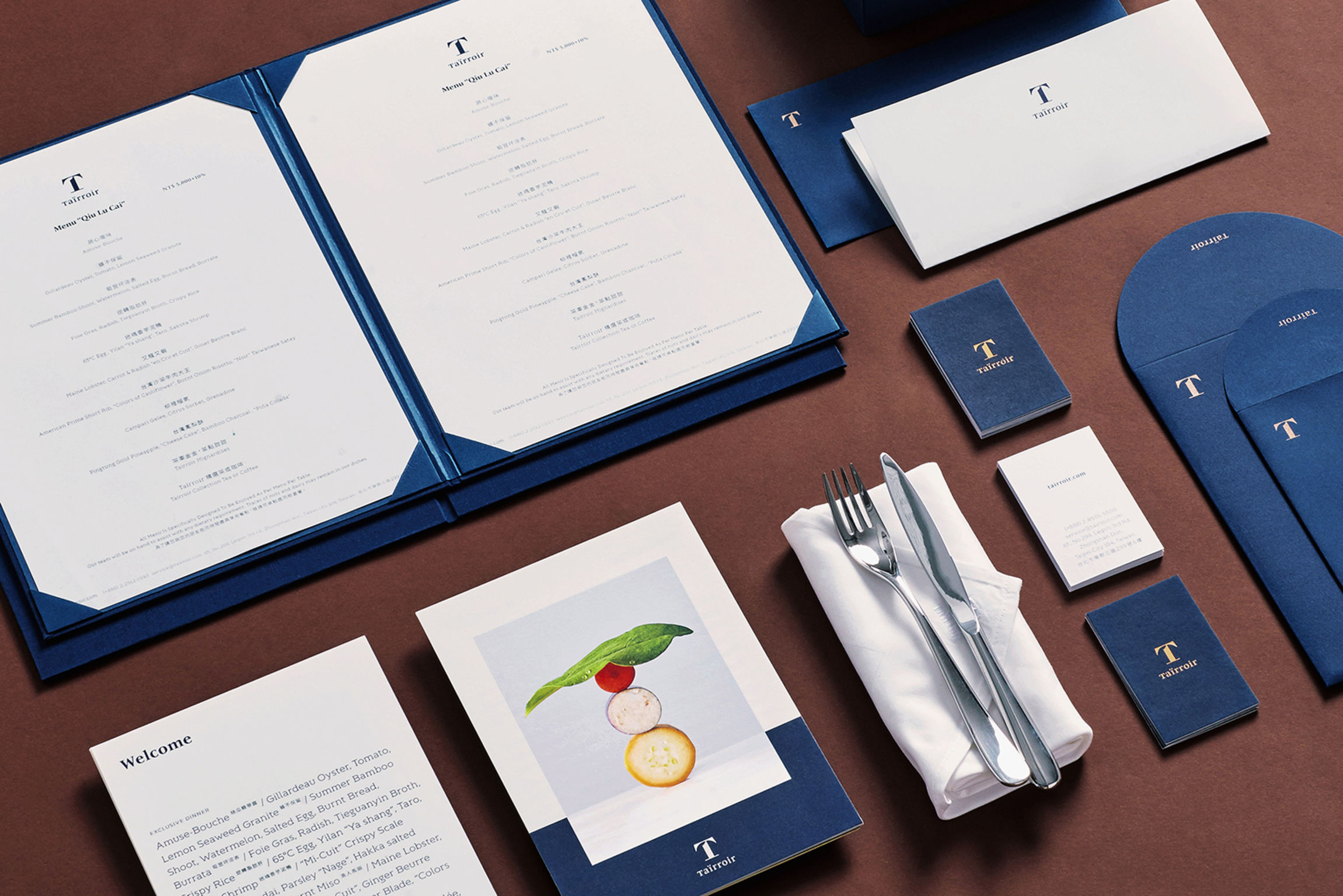
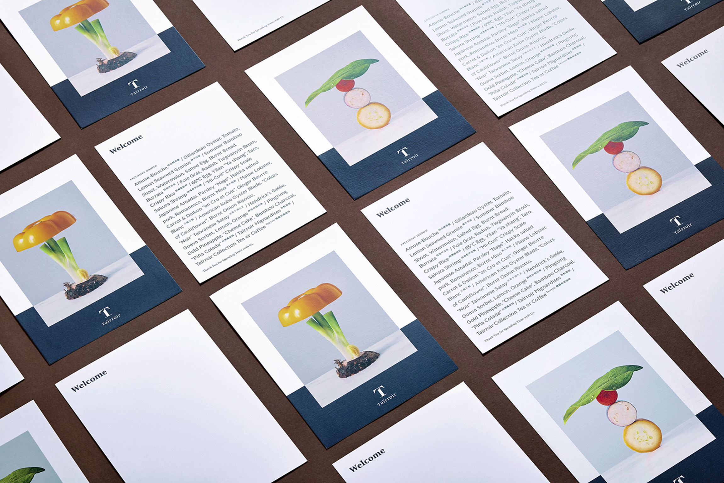
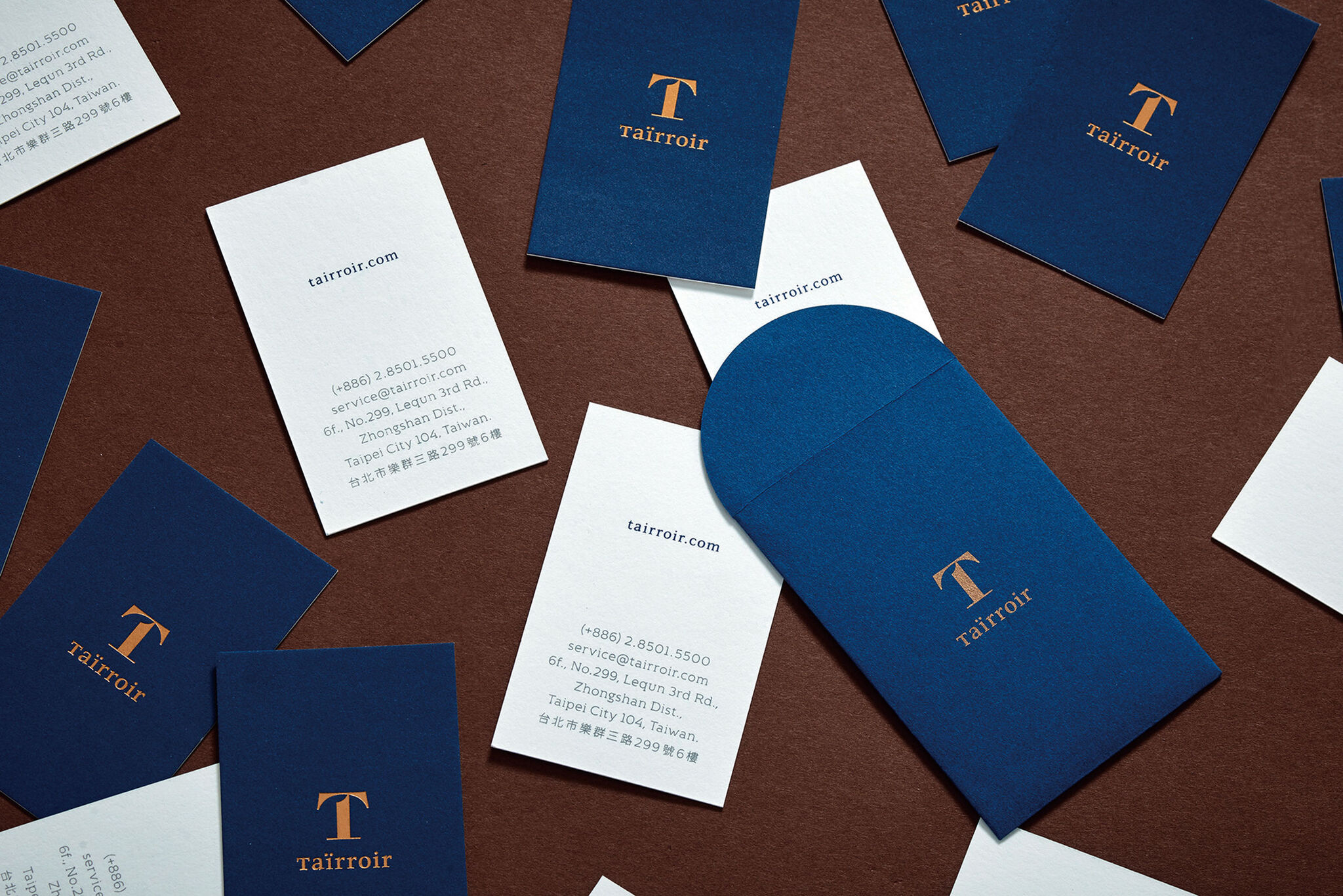
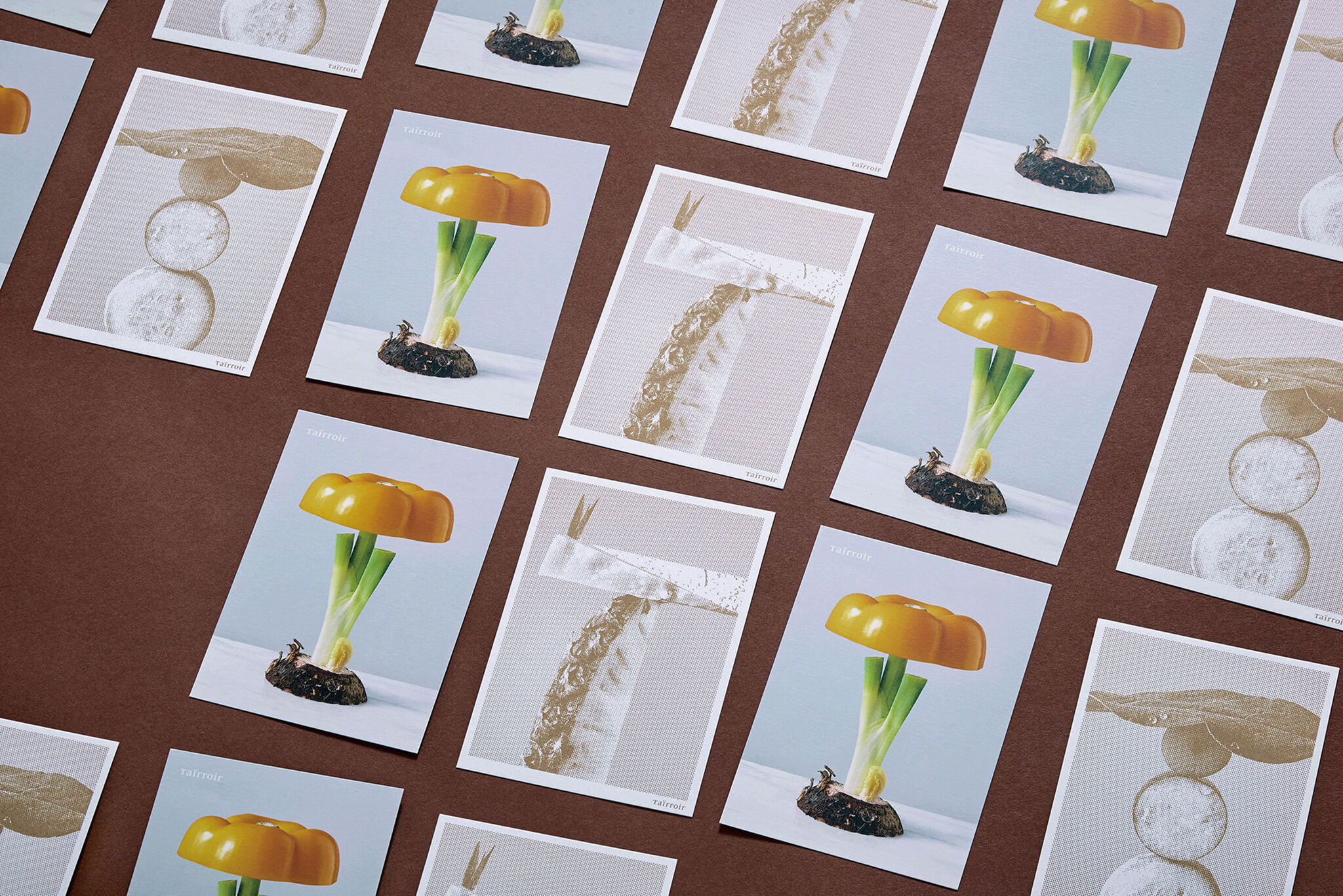
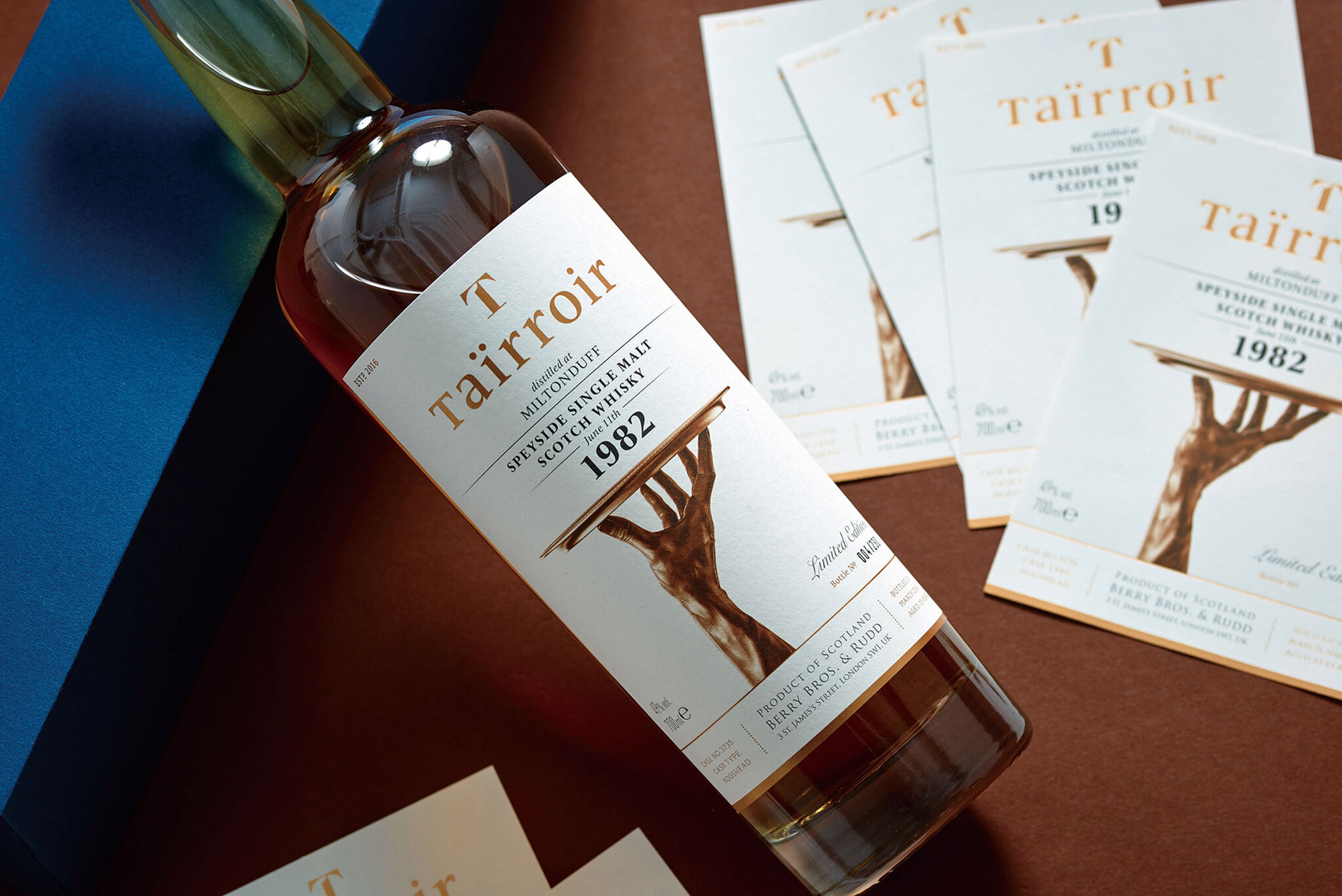
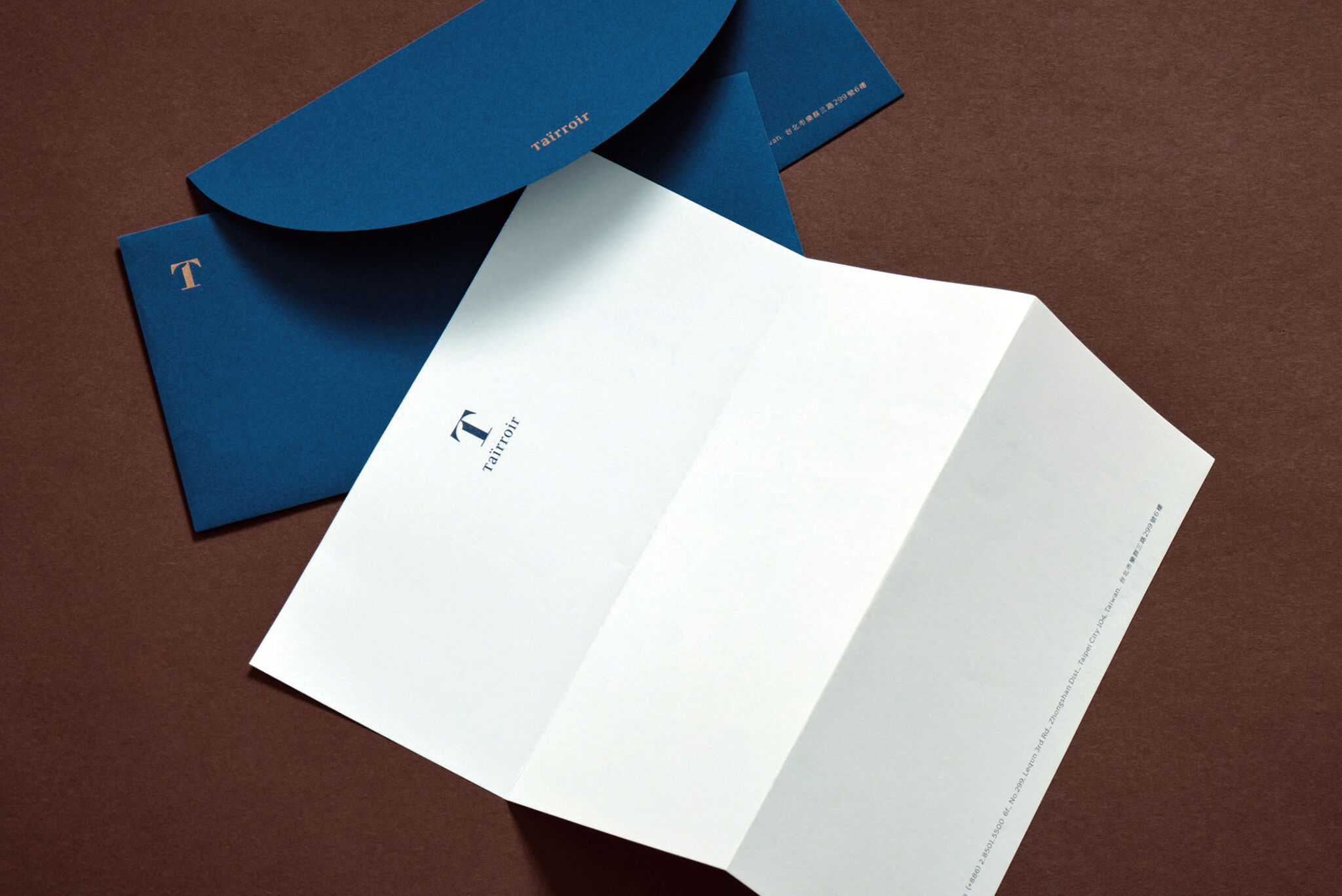
TaïrroirTaïrroir is a fine dining restaurant which marries classic Taiwanese cuisine and local ingredients with French cooking techniques. The first letter “T” is smartly transformed into the image of a hand carrying a tray to symbolize the brand’s commitment to serve. Besides, we transformed Taïrroir’s experimental spirit into a unique series of imagery by using various kinds of fresh local ingredients to build the letter T. We developed brand identity for Taïrroir, including their logo, packaging, menu, thank you card and web design. All our designs will reach food lovers and help the restaurant convey its uniqueness.
Date of Launch
2016
Development Time
up to 12 months
Target Regions
Asia, North America
Target Groups
Consumer / User
