

The Drop Rose' Wine
Wine packaging
The Drop Wine
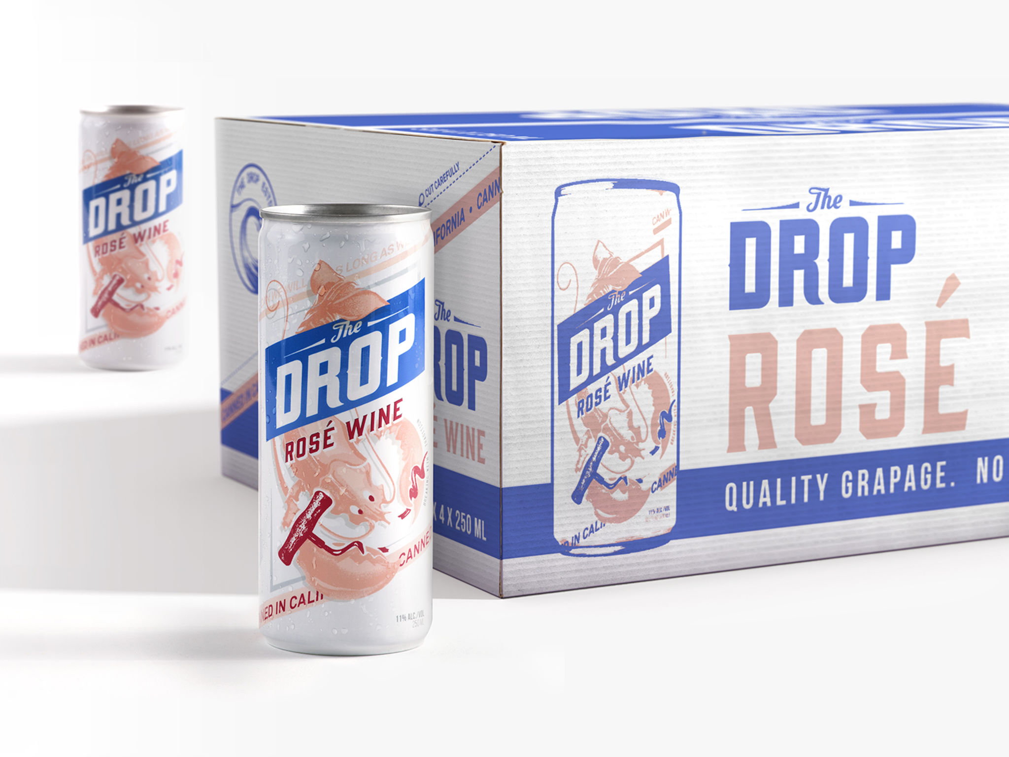
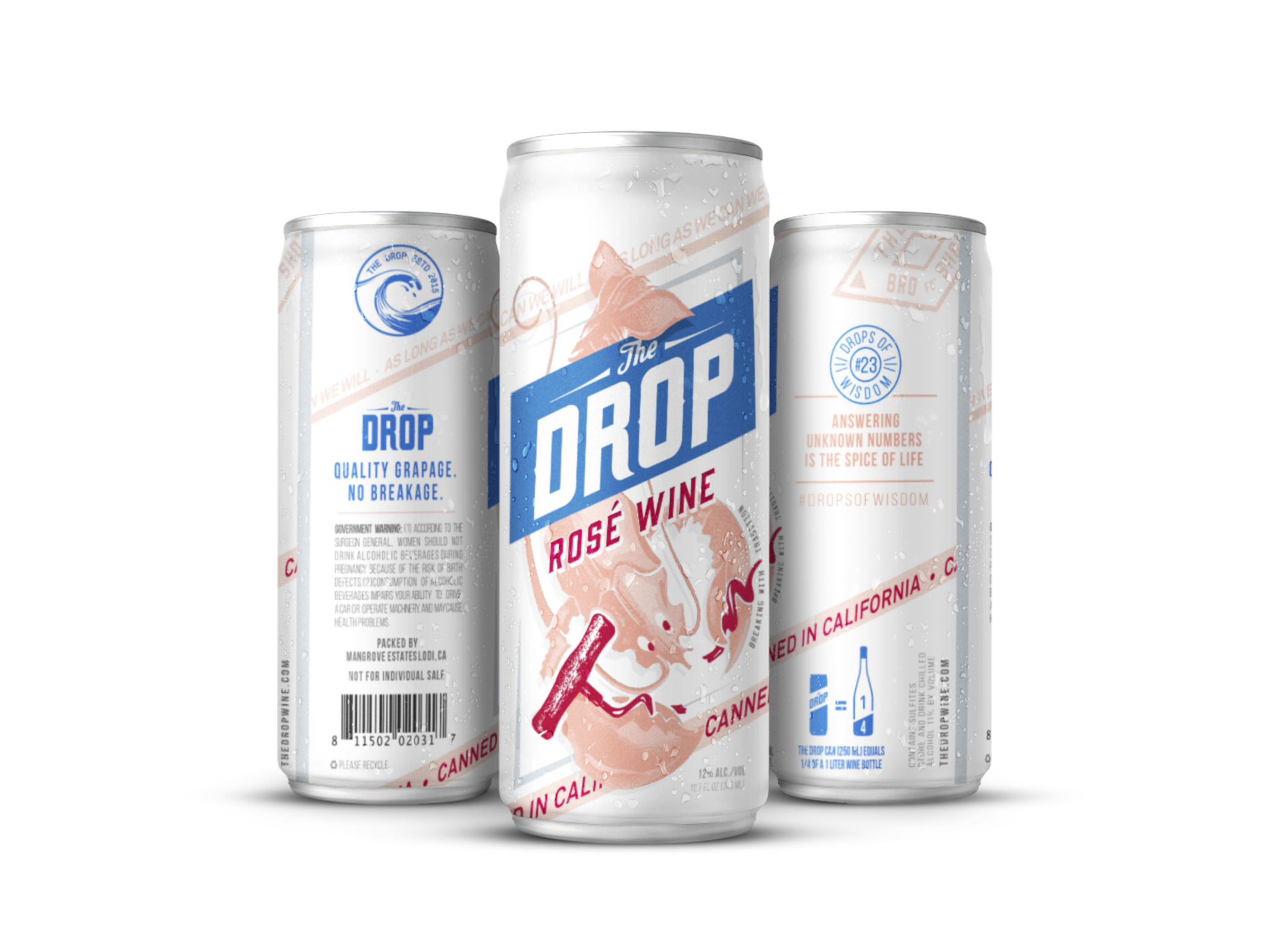
Tapping into the growing numbers of ‘bros’ drinking wine, the challenge was to bring The Drop, rose-in-a-can, to life through brand strategy, logo and packaging design. By taking on the ‘work hard play hard’ bro, every tradition in the wine world was broken. From the basic shift of launching the product in a can, to borrowing visual cues from the beer category, and having the mascot breaking a corkscrew in rebellion, the Drop’s “breaking with tradition” mentality is exemplified in the very literal sense. With its 'Quality Grapage, no Breakage' motto, The Drop isn’t shy about swearing by its quality and is equally proud of its departure from the bottle.
Client / ManufacturerDesign
The Drop Wine
New York, NY, USSafari Sundays
New York, NY, USDate of Launch
2016
Development Time
up to 12 months
Target Regions
North America
Target Groups
Consumer / User, Trade / Industry