

Thorndown
Paint packaging
Thorndown
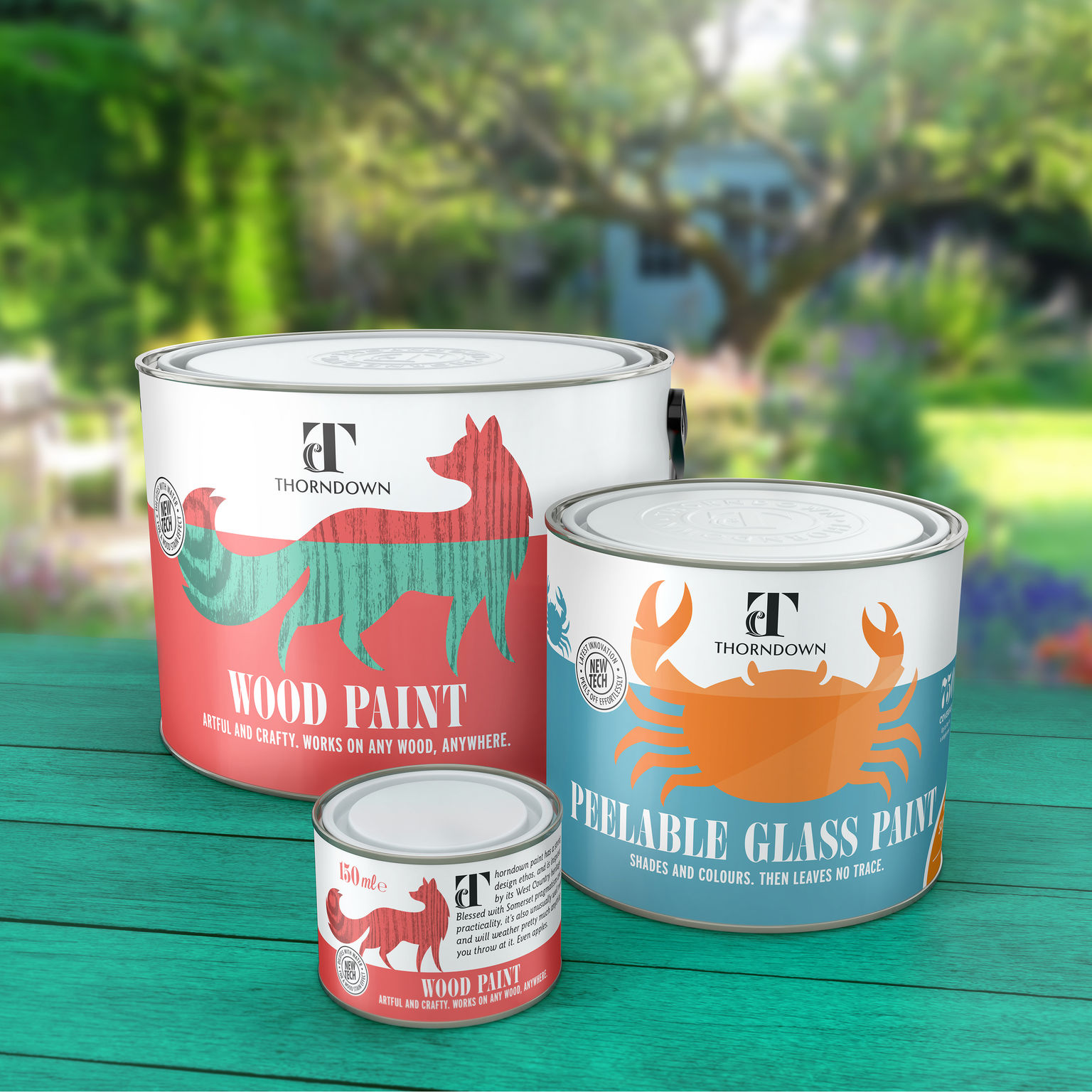
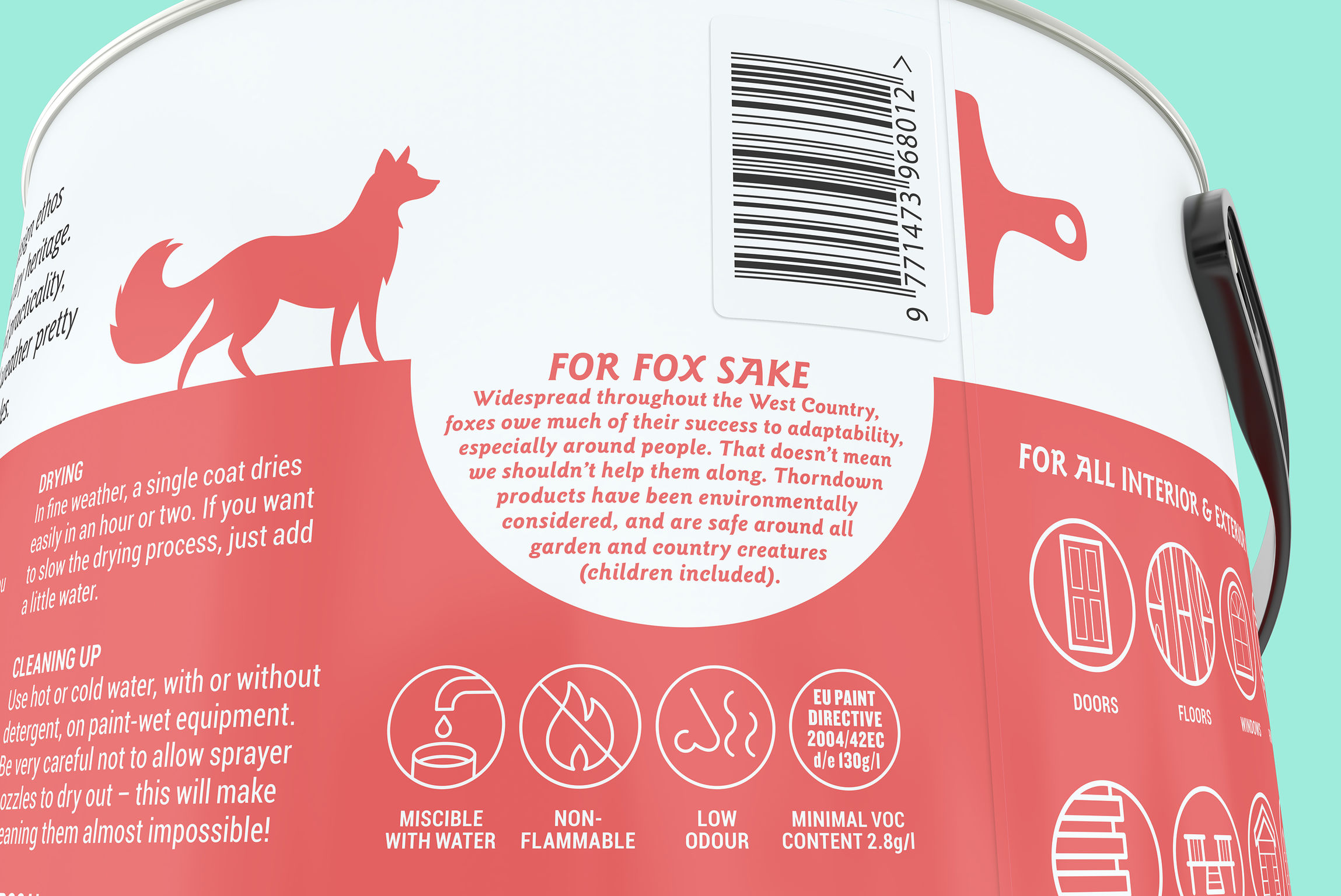
The challenge was to create a distinctive packaging solution for a new outdoor paint brand competing in an over-crowded, functional and undifferentiated category, on a start-up budget. Inspired by the UK’s scenic West Country, the brand combines pragmatism with witty flair. Creative, local wildlife imagery represents paint variants, builds emotional appeal and reinforce eco-credentials. A local copywriter ensured language authenticity. A distinctive, easier-to-use tin shape was also developed, without adding to COGs.
Date of Launch
2017
Development Time
up to 12 months
Target Regions
Europe
Target Groups
Consumer / User, Trade / Industry
