

THREE LEAFS PACKAGING
Tea packaging
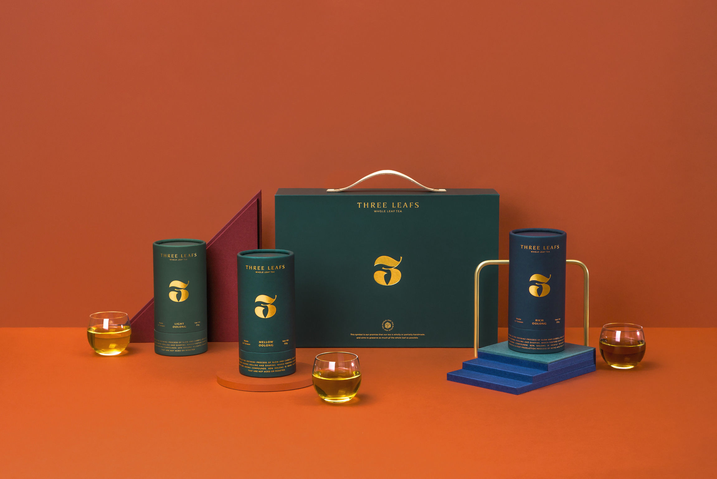
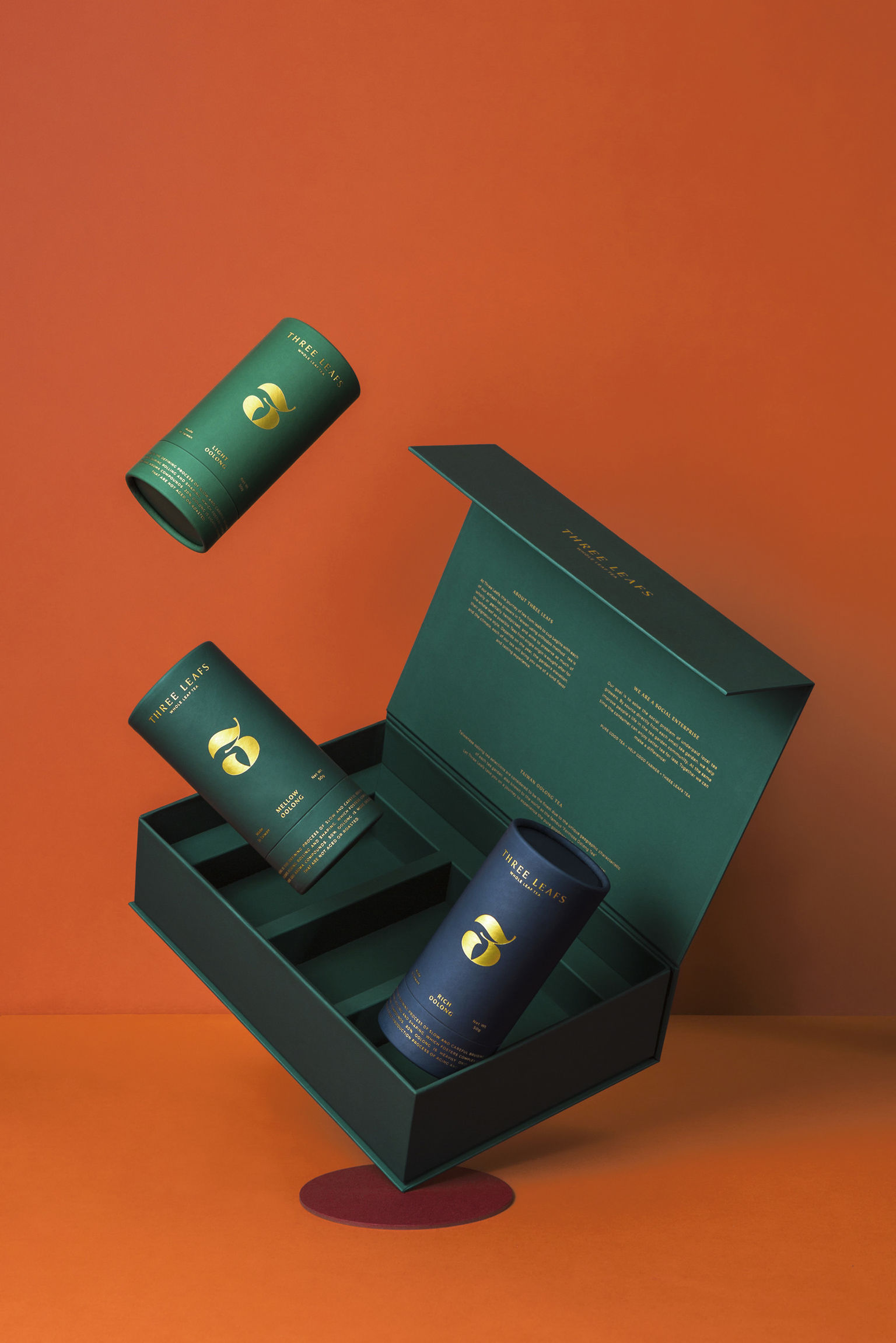
THREE LEAFS Co.Three Leafs aims to introduce the best Taiwanese tea to the world. The designers chose an international digital symbol as the main brand identity of Three Leafs, conveying the message about a single tip with three-leaves. The shape of the blade is framed into a "3" symbol with tree leaves and the number "3" combined. The full and rounded outline depicts the spirit of Three Leafs, interpreting the excellent quality of the whole leaf, and the extended leaf branches representing their intention to retain the intact leaves. Three Leafs presents the very best of Taiwan's Oolong tea in different tea boxes.
Date of Launch
2017
Development Time
up to 12 months
Target Regions
Asia
Target Groups
Consumer / User
