

Tiger Basic
Typography
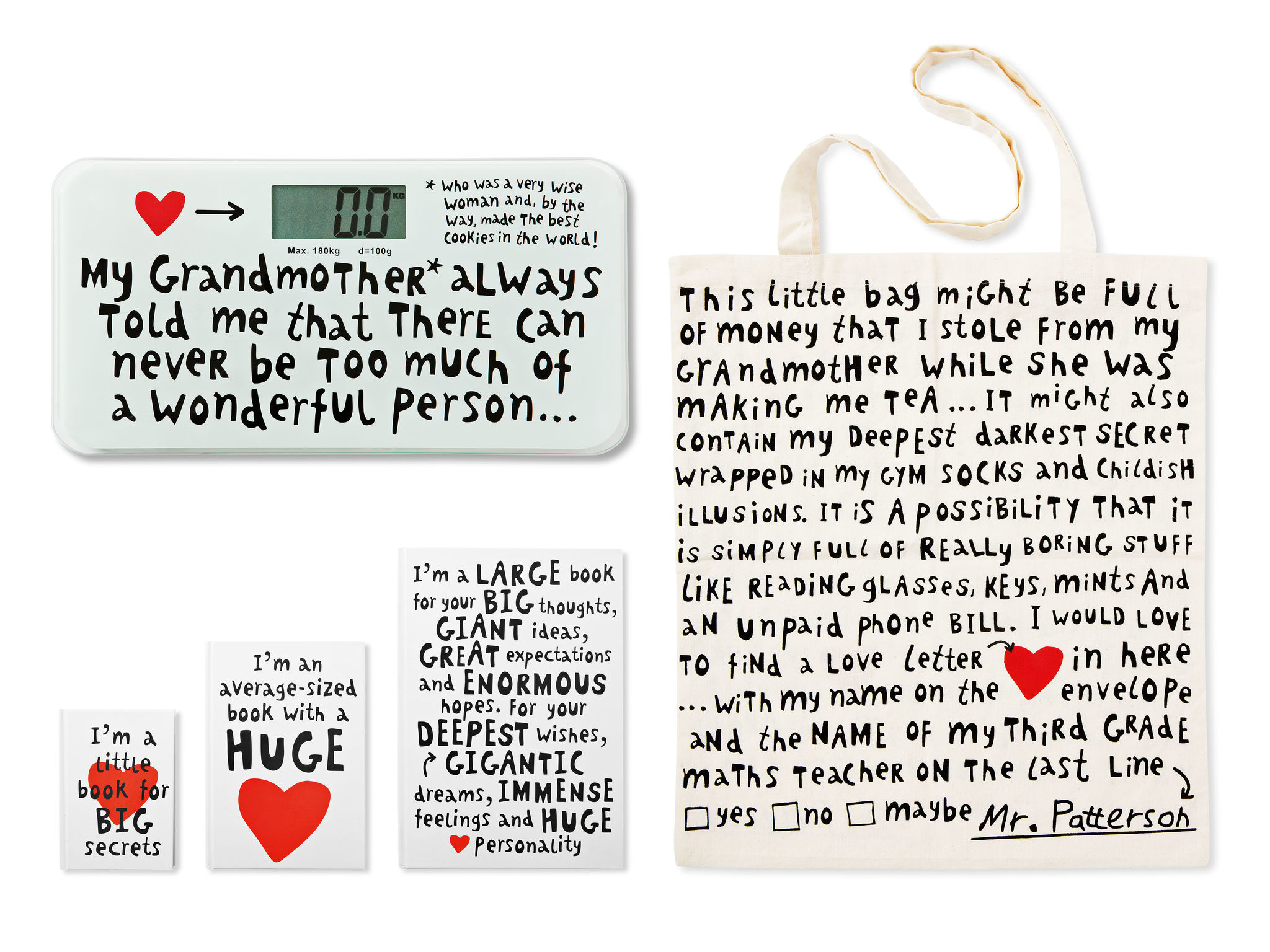
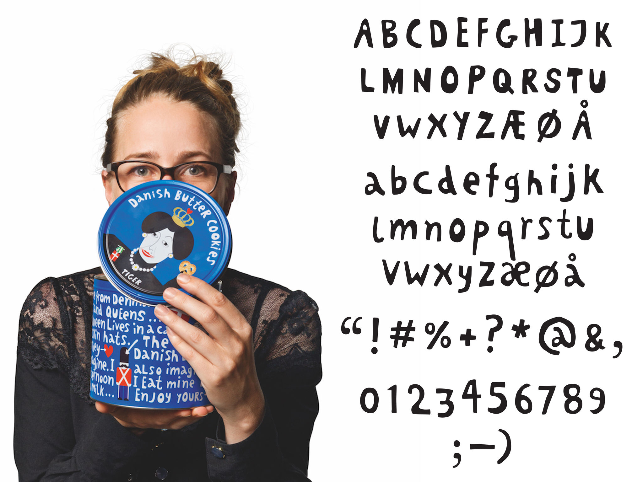
Flying Tiger Copenhagen Zebra A / STiger Basic: with Tiger Basic we wanted to create a font that reflects and reinforces Flying Tiger Copenhagen’s own unique personality – lighthearted, playful, friendly and inviting. Initially the font was created only to give certain products a greater sense of uniqueness and personality. Today, besides being used on products, it is also used in marketing materials and for pop-out words and expressions where products speak directly to consumers. The font emphasizes the quirkiness of our products, designs and the company behind. It is playful without being childish. It is humorous without being funny. And people immediately associate it with the brand
Client / Manufacturer Design

Flying Tiger Copenhagen Zebra A / S
Copenhagen, DK
Flying Tiger Copenhagen Zebra A / S
Copenhagen, DKDate of Launch
2014
Development Time
up to 12 months
Target Regions
Asia, Australia/Oceania, Europe, North America
Target Groups
Consumer / User