


TRIDKINGDOM Rebranding
Educational branding
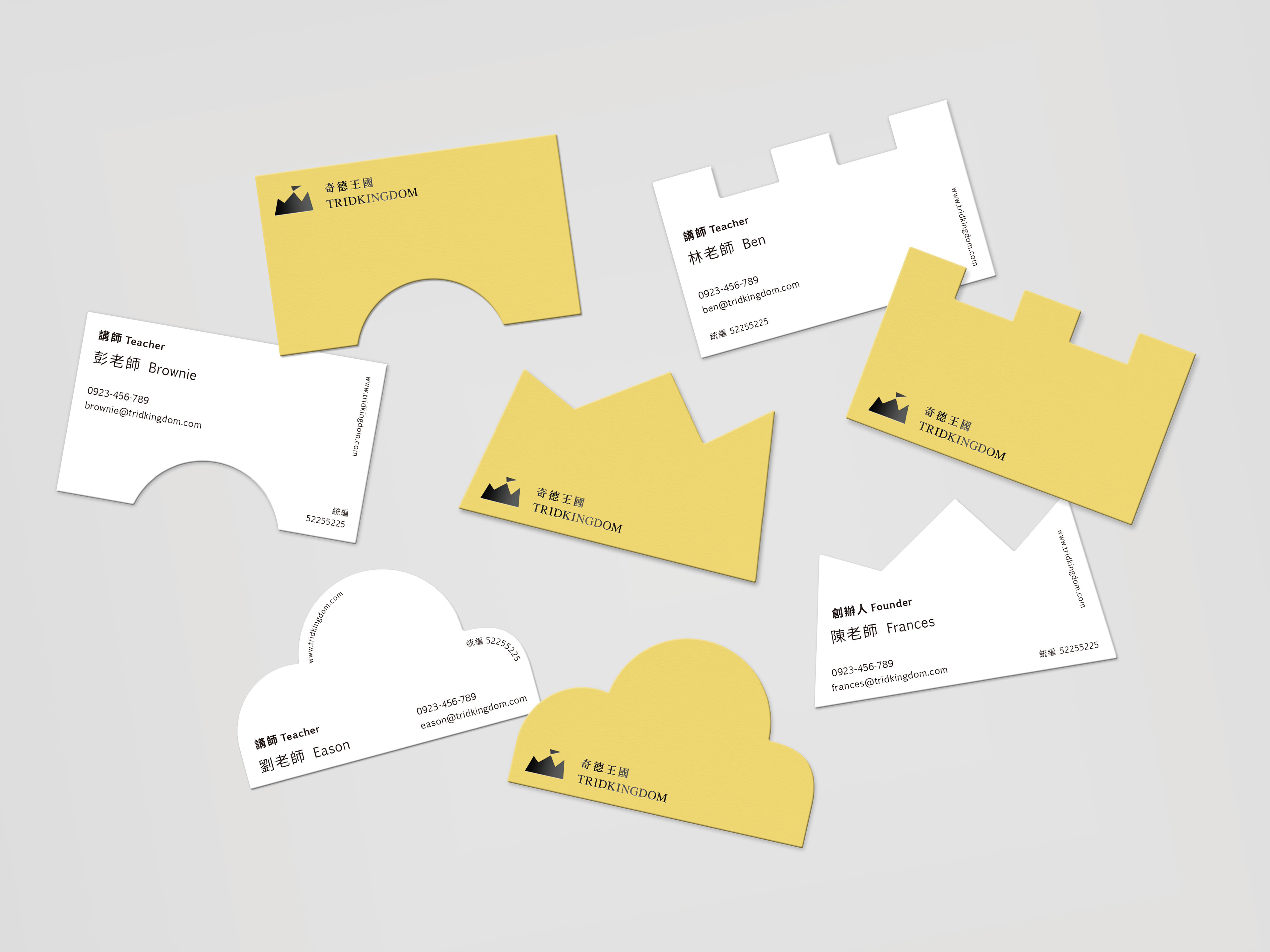
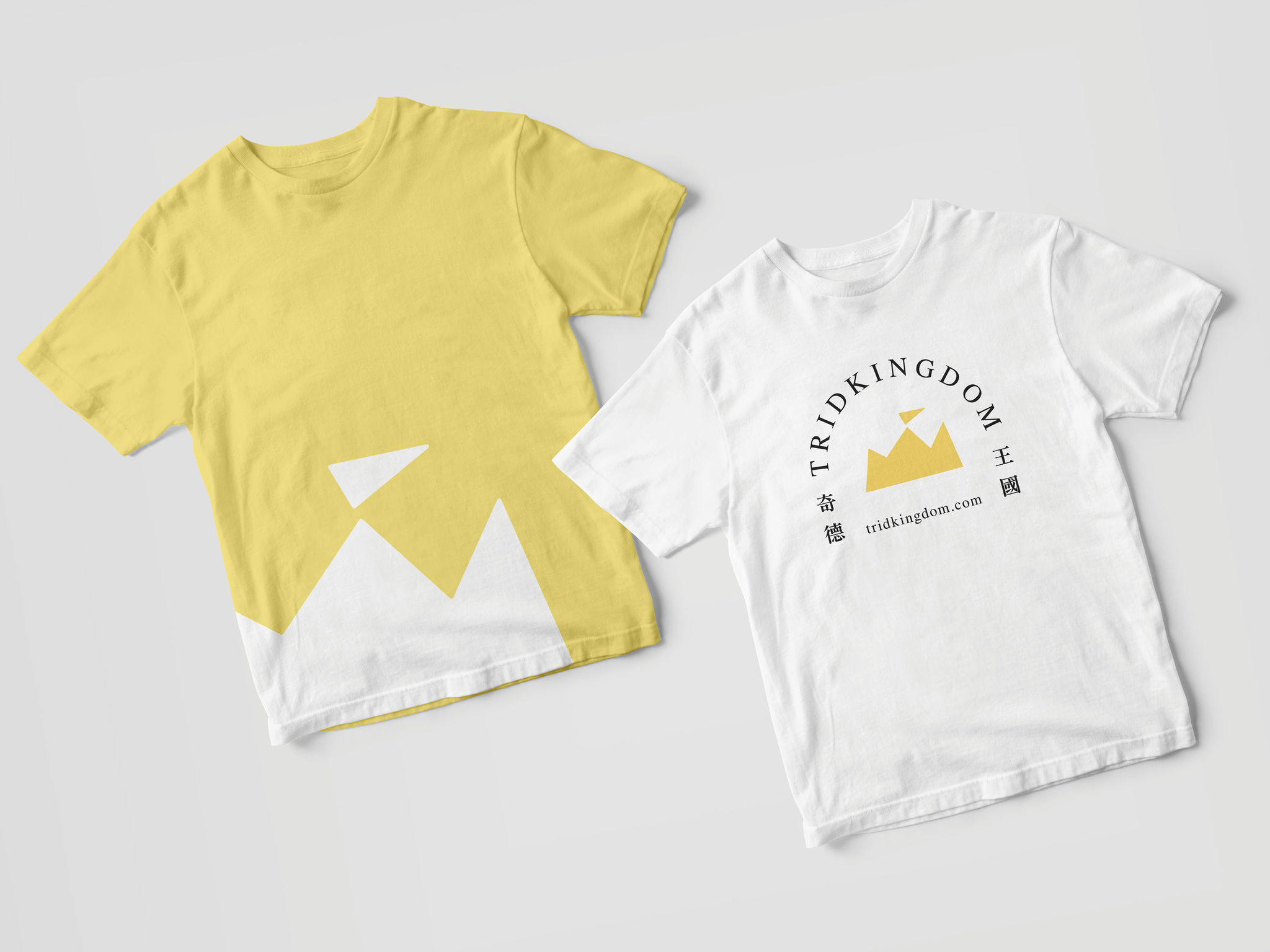
TRIDKINGDOM is an educational institution that offers entrepreneurship programs for kids. While rebranding, we keep the crown and the kingdom, which are two essential elements from the original logo representing not only the founder's mindset at the beginning but also the linkage to existing customers. To solve the previous application problem of multiple colors, we use the bright royal yellow to build a warm and soft atmosphere that keeps the brand at an advanced level yet attractive to all ages so both parents and kids can understand the brand's core value and thus feel secure about their professional programs.
Date of Launch
2020
Development Time
up to 12 months
Target Regions
Asia
Target Groups
Consumer / User