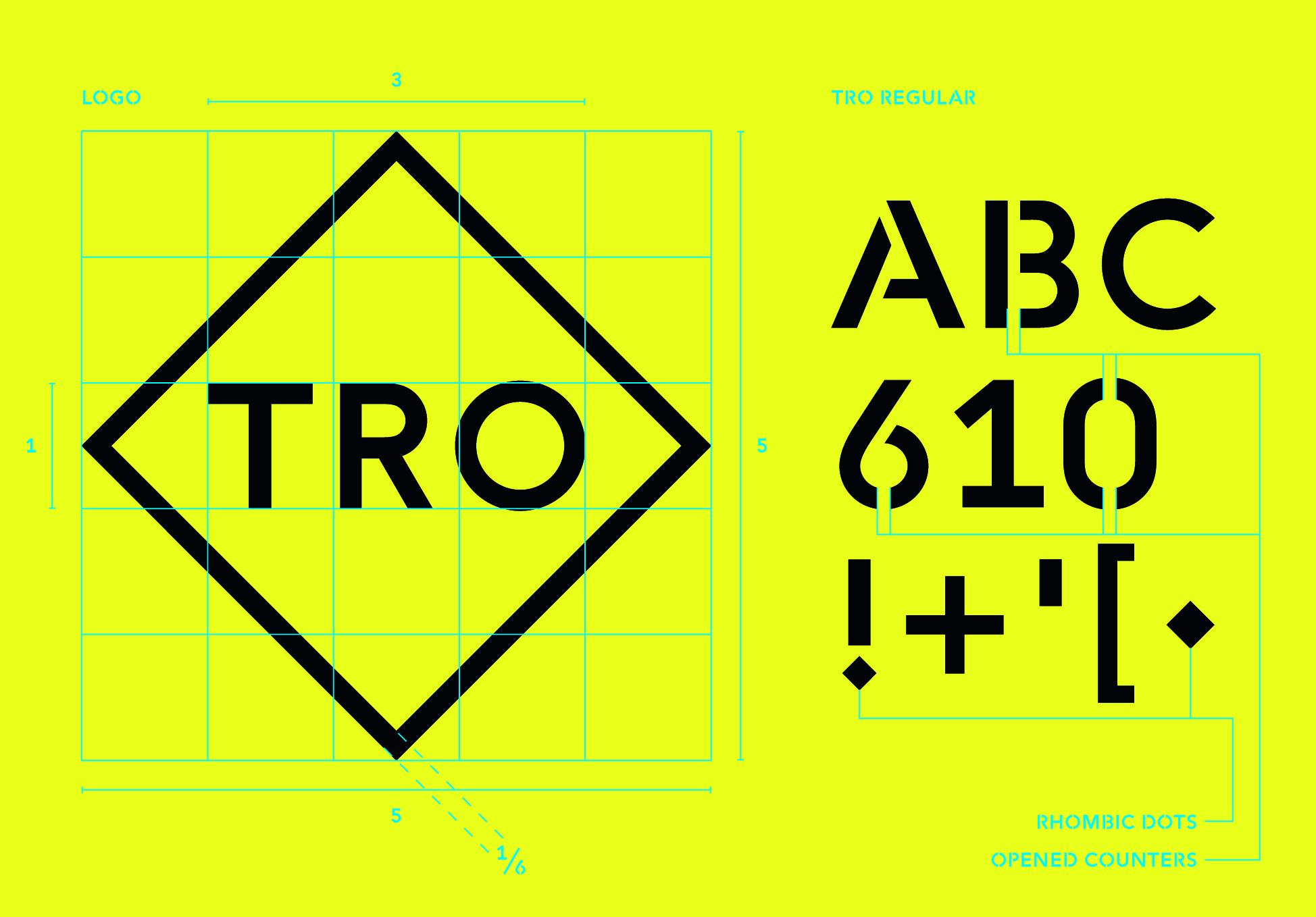
Cookies and the protection of your data

We use cookies to improve the functionality of the website, to offer you a better website experience and to provide social media features. You give your consent by clicking on “Accept all Cookies” or as part of your individual settings. Please find detailed information on the use of cookies on this website in our Data Privacy Statement.

Functional Cookies

These cookies are necessary for the operation of the site and enable security-relevant functions. In addition, we determine whether you want to remain logged in and to make our services available to you when you change between this and other websites.

Statistical Cookies

These cookies are used for analyzing user behavior on our website with the aim of improving user navigation. All data collected is evaluated anonymously. Further information is available on our data protection site.

Marketing Cookies

These cookies are used to deliver relevant advertising or to limit how many times you see an ad. Marketing cookies can share that information with the advertiser (third-party cookies). The legal basis for the data processing is the consent of the user.

TRO
TRO
TRO
TRO
2014

Share:

TRO

Corporate Design

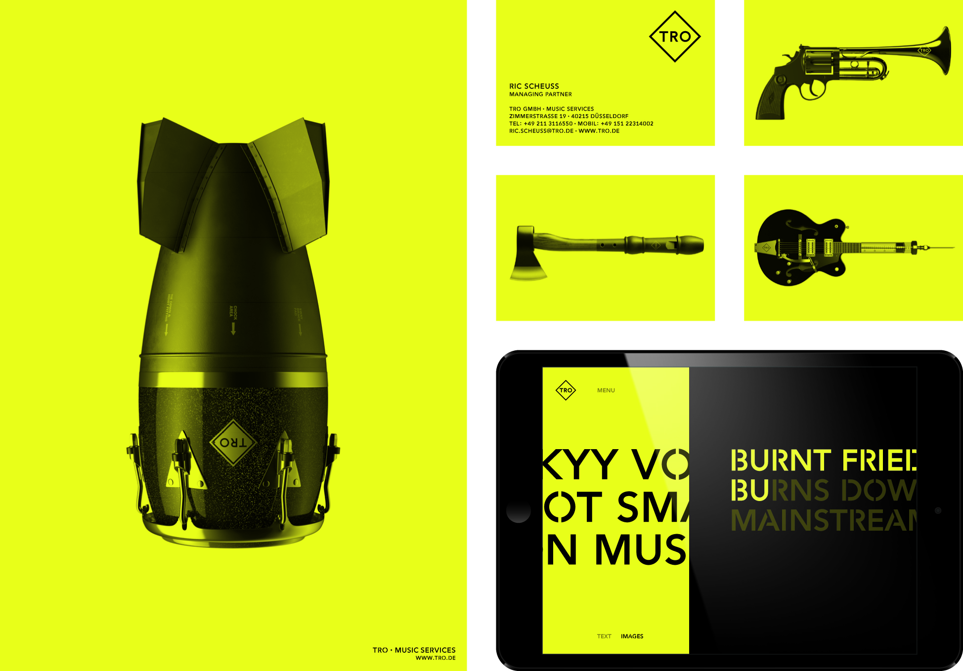
In the hands of audio and music producers TRO, music becomes a powerful means of communication – and can be used to help their clients achieve their strategic goals. The new Corporate Design brings this brand promise to life: “Dangerously effective music”. This provides a consistent basis for the trademark, typography, color scheme and imagery. The imagery is an important part of the visual identity. The basic idea of the formal connection between musical instruments and dangerous objects becomes a metaphor for the “dangerously effective” potential of music.

iF Gold Statement

The corporate design of TRO lives from its fantastic bold colour scheme and images, which are so strong that a headline or explanation is not needed. The connection of musician instruments and weapons puts music in the context of power and impact. It is an aesthetic and sensational experience. The images are worked so well that the two objects almost look as one piece. The concept is absolutely consistent and a very self-conscious statement of the company.
Client / Manufacturer

TRO GmbH

Düsseldorf, DE
Design
KW43 BRANDDESIGN

KW43 BRANDDESIGN

Düsseldorf, DE

RELATED PROJECTS