Visual design of xijingyu ancient village brand
Visual design
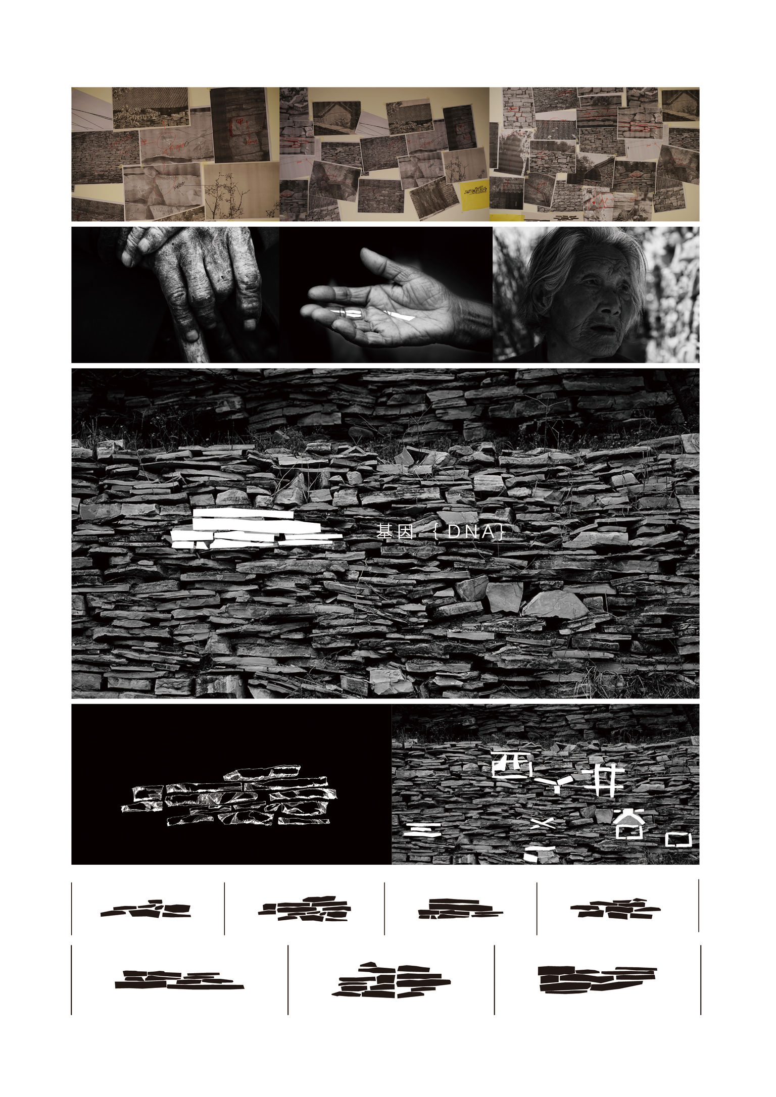
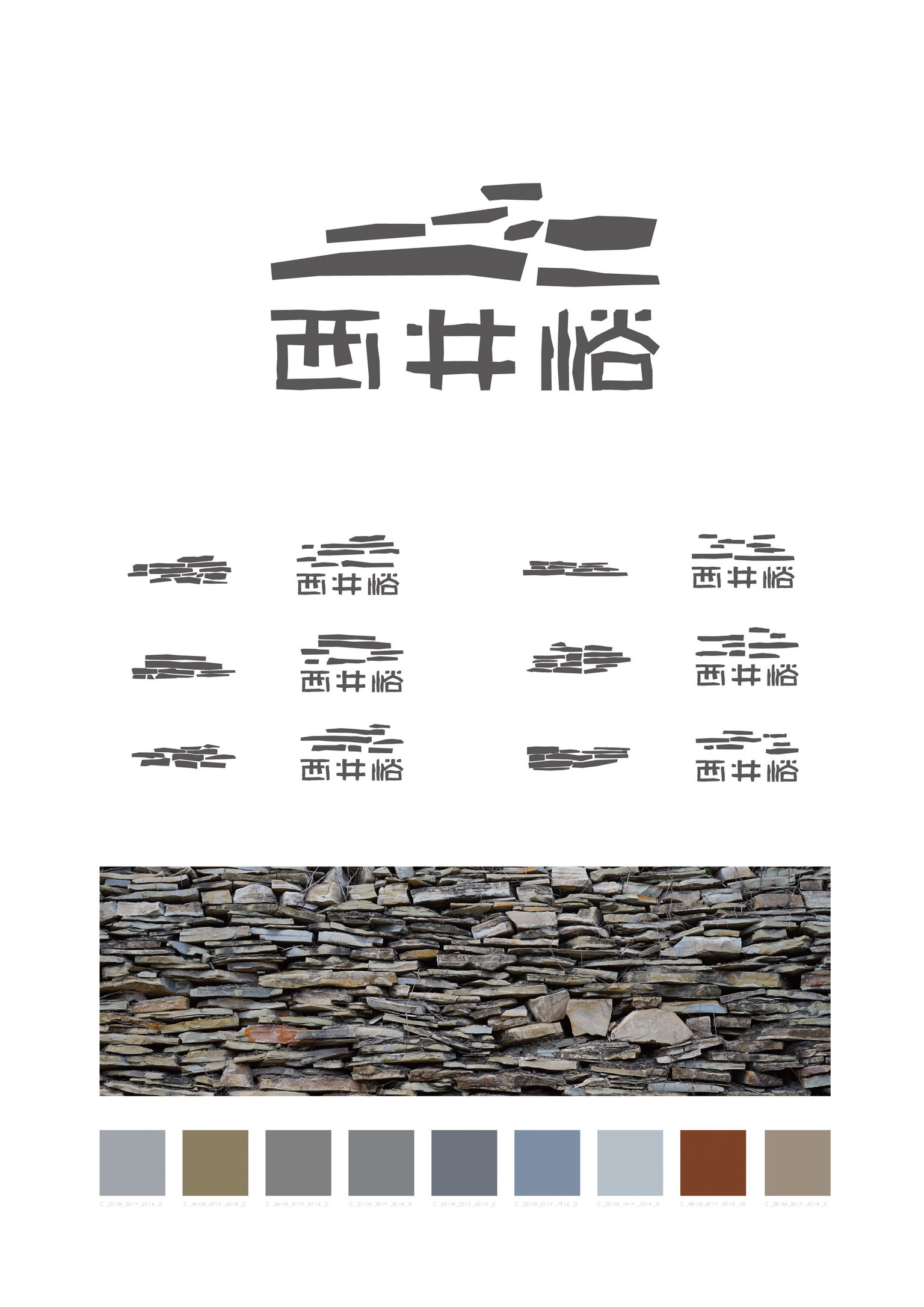
The typeface used for the logo of the ancient village of Xi Jing Yu are based on the shapes of rocks that combine to form a unified, creative whole. People recognize the typical rock structures of Xi Jing Yu. Using sectional shapes of rock wall in the typeface is a subtle, creative way to create strong brand recognition. The color of the typeface elements, light grey, also borrows from the typical color of rocks. These logo elements can also be rearranged without breaking the flow of the overall visual design. The many uses of these shapes bring the logo to life and can also be easily varied to create many interesting effects.
Client / ManufacturerDesign
NINESAGE TOURISM WWS (BEIJING) CULTURAL PROPAGATION CO., LTD.
Tianjin, CNWWS (BEIJING) CULTURAL PROPAGATION CO., LTD.
Tianjin, CNDate of Launch
2017
Development Time
13 - 24 months
Target Regions
Asia
Target Groups
Consumer / User, Public Sector / Government