Vorwerk Icons
Launch Campaign
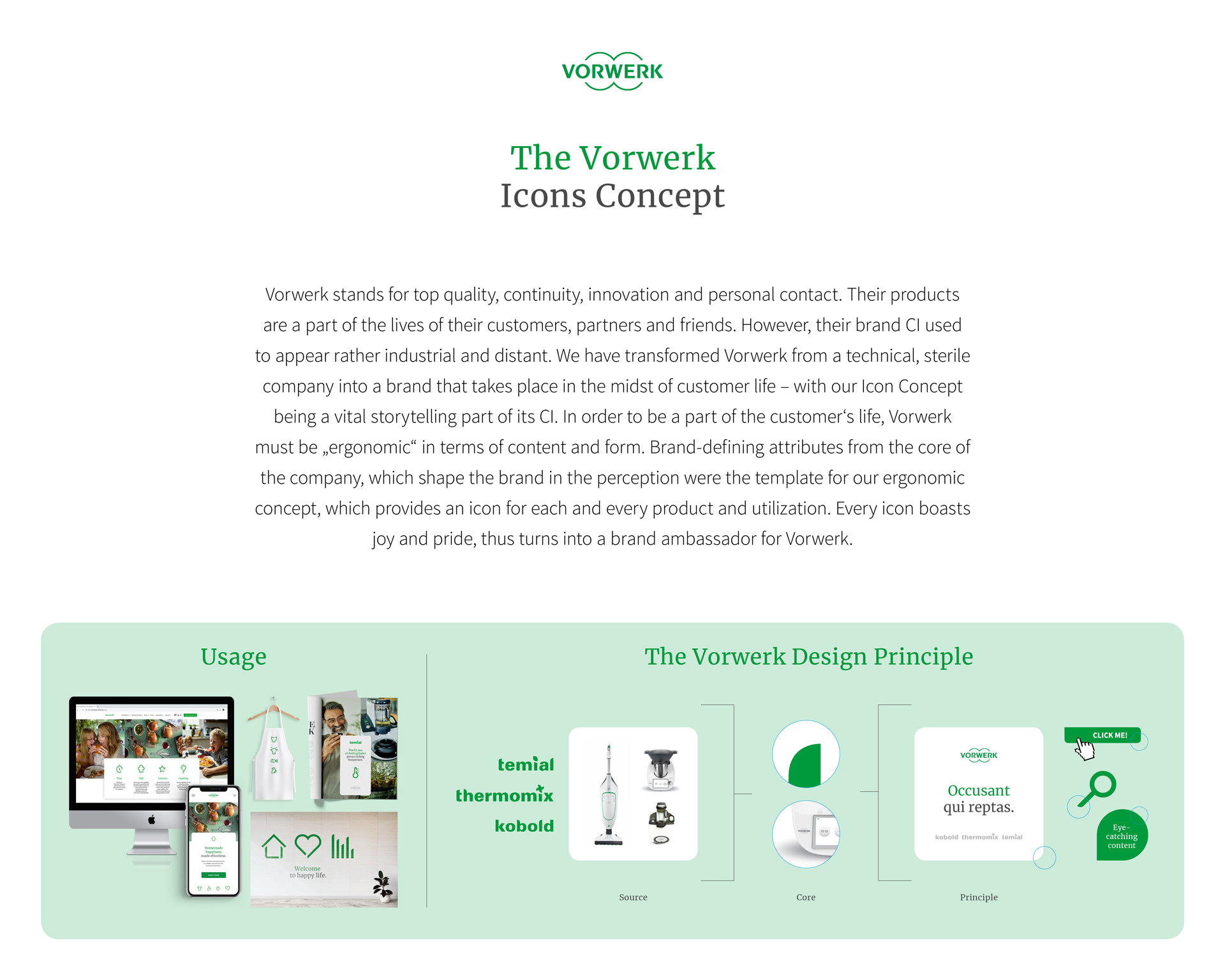
Vorwerk stands for top quality, continuity, innovation and personal contact. However, their brand corporate identity used to appear rather industrial and distant. We have transformed Vorwerk from a technical, sterile company into a brand that takes place in the midst of customer life – with our Icon Concept being a vital storytelling part of its CI. In order to be a part of the customer‘s life, Vorwerk must be "ergonomic" in terms of content and form. Brand-defining attributes from the core of the company which shape the brand perception, were the template for our ergonomic concept, which provides an icon for each and every product and utilization.
Client / ManufacturerDesign
Vorwerk International Strecker & Co
Freienbach, CHSERVICEPLAN GERMANY
München, DEDate of Launch
2019
Development Time
up to 12 months
Target Regions
Africa, Asia, Australia / Oceania, Europe, North America, South America
Target Groups
Consumer / User, Trade / Industry