

VROONG Brand Identity & Experience Design
Brand Identity & Experience Design
Meshkorea
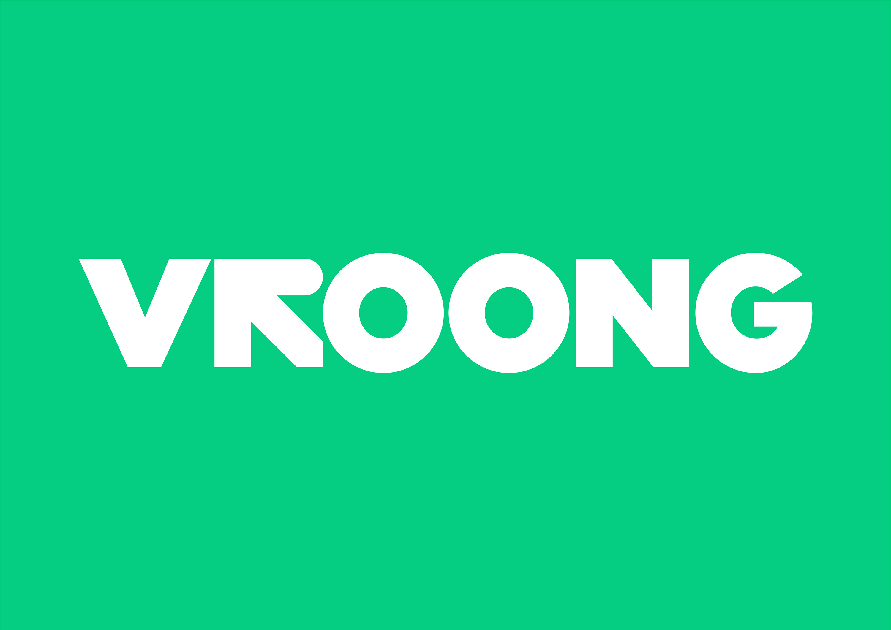
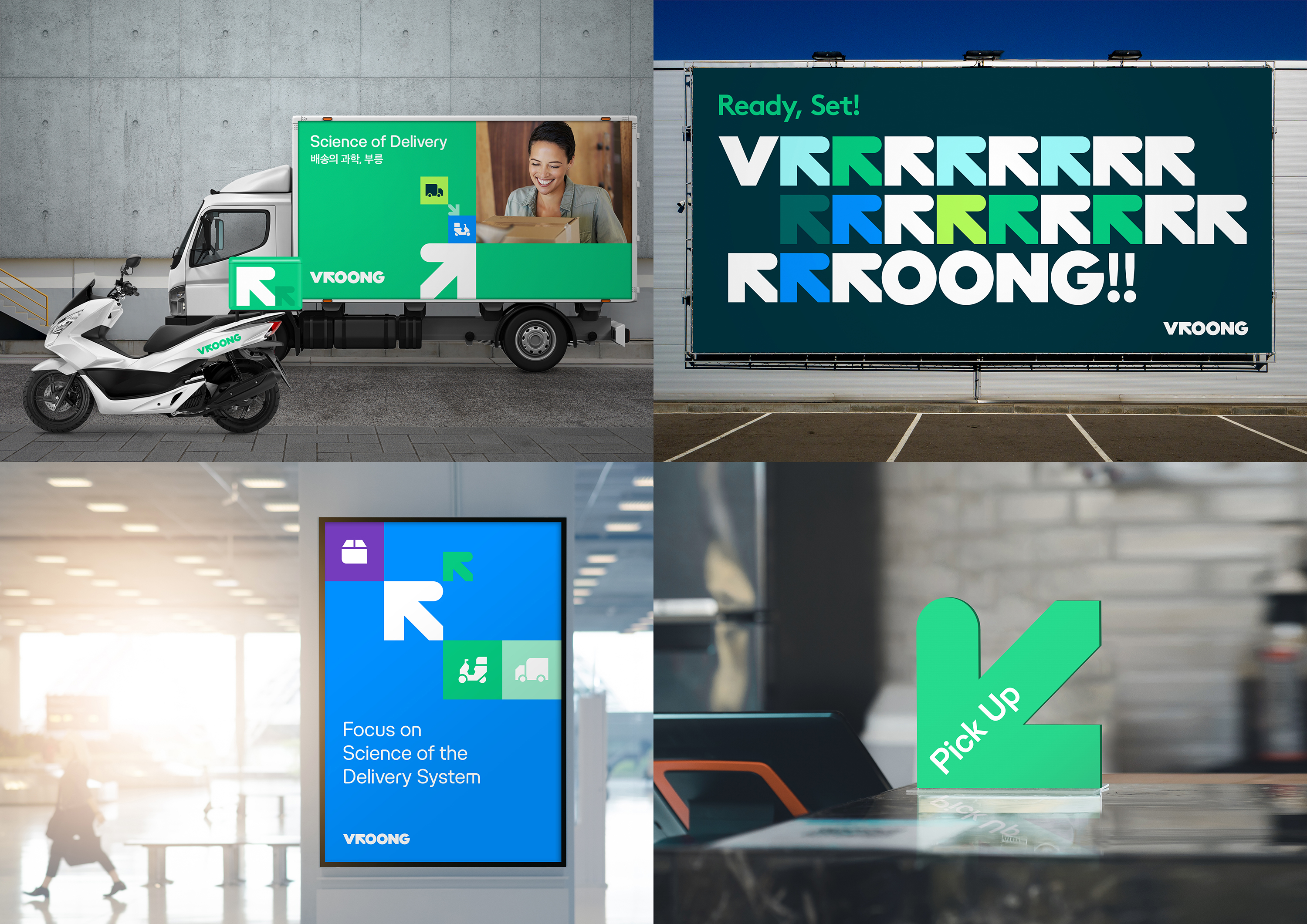
Vroong is a promising startup providing customized logistics services via a hub-and spoke-delivery system from urban logistics centers, and powered by an algorithm-based solution. Vroong is an onomatopoetic expression of starting an engine. The word mark 'Vroong' is designed to boost attention and reference the brand story by replacing the 'R' with an arrow. The arrow motif in turn represents a starting point, direction, and movement. Human skill is complemented by an efficient data-based system. The arrow also symbolizes the perfect blend of route and mobility.
Date of Launch
2019
Development Time
up to 12 months
Target Regions
Specific country/region: Republic of Korea
Target Groups
Consumer / User, Trade / Industry
