


walk&rest rebranding design (FMCG)
Rebranding
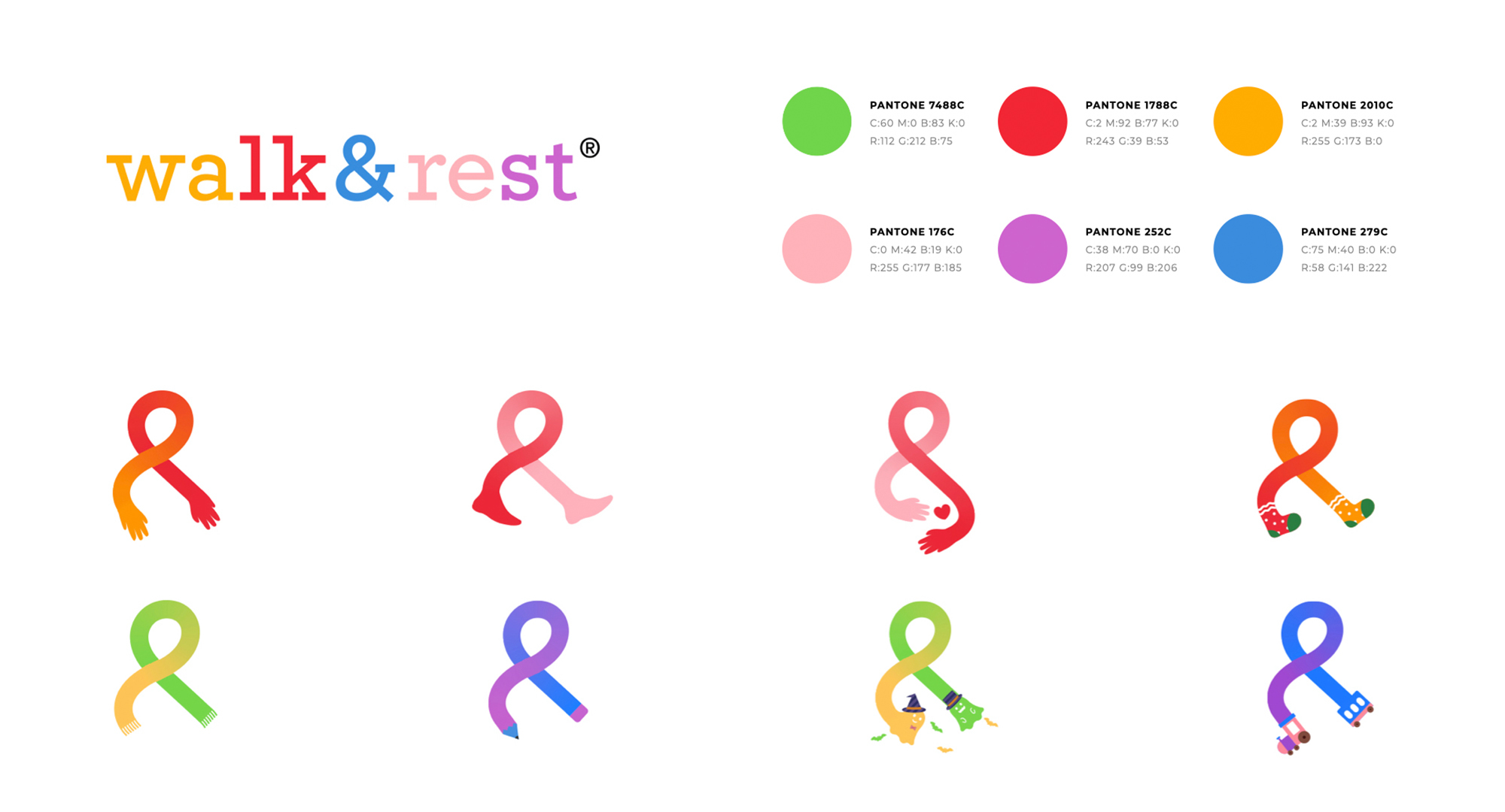
Due to regional culture differences, when it first entered the Chinese market, walk&rest could not establish an emotional resonance with its main target consumers in China. This was our attempt to correct the deficiency. First, we established a set of interesting symbolic systems, and extracted the super symbol "&" from the spelling of walk&rest, which also has a brand visual association that represents companionship. Through the combination of the color system and the visual symbol system, we adopted a relaxed and free pattern of graphic extension to form a strong brand impression, express a strong brand emotion, and accurately convey the brand message.
Client / ManufacturerDesign
walk&rest China
Shenzhen, CNHauns branding design and strategy Ltd.
Shanghai, CNDate of Launch
2020
Development Time
up to 12 months
Target Regions
Asia
Target Groups
Consumer / User