

Wonderlab
Food packaging
Wonderlab
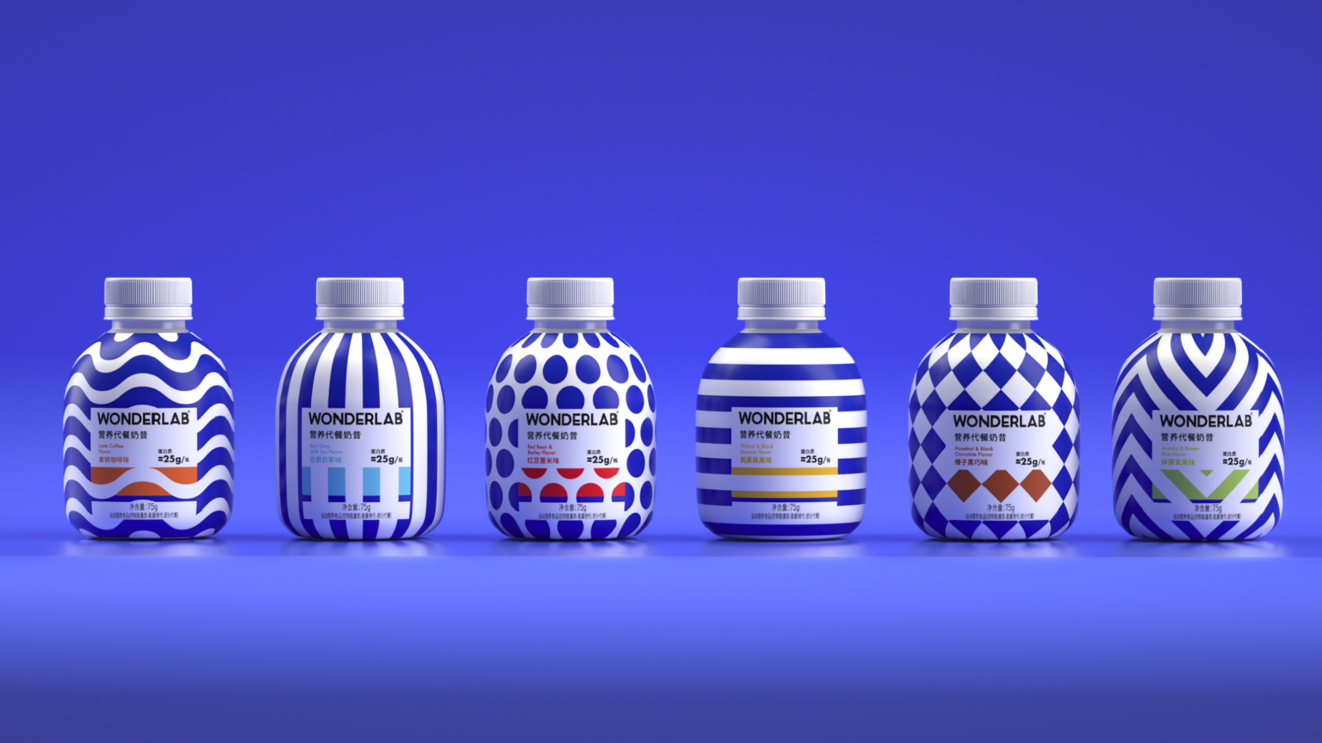
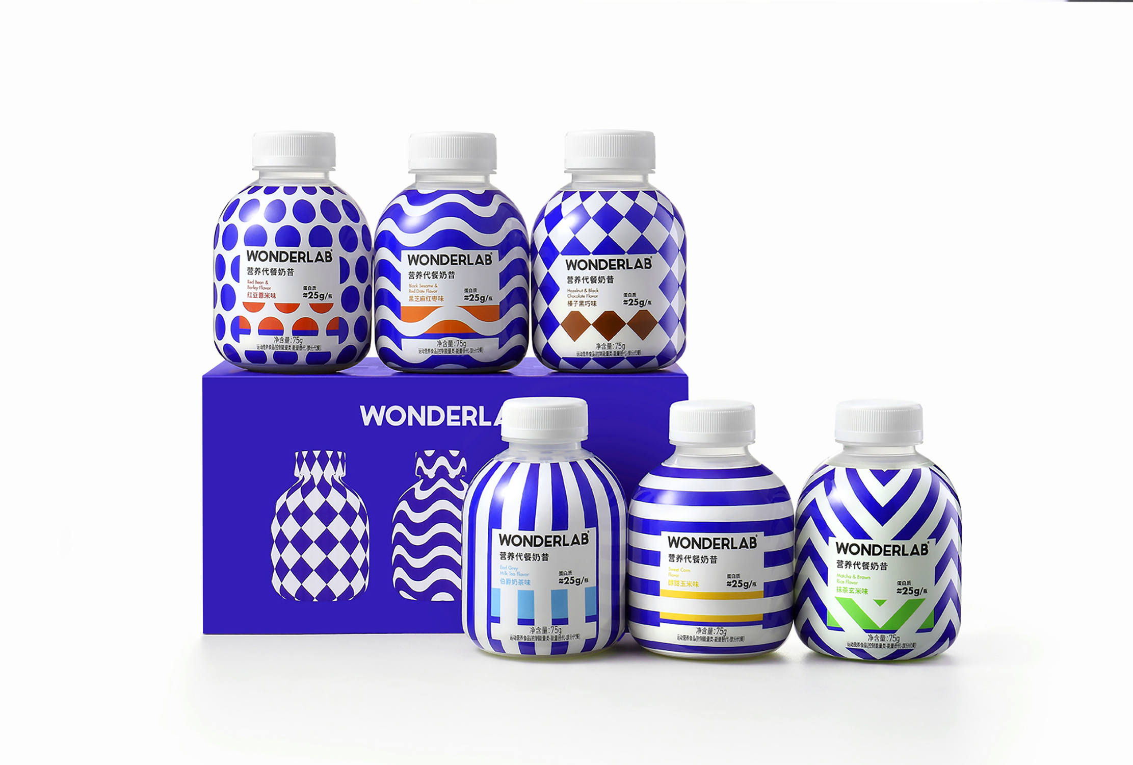
This packaging disrupts typical food branding. "Wonder" refers to the power of imagination, while "Lab" represents science. This design applies the artistic techniques of "magic geometry" to create a visual impact that inspires and stimulates the consumer. The variable geometric shapes suggest rationality while the bright colors and playfully squat bottle form suggest imagination.
iF Gold Statement
This packaging is a great example of how branding and strong visual design can make a product stand out on the shelf. As a milkshake substitute the product needed to suggest dairy while avoiding confusion. The color and patterning disrupt the category norms, while the iconic shape of the bottle subtly suggests the contents within. A design full of fun and optimism.
Client / ManufacturerDesign
Wonderlab
Shenzhen, CNE2W Studio
Shanghai, CNDate of Launch
2020
Development Time
Other duration
Target Regions
Asia
Target Groups
Consumer / User