Wuyi Rock Tea·Da Hong Pao
Tea packaging
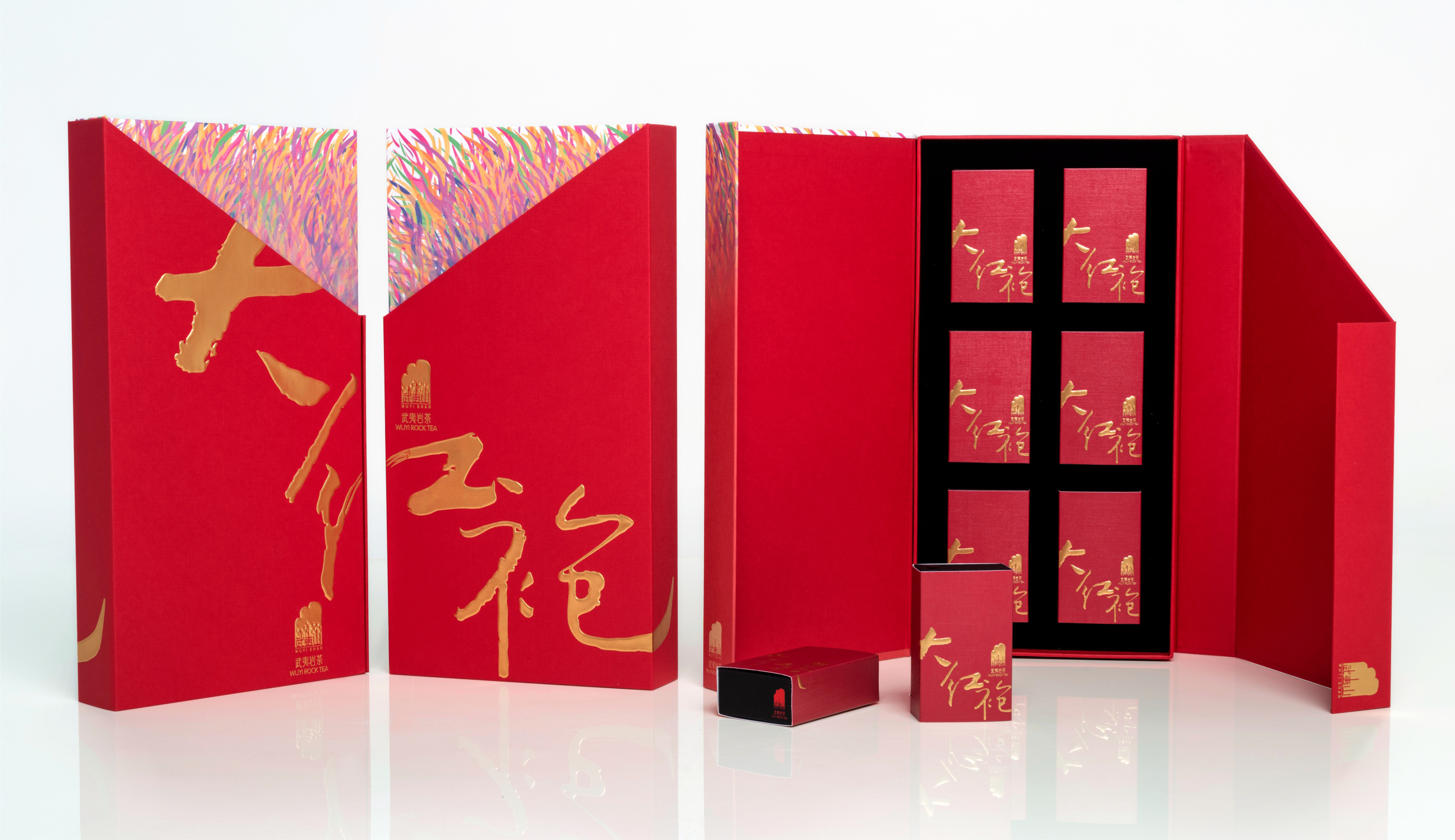
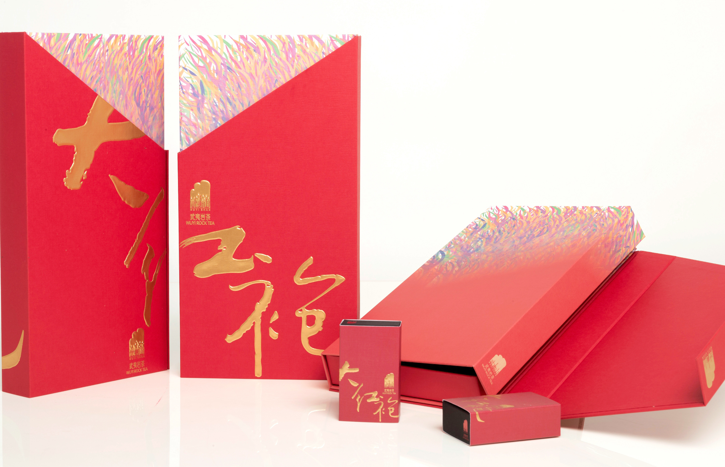
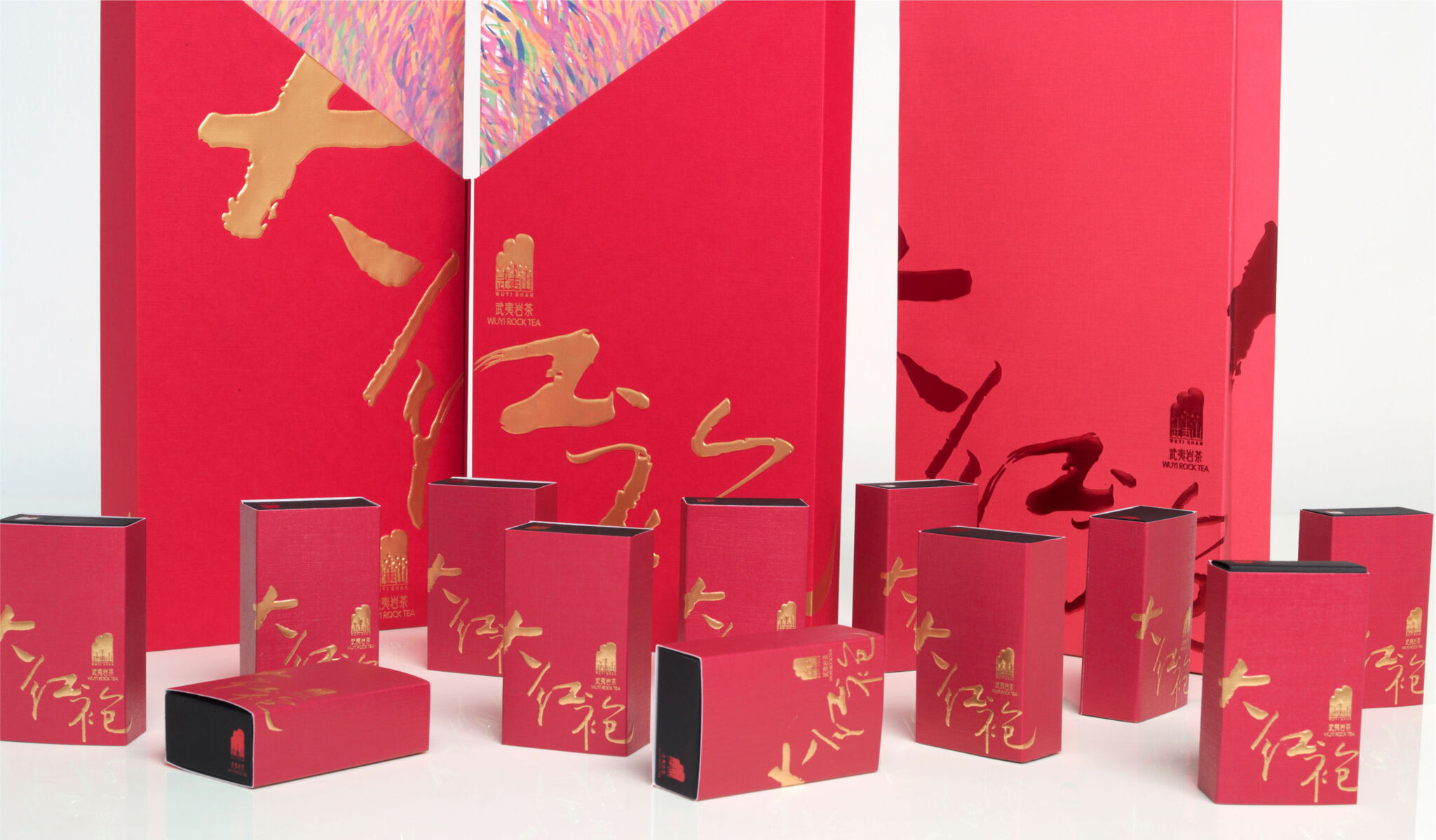
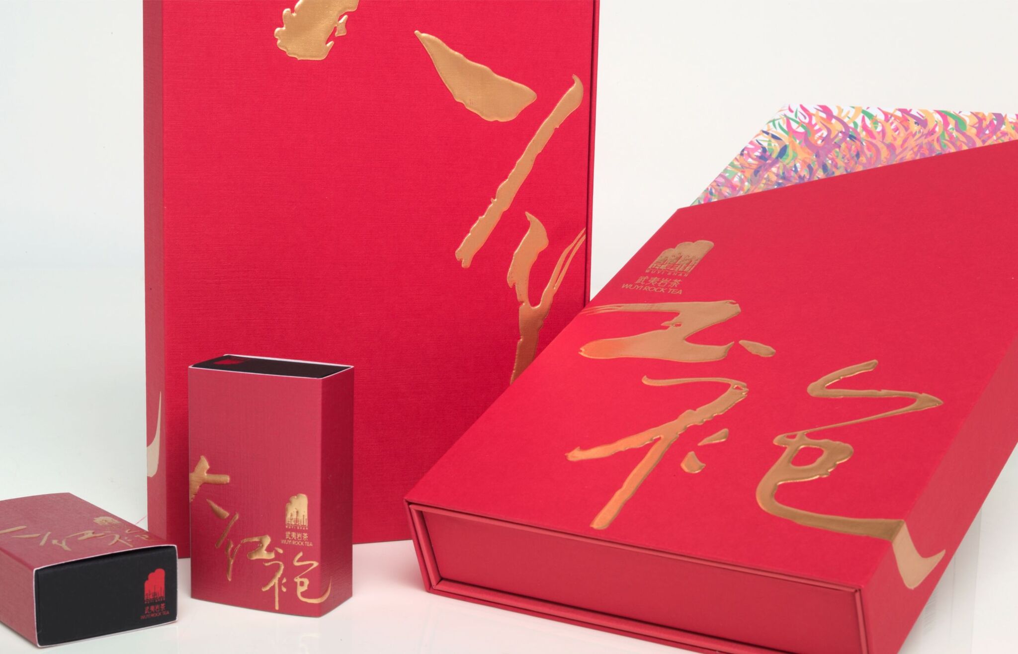
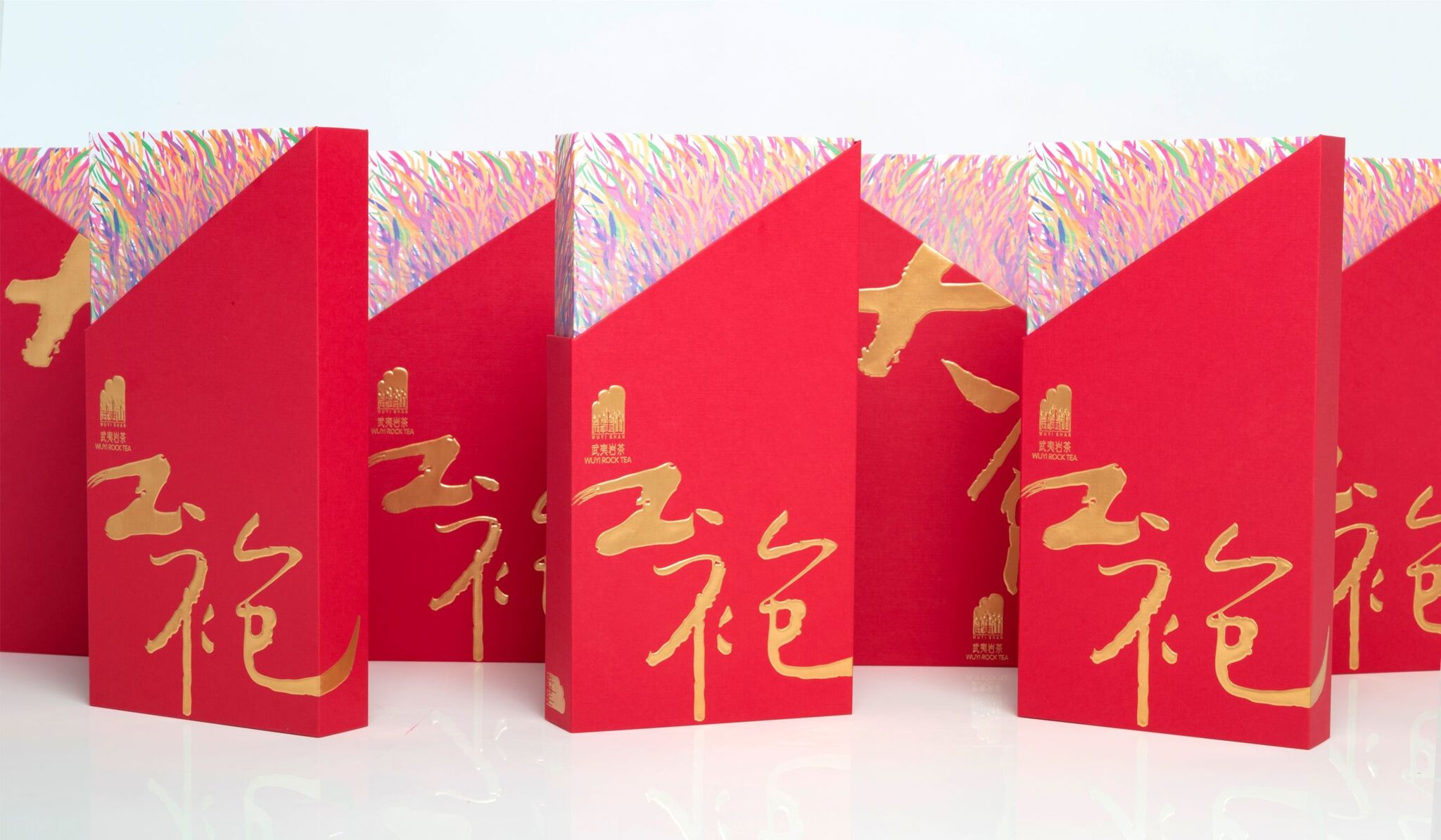
The overall outer package is primarily red with a calligraphy font in gold that forms the brand name "Da Hong Pao" when two packages are set up side by side. The box is easy to open and resembles opening a red robe. A linear pattern represents the unique texture and veins of tea leaves. The packaging material is environmental and can be reused sustainably. The simple, beautiful design expresses integrity and gives the product strong brand recognition that makes a strong visual impact in retail.
Client / ManufacturerDesign
JingChengFuDi
Fuzhou, CNZhongshan Torch Polytechnic Miaohua Chen Master Studio
Zhongshan, CNDate of Launch
2020
Development Time
up to 12 months
Target Regions
Asia
Target Groups
Consumer / User