


Wuyi rock tea·five-element of series
Tea packaging
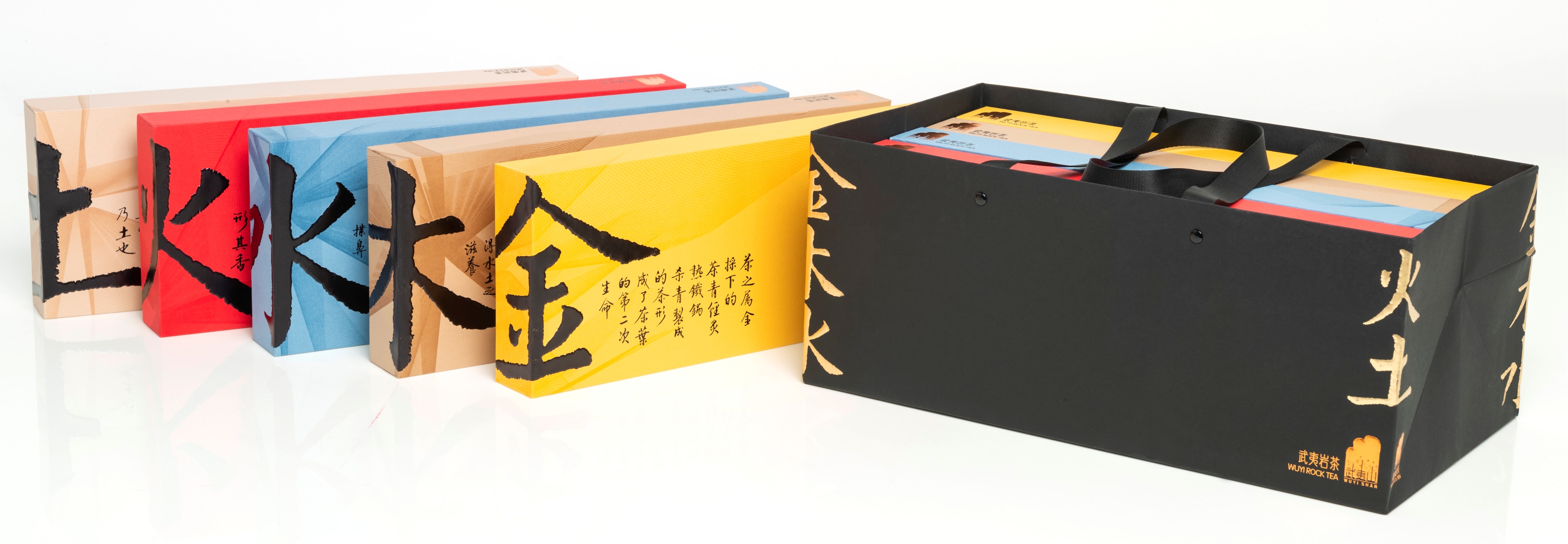
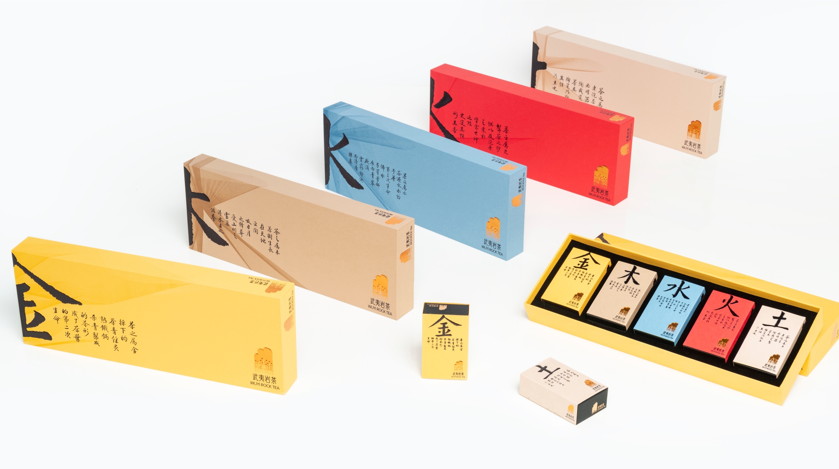
This packaging design combines tea culture and the five natural elements by using a color palette to express these elements' attributes. Yellow corresponds to gold, brown represents wood, blue stands for water, red means fire, and tan symbolizes earth. The packaging design expresses traditional cultural values but with a contemporary flair. The boxes are made of sustainable recycled materials, formed into beautiful shapes, and imprinted with rich graphics. The oversized calligraphy in the labeling continues the theme of traditional culture but with a modern twist.
Client / ManufacturerDesign
JingChengFuDi
Fuzhou, CNZhongshan Torch Polytechnic Miaohua Chen Master Studio
Zhongshan, CNDate of Launch
2020
Development Time
up to 12 months
Target Regions
Asia
Target Groups
Consumer / User