YOUTH INNOVATIVE DESIGN FESTIVAL
Brand Identification
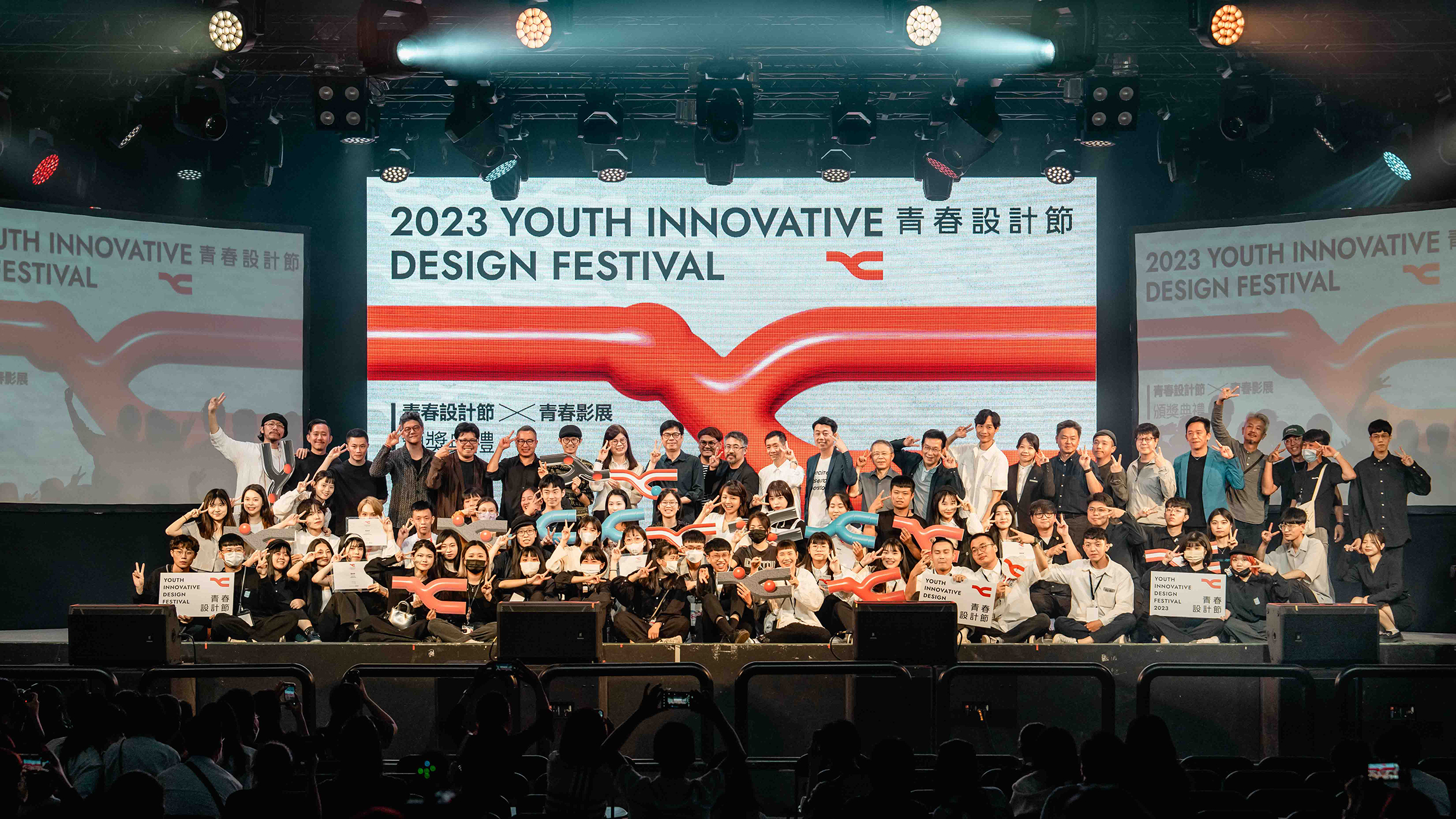
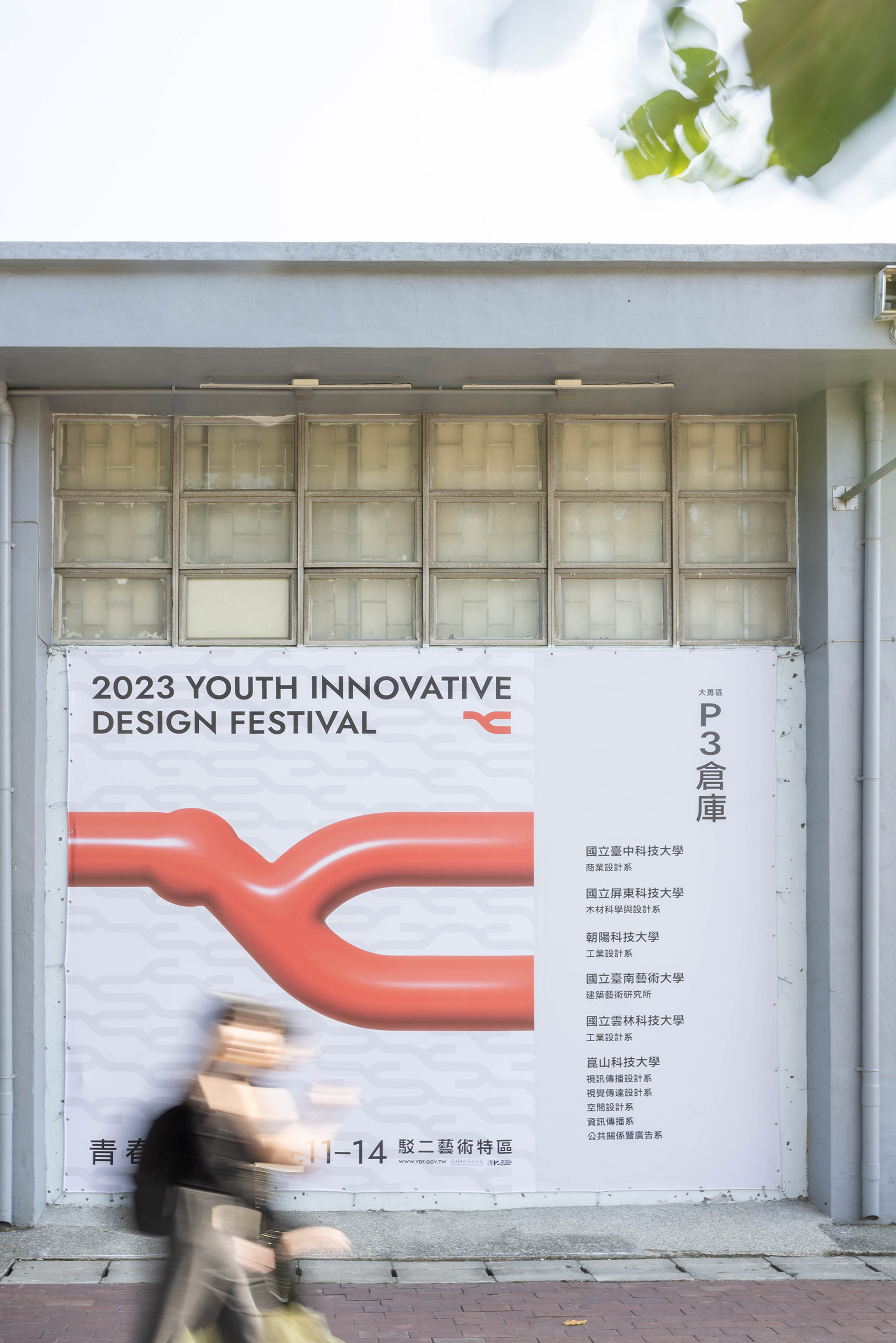
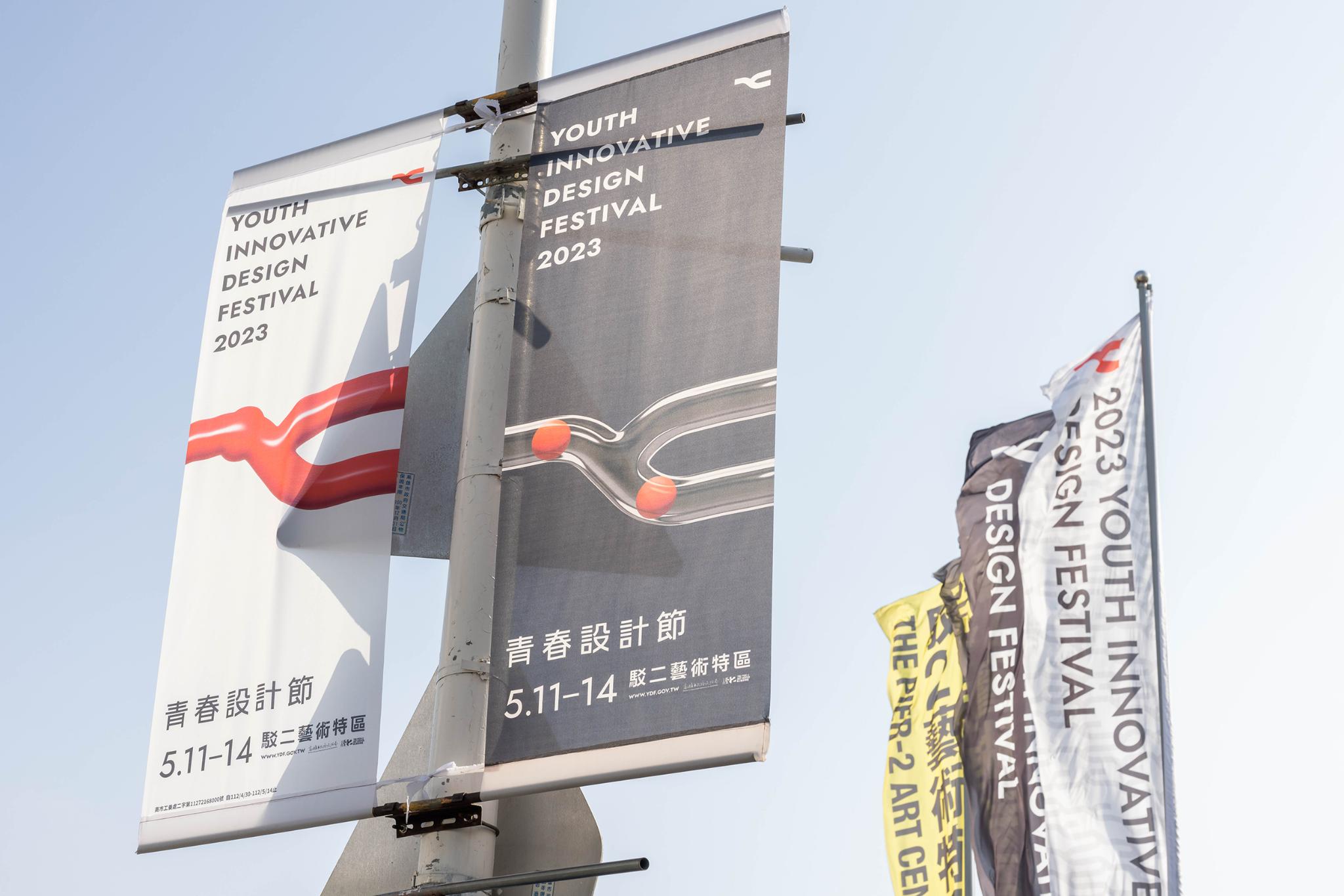
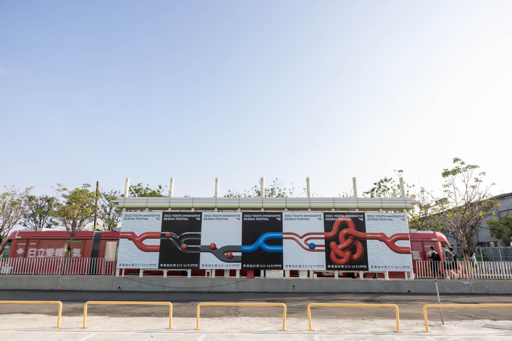
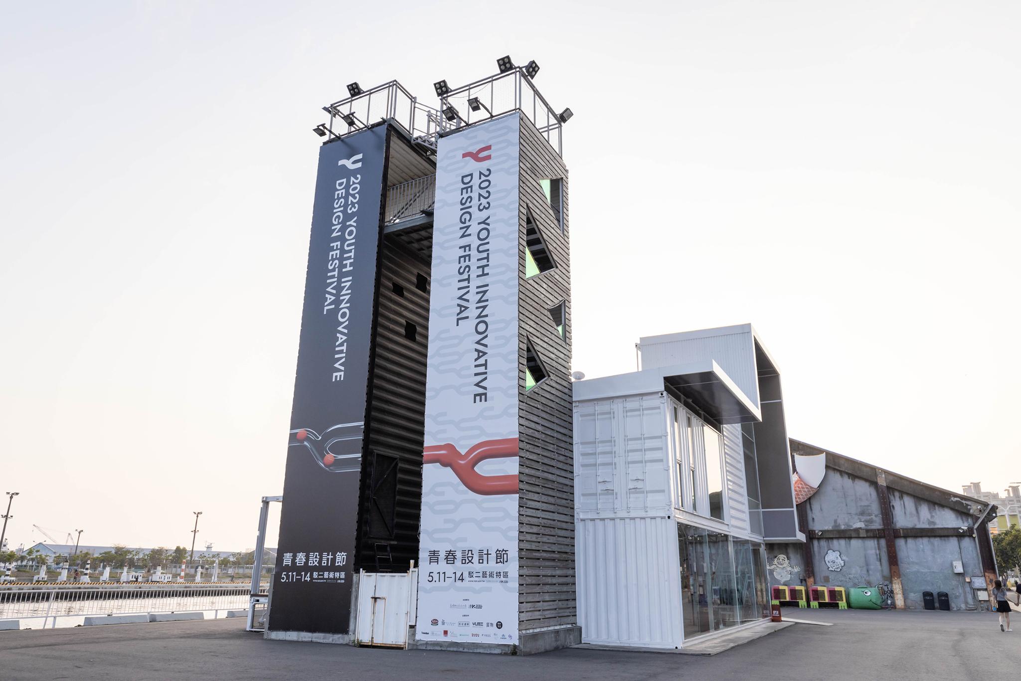
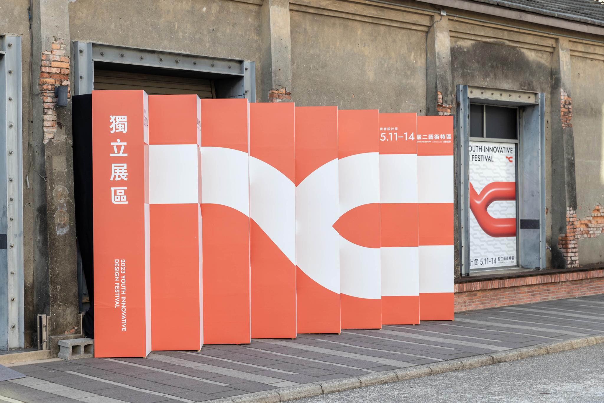
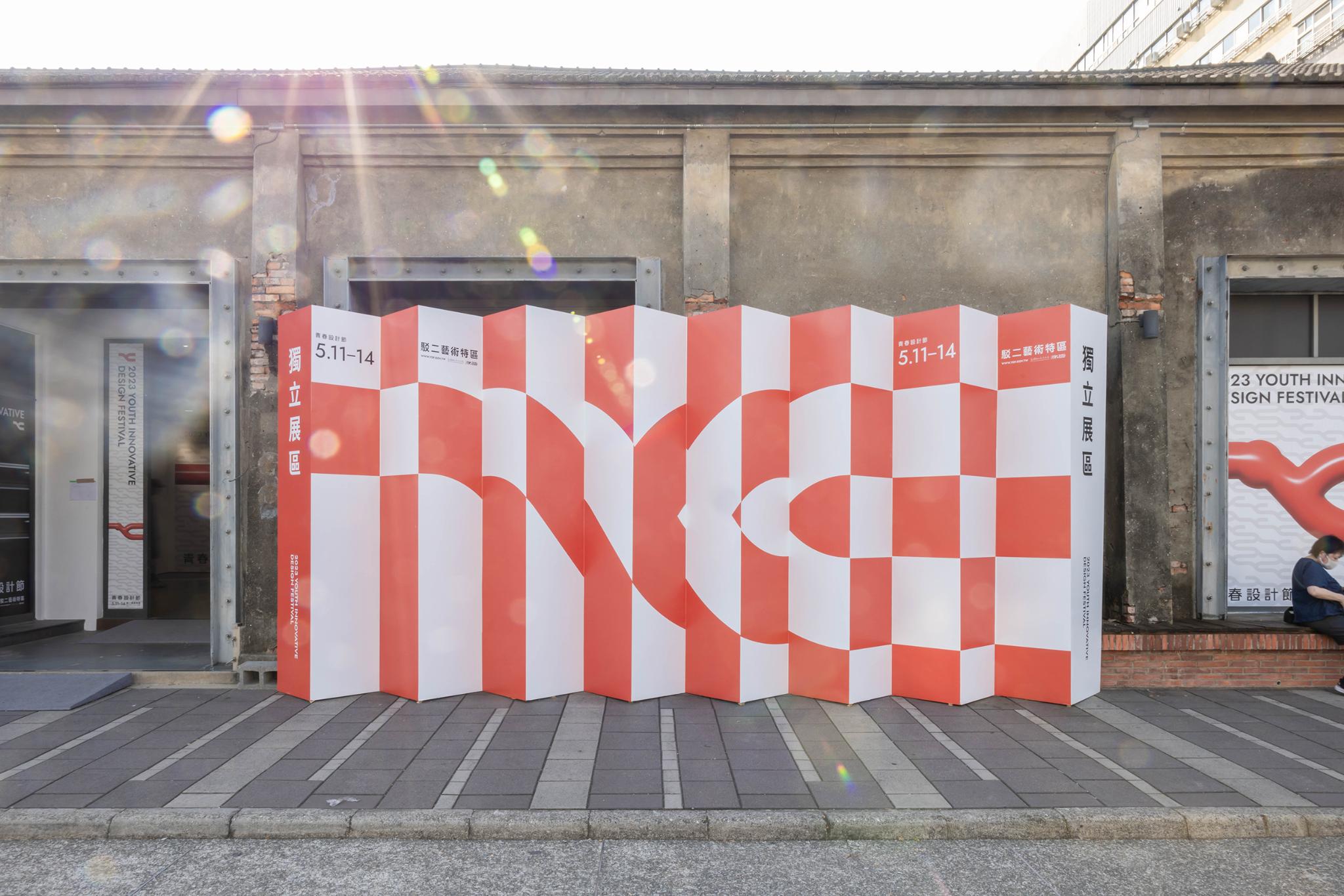
The design team aimed to create a lasting and distinctive brand identity that reflects the energy and innovation of youth. The bright red symbolizes passion and energy, and the versatility of the Y shape demonstrates flexibility and diversity. The flexible shapes can be viewed from different angles for different visual effects. The highlight of the work is the variability of its shape and the combination of color and shape to convey the spirit of youth. The artwork was used across multiple platforms and formats, from digital media to everyday merchandise, to create an all-encompassing brand experience.
Client / ManufacturerDesign
Bureau of Cultural Affairs, Kaohsiung City Government
Kaohsiung City, TWBureau of Cultural Affairs, Kaohsiung City Government
Kaohsiung City, TWIF OFFICE
Taipei City, TWDate of Launch
2023
Development Time
Confidential
Target Regions
Asia
Target Groups
Consumers / Users