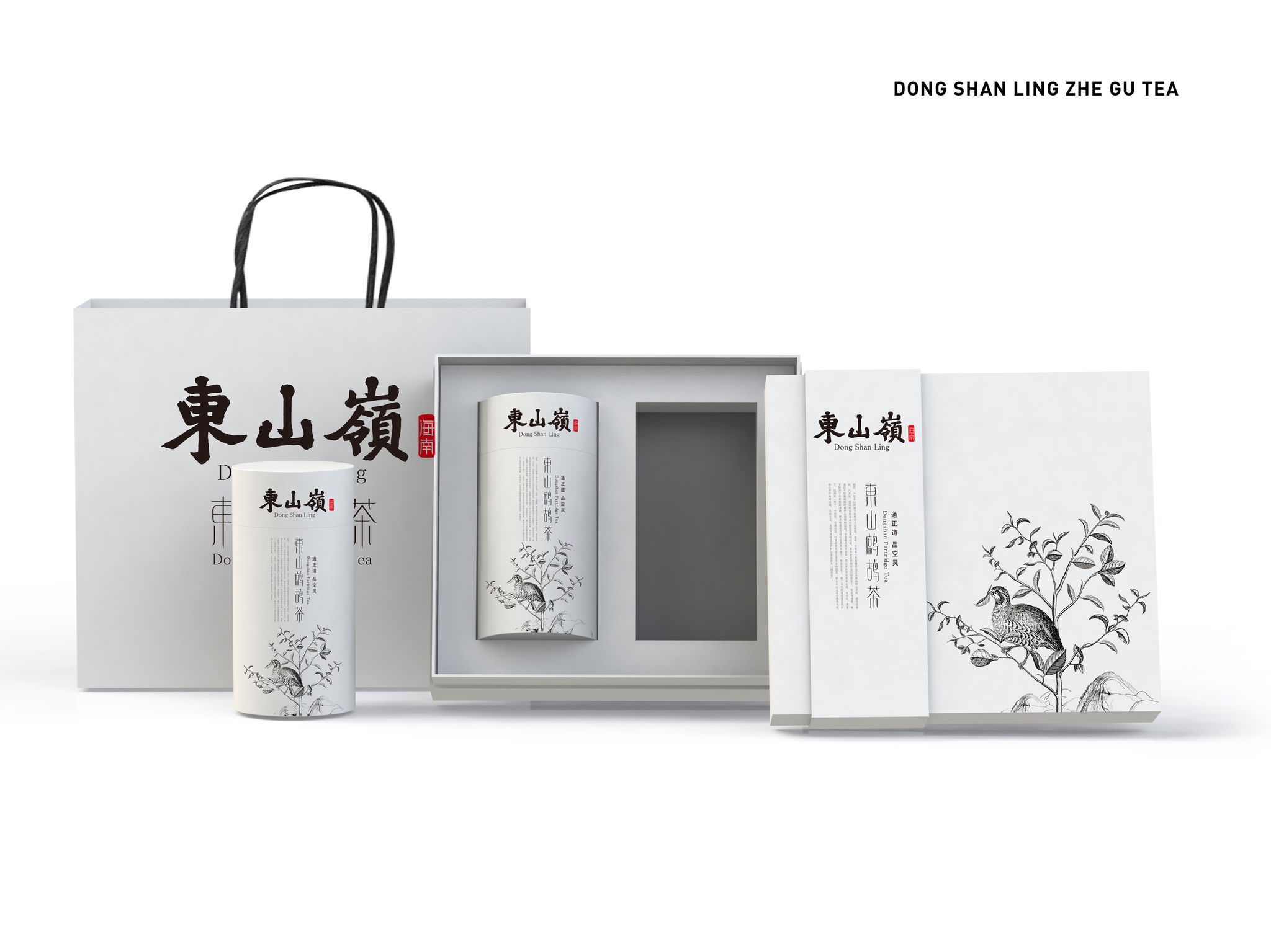
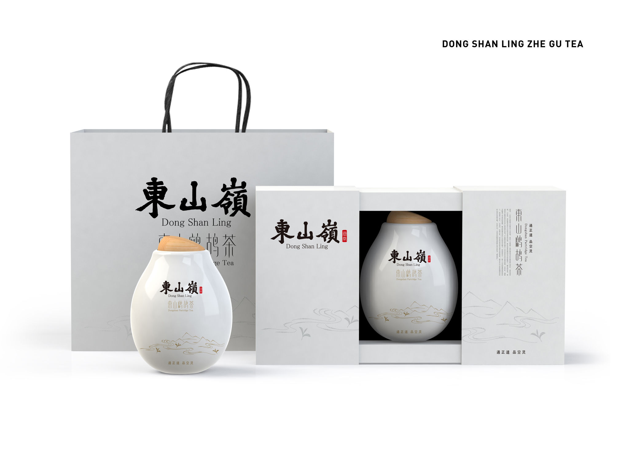
Zhe Gu Tea
Tea packaging
Zhe Gu Tea's unique logo mark originates from Chinese font of little hero with the slim profile of tea leaves, which presents the shape of the aroma. The design inspiration came from the tale of partridge. By adopting the pure white background, it depicts a partridge rest on the tree in line-drawing method directly and simply. The high-end packaging originated from an obstruct conception of Buddhism as the Chinese word “Kon.” The growing area of Zhe Gu Tea, Dong Shan hill, is a Buddhist shrine. The gift box shows the culture connotation of the growing area. Thus, the symbolic high-end packaging can represent the tea in Hainan area.
Client / Manufacturer Design
SunDesign Brand & Design (Beijing) Co., Ltd.
Beijing, CNSunDesign Brand & Design (Beijing) Co., Ltd.
Beijing, CNDate of Launch
2015
Development Time
13 - 24 months
Target Regions
Asia
Target Groups
Trade / Industry, Public Sector / Government