

AOK. Die Gesundheitskasse.
Corporate identity redesign
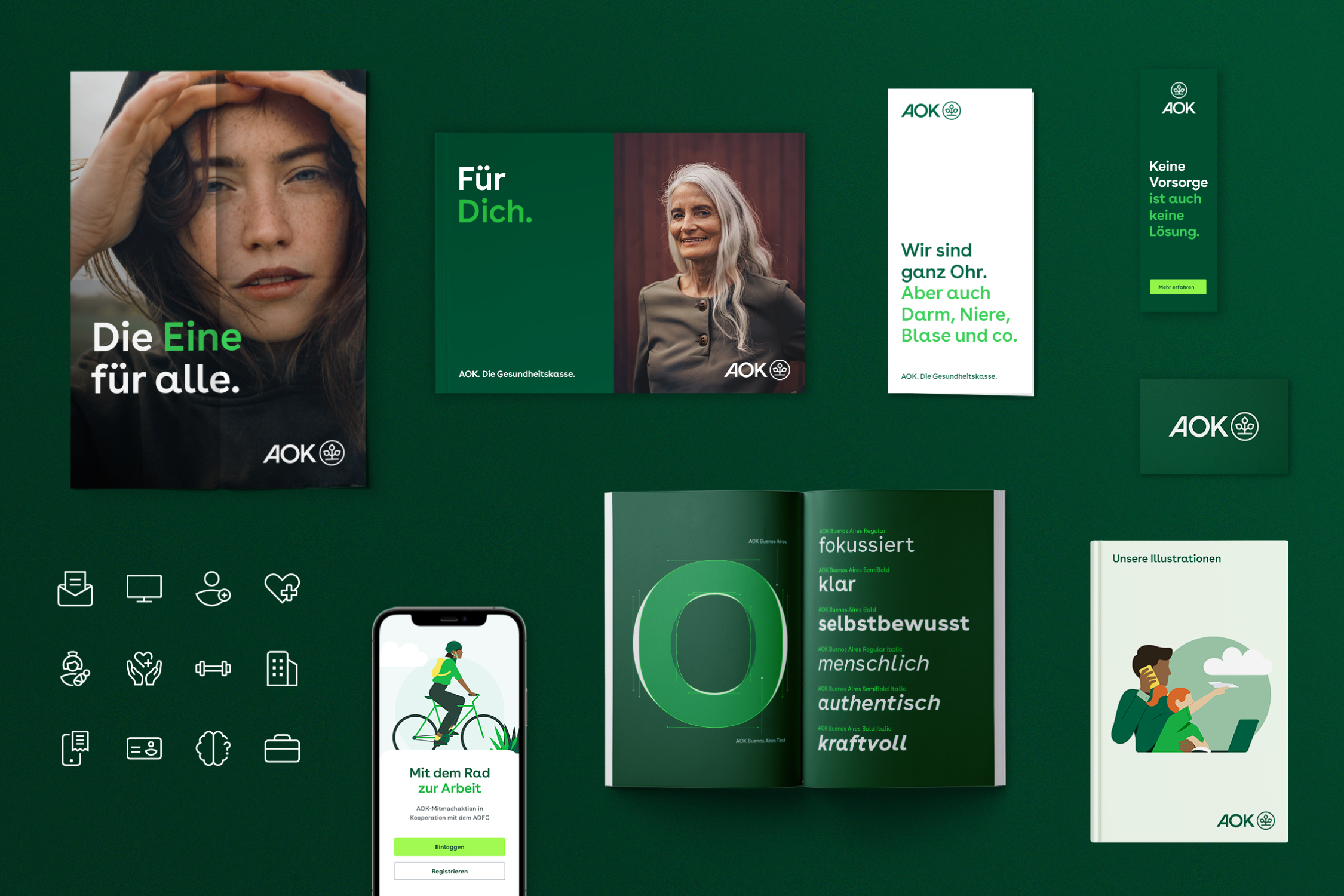
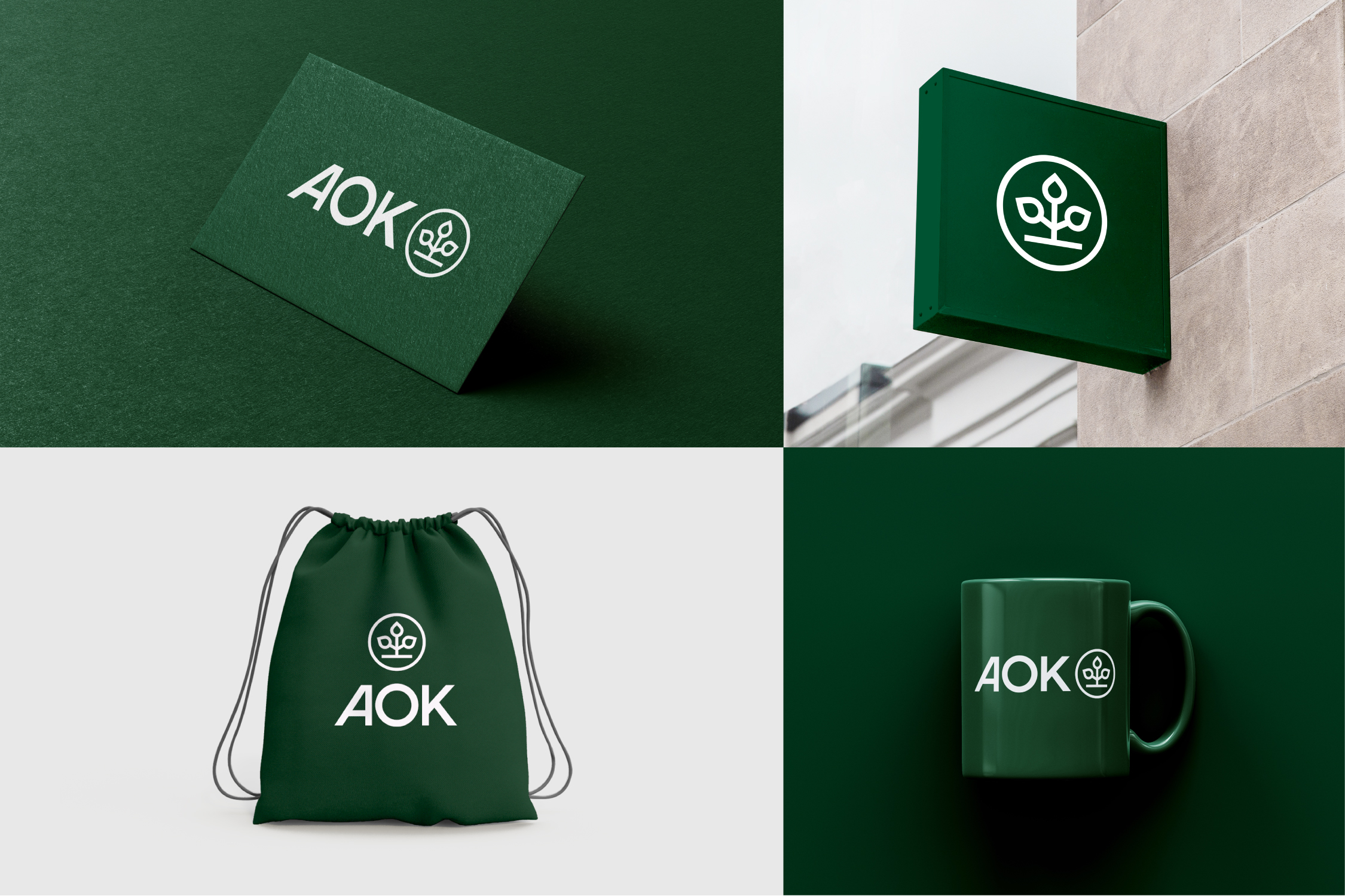
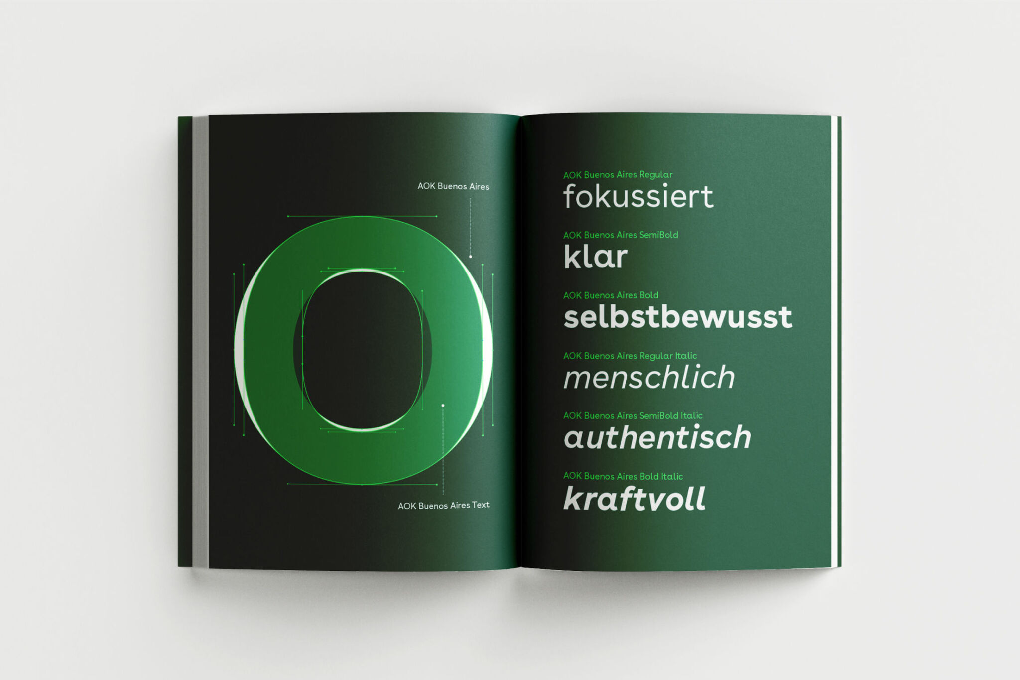
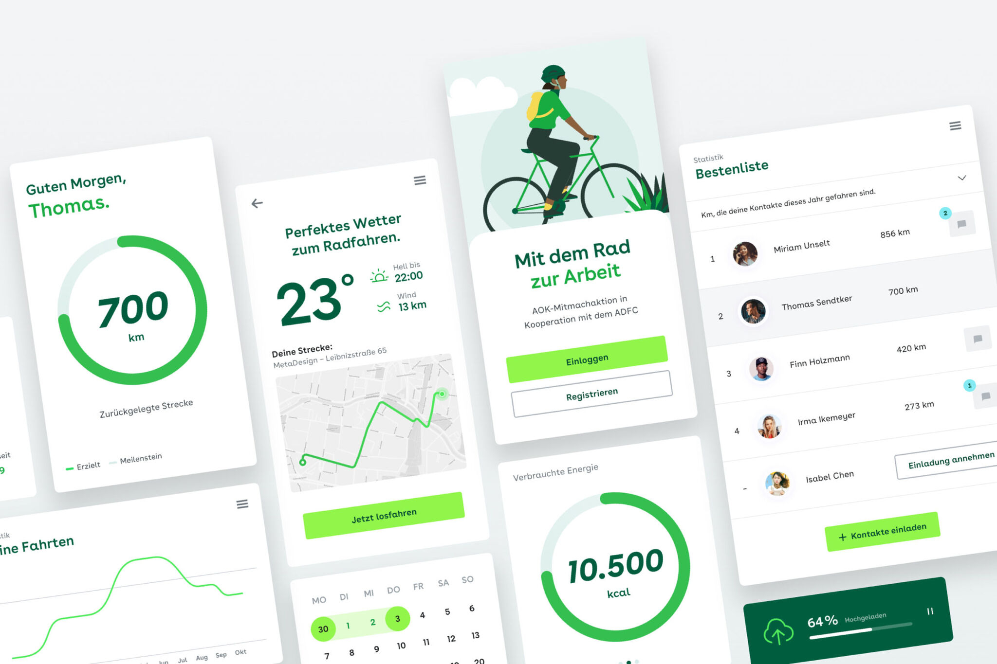
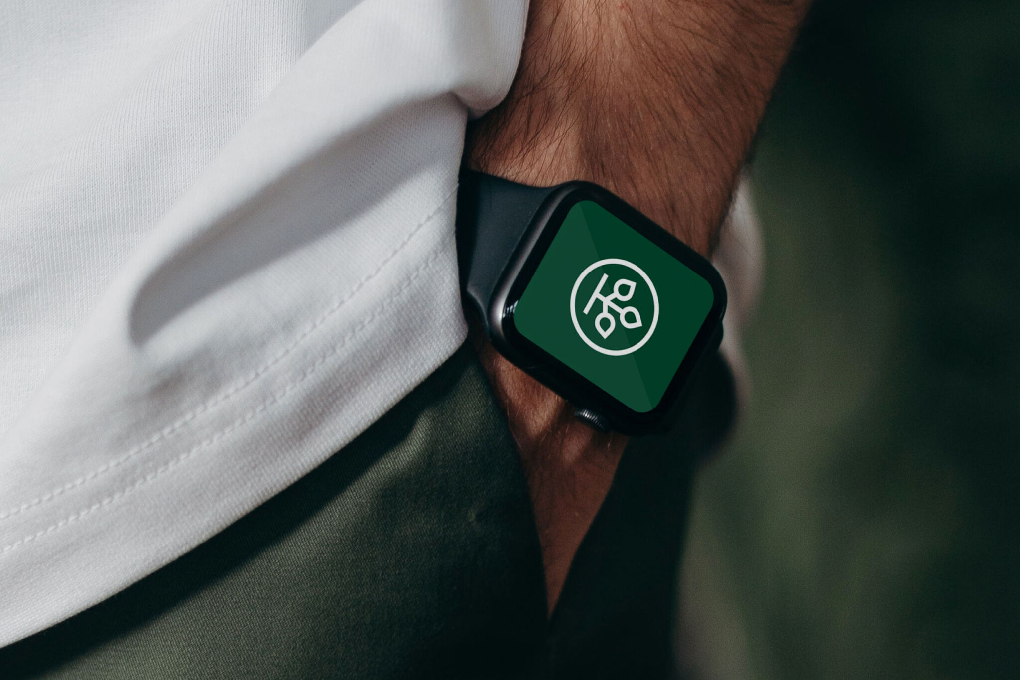
AOK is Germany's largest health insurance company, providing health coverage to more than 26 million people. But the company's enormous size proved to be a major challenge in how it was branding itself. Various regional campaigns were fragmenting AOK and making it incoherent. The aim of this rebranding was to revitalize and unify the corporate identity of Germany's No.1 health brand and create a design experience that reflects the values of AOK: empathetic, approachable, and with a clear and strong vision. A new, more human font was created; a new color palette was introduced, and the “Tree of Life” symbol was freed from its captivity within the letter “O” to make room for it to evolve into a larger brand icon.
Date of Launch
2021
Development Time
13 - 24 months
Target Regions
Specific country/region: Germany
Target Groups
Consumer / User, Public Sector Government